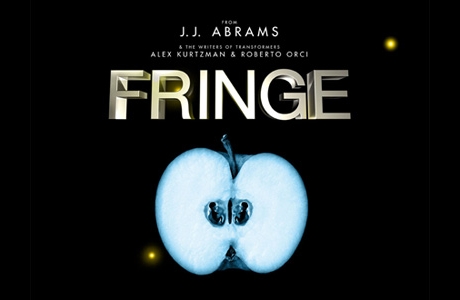
Once again I find myself without much to add to the positive consensus surrounding a new media release; in this case, it’s the FOX series Fringe, which had its premiere on Tuesday. My friends and fellow bloggers Jon Gray and Geoff Long both give the show props, which by itself would have convinced me to donate the time and DVR space to watch the fledgling serial spread its wings. The fact that the series is a sleek update of The X-Files is just icing on the cake.
In this case, it’s a cake whose monster-of-the-week decorations seem likely to rest on a creamy backdrop of conspiracy; let’s hope Fringe (if it takes off) does a better job of upkeep on its conspiracy than did X-Files. That landmark series — another spawn of the FOX network, though from long ago when it was a brassy little David throwing stones at the Goliaths of ABC, NBC, and CBS — became nearly axiomatic for me back in 1993 when I stumbled across it one Friday night. I watched it obsessively, first by myself, then with a circle of friends; it was, for a time, a perfect example not just of “appointment television” but of “subcultural TV,” accumulating local fanbaselets who would crowd the couch, eat take-out pizza, and stay up late discussing the series’ marvelously spooky adumbrations and witty gross-outs. But after about three seasons, the show began to falter, and I watched in sadness as The X-Files succumbed to the fate of so many serial properties that lose their way and become craven copies of themselves: National Lampoon, American Flagg, Star Wars.
The problem with X-Files was that it couldn’t, over its unforgivably extended run of nine seasons, sustain the weavework necessary for a good, gripping conspiracy: a counterpoint of deferral and revelation, unbelievable questions flowing naturally from believable answers with the formal intricacy of a tango. After about season six, I couldn’t even bring myself to watch anymore; to do so would have been like visiting an aged and senile relative in a nursing home, a loved one who could no longer recognize me, or me her.
I have no idea whether Fringe will ever be as good as the best or as bad as the worst of The X-Files, but I’m already looking forward to finding out. I’ve written previously about J. J. Abrams and his gift for creating haloes of speculation around the media properties with which his name is associated, such as Alias, Lost, and Cloverfield. He’s good at the open-ended promise, and while he’s proven himself a decent director of standalone films (I’m pretty sure the new Star Trek will rock), his natural environment is clearly the serial structure of dramatic television narrative, which even in its sunniest incarnation is like a friendly conspiracy to satisfy week-by-week while keeping us coming back for more.
As I stated at the beginning, other commentators are doing a fine job of assessing Fringe‘s premise and cast of characters. The only point I’ll add is that the show’s signature visual — as much a part of its texture as the timejumps on Lost or the fades-to-white on Six Feet Under — turns me on immensely. I’m speaking, of course, about the floating 3D titles that identify locale, as in this shot:

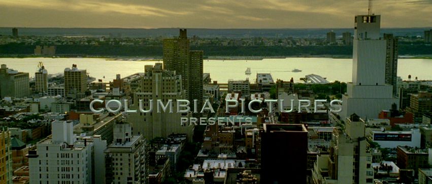
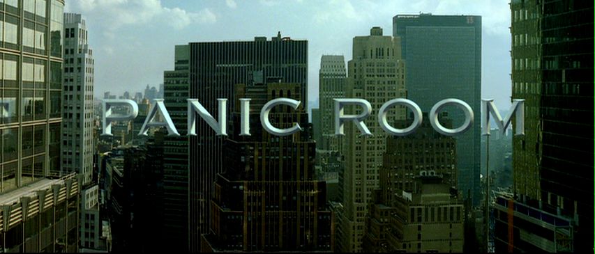
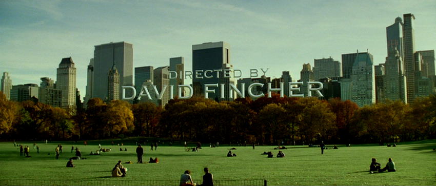
Jon points out that the conceit of embedding titles within three-dimensional space has been done previously in Grand Theft Auto 4. Though that videogame’s grim repetitiveness was too much (or not enough) for this gamer, I appreciated the title trick, and recognized it as having an even longer lineage. The truth is, embedded titles have been “floating” around the mediascape for several years. The first time I noticed them was in David Fincher’s magnificent, underrated Panic Room. There, the opening credits unfold in architectural space, suspended against the buildings of Manhattan in sunlit Copperplate:


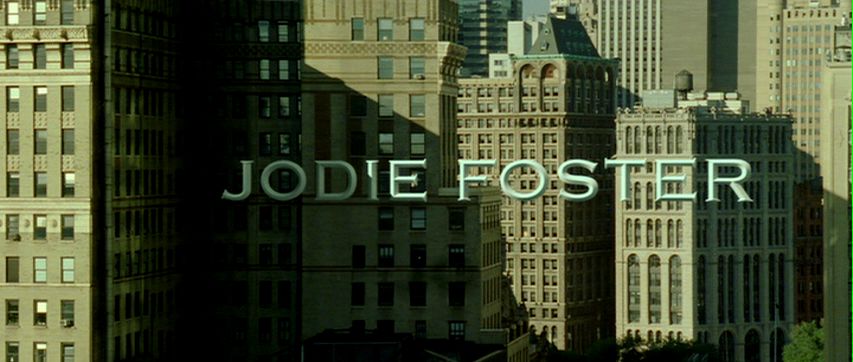
My fascination with Panic Room, a high-tech homage to Alfred Hitchcock in which form mercilessly follows function (the whole film is a trap, a cinematic homology of the brownstone in which Jodie Foster defends herself against murderous intruders), began with that title sequence and only grew. Notice, for example, how Foster’s name lurks in the right-hand corner of one shot, as though waiting for its closeup in the next:


The work of visual-effects houses Picture Mill and Computer Cafe, Panic Room‘s embedded titles make us acutely uneasy by conflating two spaces of film spectatorship that ordinarily remain reassuringly separate: the “in-there” of the movie’s action and the “out-here” of credits, subtitles, musical score, and other elements that are of the movie but not perceivable by the characters in the storyworld. It’s precisely the difference between diegetic and nondiegetic, one of the basic distinctions I teach students in my introductory film course.
But embedded titles such as the ones in Panic Room and Fringe confound easy categorical compartmentalization, rupturing the hygienic membrane that keeps the double registers of filmic phenomenology apart. The titles hang in an undecidable place, with uncertain epistemological and ontological status, like ghosts. They are perfect for a show that concerns itself with the threads of unreality that run through the texture of the everyday.
Ironically, the titles on Fringe are receiving criticism from fans like those on this Ain’t It Cool talkback, who see them as a cliched attempt to capitalize on an overworked idea:
The pilot was okay, but the leads were dull and the dialogue not much better. And the establishing subtitles looked like double ripoff of the opening credits of Panic Room and the “chapter 1” titles on Heroes. They’re “cool”, but they’ll likely become distracting in the long run.
I hated the 3D text … This sort of things has to stop. it’s not cool, David Fincher’s title sequence in Panic Room was stupid, stop it. It completly takes me out of the scene when this stuff shows up on screen. It reminds you you’re watching TV. It takes a few seconds to realize it’s not a “real” object and other characters, cars, plans, are not seeing that object, even though it’s perfectly 3D shaded to fit in the scene. And it serves NO PURPOSE other than to take you out of the scene and distract you. it’s a dumb, childish, show-off-y amateurish “let’s copy Fincher” thing, and I want it out of this and Heroes.
…I DVR’d the show while I was working, came in about 40 minutes into it before flipping over to my recording. They were outside the building at Harvard and I thought, “Hey cool, Harvard built huge letters spelling out their name outside one of their buildings.”… then I realized they were just ripping off the Panic Room title sequence. Weak.
The visual trick of embedded titles is, like any fusion of style and technology, a packaged idea with its own itinerary and lifespan; it will travel from text to text and medium to medium, picked up here in a movie, there in a videogame, and again in a TV series. In an article I published last year in Film Criticism, I labeled such entities “microgenres,” basing the term on my observation of the strange cultural circulation of the bullet time visual effect:
If the sprawling experiment of the Matrix trilogy left us with any definite conclusion, it is this: special effects have taken on a life of their own. By saying this, I do not mean simply to reiterate the familiar (and debatable) claim that movies are increasingly driven by spectacle over story, or that, in this age of computer-generated imagery (CGI), special effects are “better than ever.” Instead, bullet time’s storied trajectory draws attention to the fact that certain privileged special effects behave in ways that confound traditional understandings of cinematic narrative, meaning, and genre — quite literally traveling from one place to another like mini-movies unto themselves. As The Matrix‘s most emblematic signifier and most quoted element, bullet time spread seemingly overnight to other movies, cloaking itself in the vestments of Shakespearean tragedy (Titus, 1999), high-concept television remake (Charlie’s Angels, 2000), caper film (Swordfish, 2001), teen adventure (Clockstoppers, 2002), and cop/buddy film (Bad Boys 2, 2003). Furthermore, its migration crossed formal boundaries into animation, TV ads, music videos, and computer games, suggesting that bullet time’s look — not its underlying technologies or associated authors and owners — played the determining role in its proliferation. Almost as suddenly as it sprang on the public scene, however, bullet time burned out. Advertisements for everything from Apple Jacks and Taco Bell to BMW and Citibank Visa made use of its signature coupling of slowed time and freely roaming cameras. The martial-arts parody Kung Pow: Enter the Fist (2002) recapped The Matrix‘s key moments during an extended duel between the Chosen One (Steve Oedekerk) and a computer-animated cow. Put to scullery work as a sportscasting aid in the CBS Superbowl, parodied in Scary Movie (2000), Shrek (2001), and The Simpsons, the once-special effect died from overexposure, becoming first a cliche, then a joke. The rise and fall of bullet time — less a singular special effect than a named and stylistically branded package of photographic and digital techniques — echoes the fleeting celebrity of the morph ten years earlier. Both played out their fifteen minutes of fame across a Best-Buy’s-worth of media screens. And both hint at the recent emergence of an unusual, scaled-down class of generic objects: aggregates of imagery and meaning that circulate with startling rapidity, and startlingly frank public acknowledgement, through our media networks.
Clearly, embedded titles are undergoing a similar process, arising first as an innovation, then reproducing virally across a host of texts. Soon enough, I’m sure, we’ll see the parodies: imagine a film of the Scary Movie ilk in which someone clonks his head on a floating title. Ah, well: such is media evolution. In the meantime, I’ll keep enjoying the effect in its more sober incarnation on Fringe, where this particular package of signifiers has found a respectful — and generically appropriate — home.


