Replicants

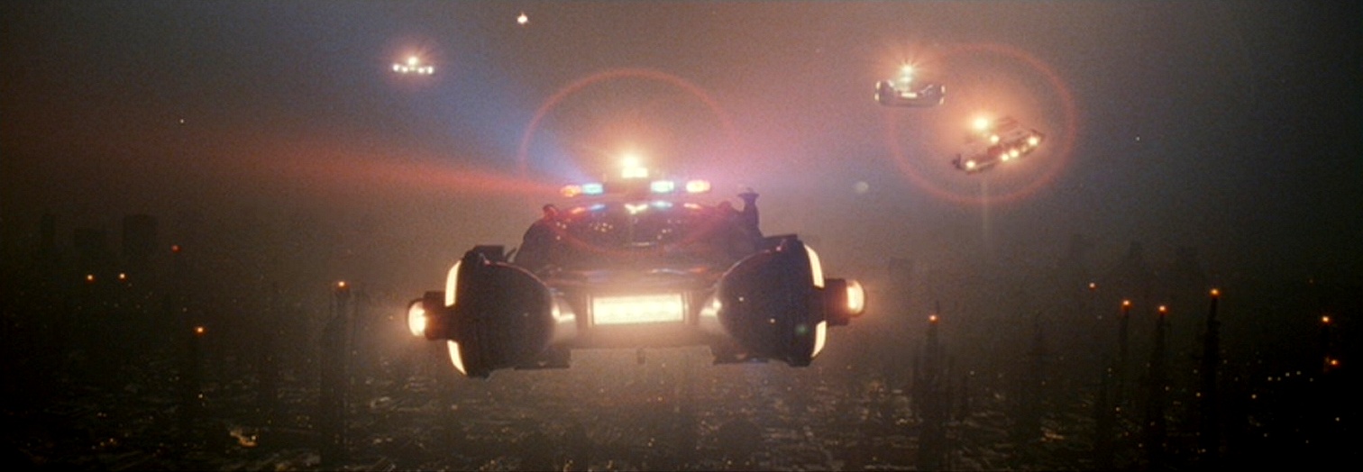
I look at Blade Runner as the last analog science-fiction movie made, because we didn’t have all the advantages that people have now. And I’m glad we didn’t, because there’s nothing artificial about it. There’s no computer-generated images in the film.

— David L. Snyder, Art Director

Any movie that gets a “Five-Disc Ultimate Collectors Edition” deserves serious attention, even in the midst of a busy semester, and there are few films more integral to the genre of science fiction or the craft of visual effects than Blade Runner. (Ordinarily I’d follow the stylistic rules about which I browbeat my Intro to Film students and follow this title with the year of release, 1982. But one of the many confounding and wonderful things about Blade Runner is the way in which it resists confinement to any one historical moment. By this I refer not only to its carefully designed and brilliantly realized vision of Los Angeles in 2019 [now a mere 11 years away!] but the many-versioned indeterminacy of its status as an industrial artifact, one that has been revamped, recut, and released many times throughout the two and a half decades of its cultural existence. Blade Runner in its revisions has almost dissolved the boundaries separating preproduction, production, and postproduction — the three stages of the traditional cinematic lifecycle — to become that rarest of filmic objects, the always-being-made. The only thing, in fact, that keeps Blade Runner from sliding into the same sad abyss as the first Star Wars [an object so scribbled-over with tweaks and touch-ups that it has almost unraveled the alchemy by which it initially transmuted an archive of tin-plated pop-culture precursors into a golden original] is the auteur-god at the center of its cosmology of texts: unlike George Lucas, Ridley Scott seems willing to use words like “final” and “definitive” — charged terms in their implicit contract to stop futzing around with a collectively cherished memory.)

I grabbed the DVDs from Swarthmore’s library last week to prep a guest lecture for a seminar a friend of mine is teaching in the English Department, and in the course of plowing through the three-and-a-half-hour production documentary “Dangerous Days” came across the quote from David L. Snyder that opens this post. What a remarkable statement — all the more amazing for how quickly and easily it goes by. If there is a conceptual digestive system for ideas as they circulate through time and our ideological networks, surely this is evidence of a successfully broken-down and assimilated “truth,” one which we’ve masticated and incorporated into our perception of film without ever realizing what an odd mouthful it makes. There’s nothing artificial about it, says David Snyder. Is he referring to the live-action performances of Harrison Ford, Rutger Hauer, and Sean Young? The “retrofitted” backlot of LA 2019, packed with costumed extras and drenched in practical environmental effects from smoke machines and water sprinklers? The cars futurized according to the extrapolative artwork of Syd Mead?

No: Snyder is talking about visual effects — the virtuoso work of a small army headed by Douglas Trumbull and Richard Yuricich — a suite of shots peppered throughout the film that map the hellish, vertiginous altitudes above the drippy neon streets of Lawrence G. Paull’s production design. Snyder refers, in other words, to shots produced exclusively through falsification: miniature vehicles, kitbashed cityscapes, and painted mattes, each piece captured in multiple “passes” and composited into frames that present themselves to the eye as unified gestalts but are in fact flattened collages, mosaics of elements captured in radically different scales, spaces, and times but made to coexist through the layerings of the optical printer: an elaborate decoupage deceptively passing itself off as immediate, indexical reality.

I get what Snyder is saying. There is something natural and real about the visual effects in Blade Runner; watching them, you feel the weight and substance of the models and lighting rigs, can almost smell the smoky haze being pumped around the light sources to create those gorgeous haloes, a signature of Trumbull’s FX work matched only by his extravagant ballet of ice-cream-cone UFOs amid boiling cloudscapes and miniature mountains in Close Encounters of the Third Kind. But what no one points out is that all of these visual effects — predigital visual effects — were once considered artificial. We used to think of them as tricks, hoodwinks, illusions. Only now that the digital revolution has come and gone, turning everything into weightless, effortless CG, do we retroactively assign the fakery of the past a glorious authenticity.

Or so the story goes. As I suggest above, and have argued elsewhere, the difference between “artificial” and “actual” in filmmaking is as much a matter of ideology as industrial method; perceptions of the medium are slippery and always open to contestation. Special and visual effects have always functioned as a kind of reality pump, investing the “nonspecial” scenes and sequences around them with an air of indexical reliability which is, itself, perhaps the most profound “effect.” With vanishingly few exceptions, actors speak lines written for them; stories are stitched into seamless continuity from fragments of film shot out of order; and, inescapably, a camera is there to record what’s happening, yet never reveals its own existence. Cinema is, prior to everything else, an artifact, and special effects function discursively to misdirect our attention onto more obvious classes of manipulation.

Now the computer has arrived as the new trick in town, enabling us to rebrand everything that came before as “real.” It’s an understandable turn of mind, but one that scholars and critics ought to navigate carefully. (Case in point: Snyder speaks as though computers didn’t exist at the time of Blade Runner. Yet it is only through the airtight registration made possible by motion-control cinematography, dependent on microprocessors for precision and memory storage for repeatability, that the film’s beautiful miniatures blend so smoothly with their surroundings.) It is possible, and worthwhile, to immerse ourselves in the virtual facade of ideology’s trompe-l’oeil — a higher order of special effect — while occasionally stepping back to acknowledge the brush strokes, the slightly imperfect matte lines that seam the composited elements of our thought.

Titles on the Fringe

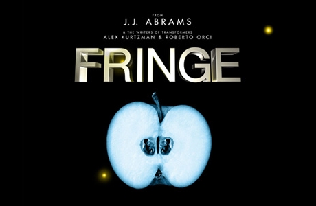
Once again I find myself without much to add to the positive consensus surrounding a new media release; in this case, it’s the FOX series Fringe, which had its premiere on Tuesday. My friends and fellow bloggers Jon Gray and Geoff Long both give the show props, which by itself would have convinced me to donate the time and DVR space to watch the fledgling serial spread its wings. The fact that the series is a sleek update of The X-Files is just icing on the cake.

In this case, it’s a cake whose monster-of-the-week decorations seem likely to rest on a creamy backdrop of conspiracy; let’s hope Fringe (if it takes off) does a better job of upkeep on its conspiracy than did X-Files. That landmark series — another spawn of the FOX network, though from long ago when it was a brassy little David throwing stones at the Goliaths of ABC, NBC, and CBS — became nearly axiomatic for me back in 1993 when I stumbled across it one Friday night. I watched it obsessively, first by myself, then with a circle of friends; it was, for a time, a perfect example not just of “appointment television” but of “subcultural TV,” accumulating local fanbaselets who would crowd the couch, eat take-out pizza, and stay up late discussing the series’ marvelously spooky adumbrations and witty gross-outs. But after about three seasons, the show began to falter, and I watched in sadness as The X-Files succumbed to the fate of so many serial properties that lose their way and become craven copies of themselves: National Lampoon, American Flagg, Star Wars.

The problem with X-Files was that it couldn’t, over its unforgivably extended run of nine seasons, sustain the weavework necessary for a good, gripping conspiracy: a counterpoint of deferral and revelation, unbelievable questions flowing naturally from believable answers with the formal intricacy of a tango. After about season six, I couldn’t even bring myself to watch anymore; to do so would have been like visiting an aged and senile relative in a nursing home, a loved one who could no longer recognize me, or me her.

I have no idea whether Fringe will ever be as good as the best or as bad as the worst of The X-Files, but I’m already looking forward to finding out. I’ve written previously about J. J. Abrams and his gift for creating haloes of speculation around the media properties with which his name is associated, such as Alias, Lost, and Cloverfield. He’s good at the open-ended promise, and while he’s proven himself a decent director of standalone films (I’m pretty sure the new Star Trek will rock), his natural environment is clearly the serial structure of dramatic television narrative, which even in its sunniest incarnation is like a friendly conspiracy to satisfy week-by-week while keeping us coming back for more.

As I stated at the beginning, other commentators are doing a fine job of assessing Fringe‘s premise and cast of characters. The only point I’ll add is that the show’s signature visual — as much a part of its texture as the timejumps on Lost or the fades-to-white on Six Feet Under — turns me on immensely. I’m speaking, of course, about the floating 3D titles that identify locale, as in this shot:

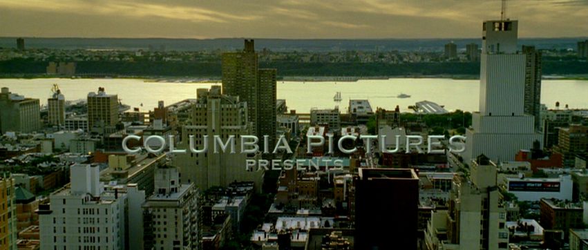
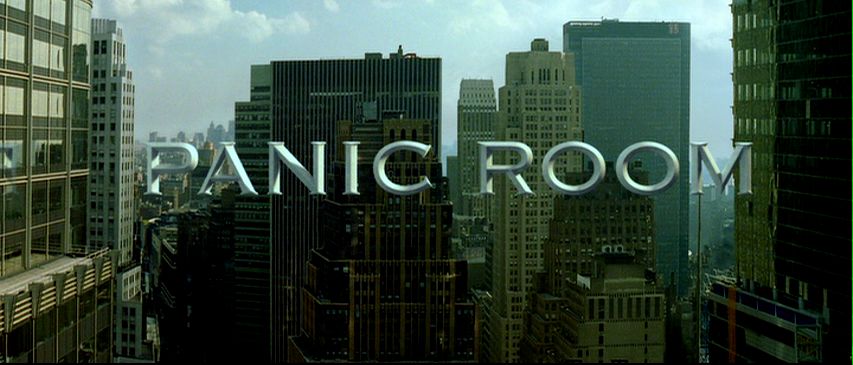
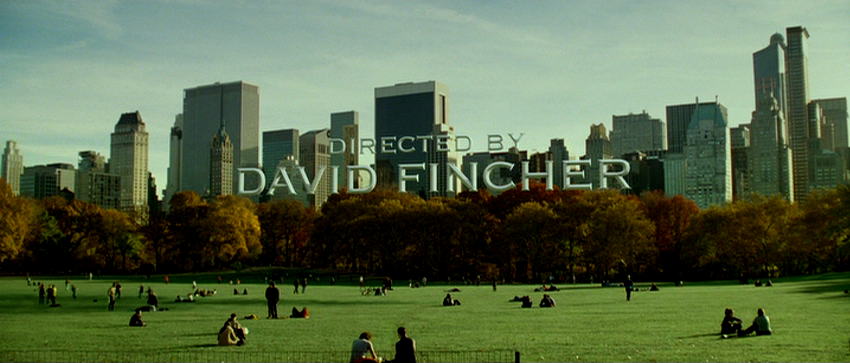
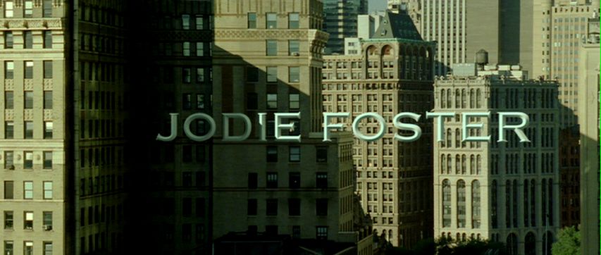
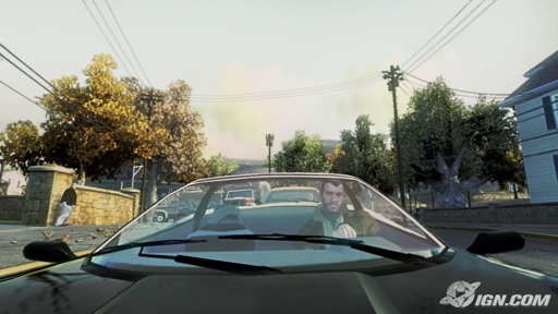
Jon points out that the conceit of embedding titles within three-dimensional space has been done previously in Grand Theft Auto 4. Though that videogame’s grim repetitiveness was too much (or not enough) for this gamer, I appreciated the title trick, and recognized it as having an even longer lineage. The truth is, embedded titles have been “floating” around the mediascape for several years. The first time I noticed them was in David Fincher’s magnificent, underrated Panic Room. There, the opening credits unfold in architectural space, suspended against the buildings of Manhattan in sunlit Copperplate:

My fascination with Panic Room, a high-tech homage to Alfred Hitchcock in which form mercilessly follows function (the whole film is a trap, a cinematic homology of the brownstone in which Jodie Foster defends herself against murderous intruders), began with that title sequence and only grew. Notice, for example, how Foster’s name lurks in the right-hand corner of one shot, as though waiting for its closeup in the next:

The work of visual-effects houses Picture Mill and Computer Cafe, Panic Room‘s embedded titles make us acutely uneasy by conflating two spaces of film spectatorship that ordinarily remain reassuringly separate: the “in-there” of the movie’s action and the “out-here” of credits, subtitles, musical score, and other elements that are of the movie but not perceivable by the characters in the storyworld. It’s precisely the difference between diegetic and nondiegetic, one of the basic distinctions I teach students in my introductory film course.

But embedded titles such as the ones in Panic Room and Fringe confound easy categorical compartmentalization, rupturing the hygienic membrane that keeps the double registers of filmic phenomenology apart. The titles hang in an undecidable place, with uncertain epistemological and ontological status, like ghosts. They are perfect for a show that concerns itself with the threads of unreality that run through the texture of the everyday.

Ironically, the titles on Fringe are receiving criticism from fans like those on this Ain’t It Cool talkback, who see them as a cliched attempt to capitalize on an overworked idea:

The pilot was okay, but the leads were dull and the dialogue not much better. And the establishing subtitles looked like double ripoff of the opening credits of Panic Room and the “chapter 1” titles on Heroes. They’re “cool”, but they’ll likely become distracting in the long run.

I hated the 3D text … This sort of things has to stop. it’s not cool, David Fincher’s title sequence in Panic Room was stupid, stop it. It completly takes me out of the scene when this stuff shows up on screen. It reminds you you’re watching TV. It takes a few seconds to realize it’s not a “real” object and other characters, cars, plans, are not seeing that object, even though it’s perfectly 3D shaded to fit in the scene. And it serves NO PURPOSE other than to take you out of the scene and distract you. it’s a dumb, childish, show-off-y amateurish “let’s copy Fincher” thing, and I want it out of this and Heroes.

…I DVR’d the show while I was working, came in about 40 minutes into it before flipping over to my recording. They were outside the building at Harvard and I thought, “Hey cool, Harvard built huge letters spelling out their name outside one of their buildings.”… then I realized they were just ripping off the Panic Room title sequence. Weak.

The visual trick of embedded titles is, like any fusion of style and technology, a packaged idea with its own itinerary and lifespan; it will travel from text to text and medium to medium, picked up here in a movie, there in a videogame, and again in a TV series. In an article I published last year in Film Criticism, I labeled such entities “microgenres,” basing the term on my observation of the strange cultural circulation of the bullet time visual effect:

If the sprawling experiment of the Matrix trilogy left us with any definite conclusion, it is this: special effects have taken on a life of their own. By saying this, I do not mean simply to reiterate the familiar (and debatable) claim that movies are increasingly driven by spectacle over story, or that, in this age of computer-generated imagery (CGI), special effects are “better than ever.” Instead, bullet time’s storied trajectory draws attention to the fact that certain privileged special effects behave in ways that confound traditional understandings of cinematic narrative, meaning, and genre — quite literally traveling from one place to another like mini-movies unto themselves. As The Matrix‘s most emblematic signifier and most quoted element, bullet time spread seemingly overnight to other movies, cloaking itself in the vestments of Shakespearean tragedy (Titus, 1999), high-concept television remake (Charlie’s Angels, 2000), caper film (Swordfish, 2001), teen adventure (Clockstoppers, 2002), and cop/buddy film (Bad Boys 2, 2003). Furthermore, its migration crossed formal boundaries into animation, TV ads, music videos, and computer games, suggesting that bullet time’s look — not its underlying technologies or associated authors and owners — played the determining role in its proliferation. Almost as suddenly as it sprang on the public scene, however, bullet time burned out. Advertisements for everything from Apple Jacks and Taco Bell to BMW and Citibank Visa made use of its signature coupling of slowed time and freely roaming cameras. The martial-arts parody Kung Pow: Enter the Fist (2002) recapped The Matrix‘s key moments during an extended duel between the Chosen One (Steve Oedekerk) and a computer-animated cow. Put to scullery work as a sportscasting aid in the CBS Superbowl, parodied in Scary Movie (2000), Shrek (2001), and The Simpsons, the once-special effect died from overexposure, becoming first a cliche, then a joke. The rise and fall of bullet time — less a singular special effect than a named and stylistically branded package of photographic and digital techniques — echoes the fleeting celebrity of the morph ten years earlier. Both played out their fifteen minutes of fame across a Best-Buy’s-worth of media screens. And both hint at the recent emergence of an unusual, scaled-down class of generic objects: aggregates of imagery and meaning that circulate with startling rapidity, and startlingly frank public acknowledgement, through our media networks.

Clearly, embedded titles are undergoing a similar process, arising first as an innovation, then reproducing virally across a host of texts. Soon enough, I’m sure, we’ll see the parodies: imagine a film of the Scary Movie ilk in which someone clonks his head on a floating title. Ah, well: such is media evolution. In the meantime, I’ll keep enjoying the effect in its more sober incarnation on Fringe, where this particular package of signifiers has found a respectful — and generically appropriate — home.

Convention in a Bubble

A quick followup to my post from two weeks ago (a seeming eternity) on my gleeful, gluttonous anticipation of the Democratic and Republican National Conventions as high-def smorgasbords for my optic nerve. I watched and listened dutifully, and now — literally, the morning after — I feel stuffed, sated, a little sick. But that’s part of the point: pain follows pleasure, hangover follows bender. Soon enough, I’ll be hungry for more: who’s with me for the debates?

Anyway, grazing through the morning’s leftovers in the form of news sites and blogs, I was startled by the beauty of this interactive feature from the New York Times, a 360-degree panorama of the RNC’s wrapup. It’s been fourteen years since Quicktime technology pervily cross-pollinated Star Trek: The Next Generation‘s central chronotope, the U.S.S. Enterprise 1701-D, in a wondrous piece of reference software called the Interactive Technical Manual. I remember being glued to the 640X480 display of my Macintosh whatever-it-was (the Quadra? the LC?), exploring the innards of the Enterprise from stem to stern through little Quicktime VR windows within which, by clicking and dragging, you could turn in a full circle, look up and down, zoom in and out. Now a more potent and less pixilated descendent of that trick has been used to capture and preserve for contemplation a bubble of spacetime from St. Paul, Minnesota, at the orgiastic instant of the balloons’ release which signaled the conclusion of the Republicans’ gathering.

Quite apart from the political aftertaste (and let’s just say that this week was like the sour medicine I had to swallow after the Democrats’ spoonful of sugar), there’s something sublime about clicking around inside the englobed map. Hard to pinpoint the precise location of my delight: is it that confetti suspended in midair, like ammo casings in The Matrix‘s bullet-time shots? The delegates’ faces, receding into the distance until they become as abstractedly innocent as a galactic starfield or a sprinkle-encrusted doughnut? Or is it the fact of navigation itself, the weirdly pleasurable contradiction between my fixed immobility at the center of this reconstructed universe and the fluid way I crane my virtual neck to peer up, down, and all around? Optical cryptids such as this confound the classical Barthesian punctum. So like and yet unlike the photographic, cinematographic, and ludic regimes that are its parents (parents probably as startled and dismayed by their own fecundity as the rapidly multiplying Palin clan), the image-machine of the Flash bubble has already anticipated the swooping search paths of my fascinated gaze and embedded them algorithmically within itself.

If I did have to choose the place I most love looking, it would be at the faces captured nearest the “camera” (here in virtualizing quotes because the bubble actually comprises several stitched-together images, undercutting any simple notion of a singular device and instant of capture). Peering down at them from what seems just a few feet away, the reporters seem poignant — again, innocent — as they stare toward center stage with an intensity that matches my own, yet remain oblivious to the panoptic monster hanging over their heads, unaware that they have been frozen in time. How this differs from the metaphysics of older photography, I can’t say; I just know that it does. Perhaps it’s the ontology of the bubble itself, at once genesis and apocalypse: an expanding shock wave, the sudden blistered outpouring of plasma that launched the universe, a grenade going off. The faces of those closest to “me” (for what am I in this system? time-traveler? avatar? ghost? god?) are reminiscent of those stopped watches recovered from Hiroshima and Nagasaki, infinitely recording the split-second at which one reality ended while another, harsher and hotter, exploded into existence.

It remains to be seen what will come of this particular Flashpoint. For the moment — a moment which will last forever — you can explore the bubble to your heart’s content.

Conventional Wisdom

Ooooh, the next two weeks have me tingling with anticipation: it’s time again for the Democratic National Convention and its bearded-Spock alternate-universe doppelganger, the Republican National Convention. I intend to watch from my cushy couch throne, which magisterially oversees a widescreen high-def window into the mass ornament of our country’s competing electoral carnivals.

Strangely, the Olympics didn’t hold me at all (beyond the short-lived controversy of their shameless simulationism), even though they served up night after night of HD spectacle. It wasn’t until I drove into the city last week to take in a Phillies game that I realized how hungry I am to immerse myself in that weird, disembodied space of the arena, where folks to the right and left of you are real enough, but rapidly fall away into a brightly-colored pointillist ocean, a rasterized mosaic that is, simply, the crowd, banked in rows that rise to the skyline, a bowl of enthusiastic spectatorial specks training their collective gaze on each other as well as inward on a central proscenium of action. At the baseball game I was in a state of happy distraction, dividing my attention among the actual business of balls, strikes, and runs; the fireworky HUDs of jumbotrons, scoreboards, and advertising banners, some of which were static billboards and others smartly marching graphics; the giant kielbasa (or “Bull Dog”) smothered with horseradish and barbecue sauce clutched in my left hand, while in my right rested a cold bottle of beer; and people, people everywhere, filling the horizon. I leaned over to my wife and said, “This is better than HD — but just barely.”

Our warring political parties’ conventions are another matter. I don’t want to be anywhere near Denver or Minneapolis/St. Paul in any physical, embodied sense. I just want to be there as a set of eyes and ears, embedded amid the speechmakers and flagwavers through orbital crosscurrents of satellite-bounced and fiber-optics-delivered information flow. I’ll watch every second, and what I don’t watch I’ll DVR, and what I don’t DVR I’ll collect later through the discursive lint filters of commentary on NPR, CNN, MSNBC, and of course Comedy Central.

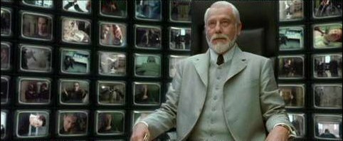
The main pleasure in my virtual presence, though, will be jumping around from place to place inside the convention centers. I remember when this joyous phenomenon first hit me. It was in 1996, when Bill Clinton was running against Bob Dole, and my TV/remote setup were several iterations of Moore’s Law more primitive than what I wield now. Still, I had the major network feeds and public broadcasting, and as I flicked among CBS, NBC, ABC, and PBS (while the radio piped All Things Considered into the background), I experienced, for the first time, teleportation. Depending on which camera I was looking through, which microphone I was listening through, my virtual position jumped from point to point, now rubbing shoulders with the audience, now up on stage with the speaker, now at the back of the hall with some talking head blocking my view of the space far in the distance where I’d been an instant previously. It was not the same as Classical Hollywood bouncing me around inside a space through careful continuity editing; nor was it like sitting in front of a bank of monitors, like a mall security guard or the Architect in The Matrix Reloaded. No, this was multilocation, teletravel, a technological hopscotch in increments of a dozen, a hundred feet. I can’t wait to find out what all this will be like in the media environment of 2008.

As for the politics of it all, I’m sure I’ll be moved around just as readily by the flow of rhetoric and analysis, working an entirely different (though no less deterministic) register of ideological positioning. Film theory teaches us that perceptual pleasure, so closely allied with perceptual power, starts with the optical and aural — in a word, the graphic — and proceeds downward and outward from there, iceberg-like, into the deepest layers of self-recognition and subjectivity. I’ll work through all of that eventually — at least by November 4! In the meantime, though, the TV is warming up. And the kielbasa’s going on the grill.

Technologies of Disappearance

My title is a lift from Alan N. Shapiro’s interesting and frustrating book on Star Trek as hyperreality, but what motivates me to write today are three items bobbing around in the news: two from the world of global image culture, the other from the world of science and technology.

Like Dan North, who blogs smartly on special effects and other cool things at Spectacular Attractions, I’m not deeply into the Olympics (either as spectator or commentator), but my attention was caught by news of what took place at last week’s opening ceremonies in Beijing. In the first case, Lin Miaoke, a little girl who sang the revolutionary hymn “Ode to the Motherland,” was, in turns out, lip-synching to the voice of another child, Yang Peiyi, who was found by the Communist Party politburo to be insufficiently attractive for broadcast. And in the second case, a digitally-assisted shot of fireworks exploding in the nighttime sky was used in place of the evidently less-impressive real thing.

To expound on the Baudrilliardian intricacies at play here hardly seems necessary: the two incidents were tied together instantly by the world press and packaged in headlines like “Fakery at the Olympics.” As often happens, the Mass Media Mind — churning blindly away like something from John Searles’s Chinese room thought experiment — has stumbled upon a rhetorical algorithm that tidily condenses several discourses: our simultaneous awe and dread of the powers of technological simulation; the sense that the Olympics embodies an omnivorous spectacularity threatening to consume and amplify beyond recognition all that is homely and human in scale; and good ol’ fashioned Orientalism, here resurrected as suspicion of the Chinese government’s tendency toward manipulation and disguise. (Another “happy” metaphorical alignment: the visibility-cloaking smog over Beijing, so ironically photogenic as a contrast to the crisp and colorful mass ornament of the crowded, beflagged arenas.)

If anything, this image-bite of twinned acts of deception functions, itself, as another and trickier device of substitution. Judging the chicanery, we move within what Adorno called the closed circle of ideology, smugly wielding criticism while failing to escape the orbit of readymade meanings to question more fundamental issues at stake. We enjoy, that is, our own sense of scandal, thinking it premised on a sure grasp of what is true and indexical — the real singer, the unaltered skies — and thus reinscribe a belief that the world can be easily sorted into what is real and what is fake.

Of course it’s all mediated, fake and real at the same time, calibrated as cunningly as the Olympics themselves. Real bodies on bright display in extremes of exertion unimaginable by this couch potato: the images on my high-def screen have rarely been so viscerally indexical in import, every grimace and bead of sweat a profane counterpoint to sacred ballistics of muscled motion. But I fool myself if I believe that the reality of the event is being delivered to me whole. Catching glimpses of the ongoing games as I shuffle through surrounding channels of televisual flow is like seeing a city in flickers from a speeding train: the experience julienned by commercials and camera cuts, embroidered by thickets of helpful HUD graphics and advertisers’ eager logos. Submerged along another axis entirely is the vanished reality of the athletes’ training: eternities of drilling and repetition, an endless dull disciplining at profound odds with the compacted, adrenalized, all-or-nothing showstoppers of physical prowess.

Maybe the collective fascination of the lip-synching stems from our uncomfortable awareness that we’re engaged in a vicarious kind of performance theft, sitting back and dining on the visual feast of borrowed bodily labor. And maybe the sick appeal of the CG fireworks is our guilty knowledge that human beings are functioning as special effects themselves, there to evince oohs and ahs. All I know is that the defense offered up by the guy I heard on BBC World News this morning seems to radically miss the point. Madonna and Britney lip-synch, he said: why is this any different? As for the digital fireworks, did we really expect helicopters to fly close to the airborne pyrotechnics? The cynicism of the first position, that talent is always a manufactured artifact, is matched by the blase assumption of the second, permuting what we might call the logic of the stuntman: if an exploit is too dangerous for a lead actor to perform, sub in a body worth a little less. In the old days, filmmakers did it with people whose names appeared only in the end credits (and then not among the cast). Nowadays, filmmakers hand the risk over to technological standins. In either case, visualization has trumped representation, the map preceding the territory.

But I see I’ve fallen into the trap I outlined earlier, dressing up in windy simulationist rhetoric a more basic dismay. Simply put, I’m sad to think of Yang Peiyi’s rejection as unready for global prime time, based on a chubby face and some crooked teeth (features, let me add, now unspooling freely across the world’s screens — anyone else wondering how she’ll feel at age twenty about having been enshrined as the Ugly Ducking?). Prepping my Intro to Film course for the fall, I thought about showing Singin’ in the Rain — beneath its happy musical face a parable of insult in which pretty but untalented people highjack the vocal performances of skilled but unglamorous backstage workers. Hey, I was kind of a chubby-faced, snaggle-toothed kid too, but at least I got to sing my own part (Frank Butler) in Annie Get Your Gun.

In other disappearance news: scientists are on their way to developing invisibility. Of this I have little to say, except that I’m relieved the news is getting covered at all. There’s more than one kind of disappearance, and if attention to events at Berkeley and Beijing is reassuring in any measure, it’s in the “making visible” of cosmetic technologies that, in their amnesiac emissions and omissions, would otherwise sand off the rough, unpretty edges of the world.

Crudeness, Complexity, and Venom’s Bite

Back in the 70s, like most kids who grew up middle-class and media-saturated in the U.S., I lived for the blocks of cartoons that aired after school and on Saturday mornings. From Warner Brothers and Popeye shorts to affable junk like Hong Kong Phooey, I devoured just about everything, with the notable exception of Scooby Doo, which I endured with resigned numbness as a bridge between more interesting shows. (Prefiguring my later interest in special effects both cheesy and classy, I was also nutty for the live-action Filmation series the networks would occasionally try out on us: cardboard superhero morality plays like Shazam! and Isis, as well as SF-lite series Ark II, Space Academy, and Jason of Star Command, which was the Han Solo to Space Academy‘s Luke Skywalker.)

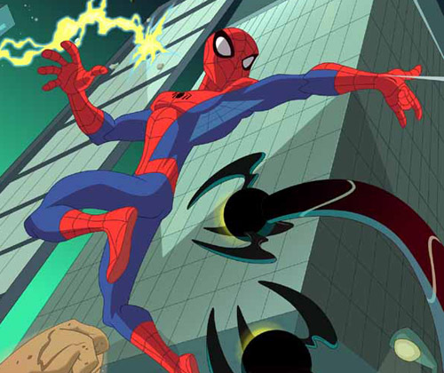
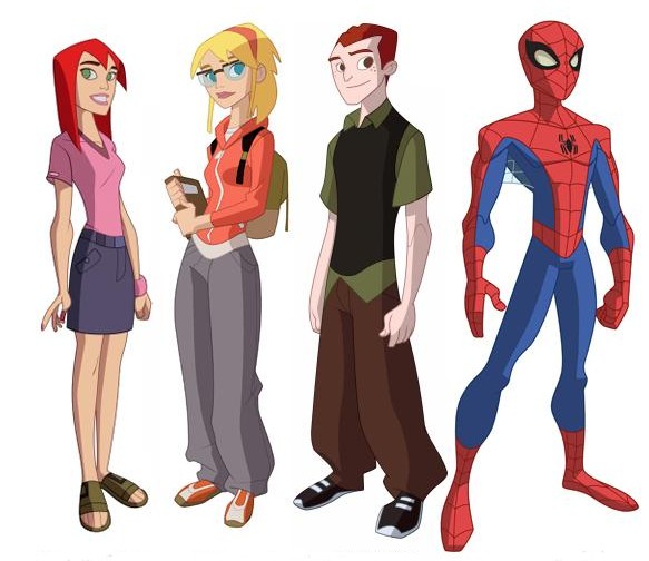
Nowadays, as a fancypants professor of media studies who teaches courses on animation and fandom, I have, I suppose, moved on to a more mature appreciation of the medium’s possibilities, just as animation itself has found a new cultural location in primetime fare like Family Guy, South Park, and CG features from Pixar and DreamWorks that speak simultaneously to adult and child audiences. But the unreformed ten-year-old in me is still drawn to kids’ cartoons – SpongeBob is sublime, and I rarely missed an episode of Bruce Timm’s resurrection of Superman from the 1990s. This week I had a look at the new CW series, The Spectacular Spider-Man (Wiki rundown here; Sony’s official site here), and was startled both by my own negative response to the show’s visual execution and my realization that the transmedia franchise has passed me by while I was busy with others things … like going to graduate school, getting married, and buying a house. Maybe the photographic evidence of a youthful encounter that recently turned up has made me sensitive to the passage of time; whatever the cause, the new series came as a shock.

First, the visual issue. It’s jolting how crude the animation of the new Spider-Man looks to my eye, especially given my belief that criticisms of this type are inescapably tied to generational position: the graphics of one era seem trite beside the graphics of another, a grass-is-always-greener perceptual mismatch we all too readily misrecognize as transhistorical, inherent, beyond debate. In this case, time’s arrow runs both ways: The garbage kids watch today doesn’t hold a candle to the art we had when I was young from one direction, Today’s shows [or movies, or music, or baseball teams, etc.] are light-years beyond that laughable crap my parents watched from the other. Our sense of a media object’s datedness is based not on some teleological evolution (as fervently as we might believe it to be so) but on stylistic shifts and shared understandings of the norm — literally, states of the art. This technological and aesthetic flux means that very little cultural material from one decade to another escapes untouched by some degree of ideological Doppler shift, whether enshrined as classic or denigrated as obsolete, retrograde, stunted.

Nevertheless, I have a hard time debating the evidence of my eyes – eyes here understood as a distillation of multiple, ephemeral layers of taste, training, and cultural comfort zoning. The character designs, backgrounds, framing and motion of The Spectacular Spider-Man seem horribly low-res at first glance: inverting the too-many-notes complaint leveled at W. A. Mozart, this Spider-Man simply doesn’t have enough going on inside it. Of course, bound into this assessment of the cartoon’s graphic surface is an indictment of more systemic deficits: the dialogue, characterization, and storytelling seem thin, undercooked, dashed off. Around my visceral response to the show’s pared-down quality there is a whiff of that general curmudgeonly rot (again, one tied to aging — there are no young curmudgeons): The Spectacular Spider-Man seems slangy and abrupt, rendered in a rude optical and narrative shorthand that irritates me because it baffles me. I see the same pattern in my elderly parents’ reactions to certain contemporary films, whose rhythms seem to them both stroboscopically intense and conceptually vapid.

The irony in all this is that animation historically has been about doing more with less — maximizing affective impact, narrative density, and thematic heft with a relative minimum of brush strokes, keyframes, cel layers, blobs of clay, or pixels. Above all else, animation is a reducing valve between the spheres of industrial activity that generate it and the reception contexts in which the resulting texts are encountered. While the mechanism of the live-action camera captures reality in roughly a one-to-one ratio, leaving only the stages of editing and postproduction to expand the labor-time involved in its production, animation is labor- and time-intensive to its very core: it takes far longer to produce one frame than it takes to run that frame through the projector. (This is nowhere clearer than in contemporary CG filmmaking; in the more crowded shots of Pixar’s movie Cars, for example, some frames took entire weeks to render.)

As a result, animation over the decades has refined a set of representational strategies for the precise allocation of screen activity: metering change and stasis according to an elaborate calculus in which the variables of technology, economics, and artistic expression compete — often to the detriment of one register over another. Most animation textbooks introduce the idea of limited animation in reference to anime, whose characteristic mode of economization is emblematized by frozen or near-frozen images imparted dynamism by a subtle camera movement. But in truth, all animation is limited to one degree or another. And the critical license we grant those limitations speaks volumes about collective cultural assumptions. In Akira, limitation is art: in Super Friends (a fragment of which I caught while channel-surfing the other day and found unwatchably bad), it’s a commercial cutting-of-corners so base and clumsy as to make your eyeballs burst.

It’s probably clear that with all these caveats and second-guessings, I don’t trust my own response to The Spectacular Spider-Man‘s visual sophistication (or lack of it). My confidence in my own take is further undermined by the realization that the cartoon, as the nth iteration of a Spider-Man universe approaching its fiftieth year, pairs its apparent crudeness with vast complexity: for it is part of one of our few genuine transmedia franchises. I’ve written on transmedia before, each time, I hope, getting a little closer to understanding what these mysterious, emergent entities are and aren’t. At times I see them as nothing more than a snazzy rebranding of corporate serialized media, an enterprise almost as old as that other oldest profession, in which texts-as-products reproduce themselves in the marketplace, jiggering just enough variation and repetition into each spinoff that it hits home with an audience eager for fresh installments of familiar pleasures. At other times, though, I’m less cynical. And for all its sketchiness, The Spectacular Spider-Man offers a sobering reminder that transmedia superheroes have walked the earth for decades: huge, organic archives of storytelling, design networks, and continuously mutating continuity.

Geoff Long, who has thought about the miracles and machinations of transmedia more extensively and cogently than just about anyone I know, recently pointed out that we live amid a glut of new transmedia lines, most of which — like those clouds of eggs released by sea creatures, with only a lottery-winning few lucky enough to survive and reproduce — are doomed to failure. Geoff differentiates between these “hard” transmedia launches and more “soft” and “crunchy” transmedia that grow slowly from a single, largely unanticipated success. In Spider-Man, Batman, Superman and the like, we have serial empires of apparent inexhaustibility: always more comic books, movies, videogames, action figures to be minted from the template.

But the very scale of a long-lived transmedia system means that, at some point, it passes you by; which is what happened to me with Spider-Man, around the time that Venom appeared. This symbiotic critter (I could never quite figure out if it’s a sentient villain, an alter-ego of Spidey, or just a very aggressive wardrobe malfunction) made its appearance around 1986, approximately the same time that I was getting back into comic books through Love and Rockets, Cerebus, and the one-two punch of Frank Miller’s The Dark Knight Returns and Moore’s and Gibbons’s Watchmen. Venom represented a whole new direction for Spider-Man, and, busy with other titles, I never bothered to do the homework necessary to bind him into my personal experience of Spider-Man’s diegetic history. Thus, Sam Raimi’s botched Spider-Man 3 left me cold (though it did restage some of the Gwen Stacy storyline that broke my little heart in the 70s), and when Venom happened to show up on the episode of Spectacular Spider-Man that I watched, I realized just how out of touch I’ve become. Venom is everywhere, and any self-respecting eight-year-old could probably lecture me on his lifespan and dietary habits.

Call this lengthy discourse a meditation on my own aging — a bittersweet lament on the fact that you can’t stay young forever, can’t keep up with everything the world of pop entertainment has to offer. Long after I’ve stopped breathing, the networked narratives of my favorite superheroes and science-fiction worlds will continue to proliferate. My mom and dad can enjoy this summer’s Iron Man without bothering over the lengthy history of that hero; perhaps I’ll get to the same point when, as an old man one day, I confront some costumed visual effect whose name I’ve never heard of. In the meantime, Venom oozes virally through the sidechannels and back-alleys of Spider-Man’s mediaverse, popping up in the occasional cartoon to tease me — much as he does the eternally-teenaged, ever-tormented Peter Parker — with a dark glimpse of my own mortality, as doled out in the traumas of transmedia.

Digital Day for Night

A quick followup to my recent post on the new Indiana Jones movie: I’ve seen it, and find myself agreeing with those who call it an enjoyable if silly film. Actually, it was the best couple of hours I’ve spent in a movie theater on a Saturday afternoon in quite a while, and seemed especially well suited to that particular timeframe: an old-fashioned matinee experience, a slightly cheaper ticket to enjoy something less than classic Hollywood art. Pulp at a bargain price.

But my interest in the disproportionately angry fan response to the movie continues. And to judge by articles popping up online, Indiana Jones and the Kingdom of the Crystal Skull is providing us, alongside its various pleasures (or lack thereof), a platform for thinking about that (ironically) age-old question, “How are movies changing?” — also known as “Where has the magic gone?” Here, for example, are three articles, one from Reuters, one from The Atlantic.com, and one from an MTV blog, each addressing the film’s heavy use of CGI.

I can see what they’re talking about, and I suppose if I were less casual in my fandom of the first three Indy movies, I’d be similarly livid. (I still can’t abide what’s been done to Star Wars.) At the same time, I suspect our cultural allergy to digital visual effects is a fleeting phenomenon — our collective eyes adjusting themselves to a new form of light. Some of the sequences in Crystal Skull, particularly those in the last half of the film, simply wouldn’t be possible without digital visual FX. CG’s ability to create large populations of swarming entities onscreen (as in the ant attack) or to stitch together complex virtual environments with real performers (as in the Peru jungle chase) were clearly factors in the very conception of the movie, with the many iterations of the troubled screenplay passing spectacular “beats” back and forth like hot potatoes on the assumption that, should all else fail, at least the movie would feature some killer action.

Call it digital day for night, the latest version of the practice by which scenes shot in daylight “pass” for nighttime cinematography. It’s a workaround, a cheat, like all visual effects, in some sense nothing more than an upgraded cousin of the rear-projected backgrounds showing characters at seaside when they’re really sitting on a blanket on a soundstage. It’s the hallmark of an emerging mode of production, one that’s swiftly becoming the new standard. And our resistance to it is precisely the moment of enshrining a passing mode of production, one that used to seem “natural” (for all its own undeniable artificiality). By such means are movies made, but it’s also the way that the past itself is manufactured, memory and nostagia forged through an ongoing dialectic of transparency and opacity that haunts our recreational technologies.

We’ll get used to the new way of doing things. And someday, movies that really do eschew CG in favor of older FX methodologies, as Spielberg and co. initially promised to do, will seem as odd in their way as performances of classical music that insist on using authentic instruments from the time. For the moment, we’re suspended between one mode of production and another, truly at home in neither, able only to look unhappily from one bank to another as the waterfall of progress carries us ever onward.

The Id Machine

In one of those media events so global — perhaps solar-systemic? — in scope that you hardly need me to remind you about it, Grand Theft Auto IV launches today. Early word on Rockstar’s latest is everything it ought to be: game reviewers are enraptured, moral guardians enraged. Me, I’m just waiting to get my hands on the thing, which manifests in this world as a silver disk in a bright-green plastic case, but becomes in the space of the screen another totemic circle: a steering wheel. Maybe more than any other virtual-world franchise, GTA toggles its players smoothly between human and automotive avatars, encasing us in cars for such long stretches of gametime that, as Tycho at Penny Arcade writes, you might end up just “sitting in a parking lot listening to the radio.”

The webcomic associated with Tycho’s post makes another good point about Grand Theft Auto, namely that its possible pathways are so seemingly infinite in number that they risk numbing the player with the paralysis of “total freedom.” The opposite of the rail shooter to which I compared the Harry Potter novels a few posts back, GTA and its ilk are better described as sandbox games, which emphasize the open-endedness of play. Now, I admit to being skeptical of such neat distinctions, believing in my curmudgeonly way that the sense of unbounded possibility offered up by most “interactive” experiences is just that: a phantasmic structure of feeling, conveniently packaged and sold to us in the same way that advance hype about the summer movie season is more the actual commodity than the movies themselves. (That said, I’m looking forward, same as always, to things like Iron Man, Indiana Jones and the Kingdom of the Crystal Skull, The Dark Knight, and — mmmm yes — Speed Racer.) It’s a matter of perception, not pathways. The most scripted of videogames (if done well) can get my heart thumping with the sense that anything might happen next, while GTA, no matter how many gigabytes of gamedata and corresponding square mileage of explorable diegesis it may offer, can still wear out its welcome. Though I played both avidly, I never finished either Grand Theft Auto III or its sequel, Vice City.

That said, I never played anything as gripping, anarchic, and sensual, either. My friend Chris Dumas calls GTA the “id machine,” and he’s right. Like the Krell technology buried beneath the surface of Altair IV in Forbidden Planet, GTA is a visualization engine for the subconscious, pipelining our nastiest, bloodiest impulses into daylight, setting loose neon monsters we didn’t know we had in us. It’s insane fun to play and, like the best videogames, cinematically engrossing to observe. It’s also perversely Bazinian in form. As a grad student in 2002, I wrote a paper called “Grand Theft Auto 3 and the Interface of the Everyday,” arguing that GTA is at heart a simulation — not of mechanical or physical processes, but urban experience. Here’s the intro:

With its heightened violence, black humor, and mise-en-scene reminiscent of blaxploitation and vigilante films from the 1970s and Quentin Tarantino’s postmodern recyclings in movies such as Reservoir Dogs (1992) and Pulp Fiction (1994), GTA3 seems to stand apart from the tradition of simulation games, so much so that its simulationist tendencies are perceptible only upon reflection; on first glance it is more likely to be put into the category of “shoot-em-up” games such as Doom, Quake, and other first-person shooters, or hand-to-hand fighting games such as Tekken and Mortal Kombat. I argue, however, that GTA3 actually represents the culmination, in a form so pure as to be almost unrecognizable, of a particular simulationist logic that has heretofore stayed comfortably submerged in videogames: the notion of urban realism. Or rather, a refracted and stylized realism whose excesses should not be allowed to obscure its essential goal: the representation of modern urban existence, complete with dead time, bad weather, traffic lights, blaring radio stations, law enforcement by turns oblivious and aggressive, and a totalizing motif of passage – endless motion through the city’s spaces on foot or (more often) behind the wheel of a car, from the vantage point of which Liberty City’s bridges and skyscrapers, storefronts and pedestrians, become spectacles simultaneously mundane and beautiful.

In this sense, GTA3 follows a logic of modernity articulated by Walter Benjamin and Siegfried Kracauer, and before them Baudelaire, whose epigrammatic summation of modernity as “the transient, the fleeting, the contingent” set the terms for a discourse of ephemera – the idea that the truth of contemporary existence, and perhaps the key to its revolutionary reform, resides not in the monumental and “historic” but in the unnoticed and ordinary. In this paper I shall explore the idea that GTA3 makes the everyday its object of simulation, interaction, and pleasure, enabling users to play within the environs of a stylized urban reality as a way of experiencing, and reflecting upon, their own place in the world and position in society. In the second half of the paper I move toward a consideration of videogames in general, setting them against a backdrop of twentieth-century technologies, in order to argue that videogames share a function that Benjamin identified as “subject[ing] the human sensorium to a complex kind of training” in which “perception in the form of shocks [is] established as a formal principle.” Under this view, the content of Grand Theft Auto (which concerns itself textually with an alternating rhythm of shocks and boredom) merges with the formal operations of videogames, which, consumed in unmarked leisure time, reflect changes wrought in consciousness by technology and industrialization, similar to Benjamin’s description of the Fun Fair whose Dodgem cars achieve “a taste of the drill to which the unskilled laborer is subjected in the factory.” I begin with a consideration of three main components of GTA3’s play: the city, the flâneur, and the car.

Looking at this argument today, it doesn’t seem too earthshaking; Gonzalo Frasca explores some similar ideas in his 2003 essay “Sim Sin City.” It may be that with the advancing tide of computer graphics, we’re less scandalized by the notion that videogames can stand in, even substitute for, the visual and auditory sensorium through which we filter and know reality. Games, that is, increasingly engage in a double simulation, first of our lived sensory existence and only secondarily of more ephemeral (but nonetheless meaningful) matters: ethics, aesthetics, class consciousness. In the case of GTA, the subjectivity tourism is that of a violent, animalistic, unforgiving struggle to survive on the streets, something that its player demographic will likely never confront. GTA provides in musical flashes a world we recognize as our own even as we comfortably disavow it through the technological trick of switching off the console: inverting the hypodermic needle’s injection, we anesthetize ourselves precisely by unplugging, retreating from the raw truth of the made-up game into the ongoing dream of our privileged, protected lives.

Retrographics and Multiplayer avant la lettre

super-mario-galaxy-21.jpg

Let me start with a disclosure: although I own both a Nintendo Wii and an XBox 360, I almost exclusively play the latter — and rarely play the former. I’ve agonized over this. Why does my peak Wii moment remain the mercenary achievement of tracking one down last summer? Why haven’t the Wii-mote and its associated embodied play style inspired me to spend a fraction as many hours in front of the television as I’ve spent working through Katamari Beautiful, Valve’s Orange Box, Halo 3, and Need for Speed Carbon on the Xbox? The answer, it seems to me, comes down to graphics: Microsoft’s console simply pushes more pixels and throws more colors on my new HD TV, and I vanish into those neon geometries without looking back. I feel guilty about this, vaguely philistine, the same way I felt when I switched from Macintosh to PC. But there it is. Like Roy Neary (Richard Dreyfuss) in Close Encounters of the Third Kind, I go where the pretty lights lead me.

But that doesn’t make the phenomenon of the Wii any less fascinating, and the recent New York Times article on the top-selling console games of 2007 is compelling in its assertion that gamers are turning away from the kind of high-end techno-sublime represented by the Xbox 360 and the Playstation 3 and toward the simpler graphics and more accessible play style of the Wii. It makes sense that a dialectic would emerge in videogames between the superadvanced aesthetic and its primitive-by-comparison cousin; the binary of shiny-new and gnarly-old has structured everything from Quake‘s blend of futuristic cyborgs and medieval demons to Robert Zemeckis’s digital adaptation of the ancient Beowulf.  Anyone who’s discovered the joy of bringing old 8-bit games to life with emulators like MAME knows that the pleasure of play involves an oscillation between where we’ve been and where we’re going; between what passes for new now and what used to do so; between the sensory thrill of the state-of-the-art and the nostalgia of our first innocent encounters with the videogame medium in all its subjectivity-transforming power.

A less elaborate way of saying which is: the Wii represents through its pared-down graphics the return of a historical repressed, the enshrining of a certain simplicity that remains active at the medium’s heart, but until now has not been packaged and sold back to us with quite such panache.

The other interesting claim in the article is that the top games (World of Warcraft, Guitar Hero) are not solitary, solipsistic shooters like Bioshock and Halo, but rich social experiences — you play them with other people around, whether online or ranged around you in the dorm room. Seth Schiesel writes,

Ever since video games decamped from arcades and set up shop in the nation’s living rooms in the 1980s, they have been thought of as a pastime enjoyed mostly alone. The image of the antisocial, sunlight-deprived game geek is enshrined in the popular consciousness as deeply as any stereotype of recent decades.

The thing is, I can’t think of a time when the games I played as a child and teenager in the 1970s and 1980s weren’t social. I always consumed them with a sense of community, whether because my best friend Dan was with me, watching me play (or I watching him) and offering commentary, or because I talked about games endlessly with kids at school. Call it multiplayer avant la lettre; long before LANs and the internet made it possible to blast each other in mazes or admire each other’s avatarial stand-ins, we played our games together, making sense of them as a community — granted, a maligned subculture by the mainstream measure of high school, but a community nonetheless. As graphics get better and technologies more advanced, I hope that gamers don’t rewrite their pasts, forgetting the friendships forged in an around algorithmic culture.

Always Under Construction

enterprise-under-construction.jpg

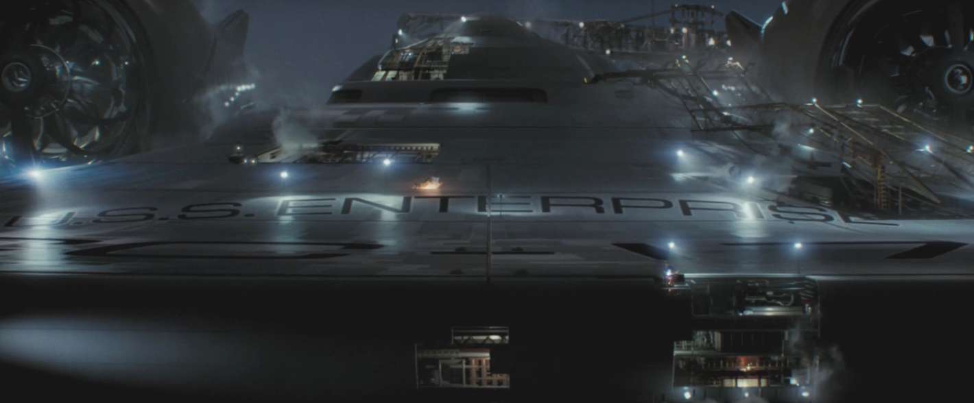
The teaser for J. J. Abrams’s Star Trek reboot, previously playing only to privileged viewers of Cloverfield, is now available for global consumption and scrutiny on Paramount’s official movie site. My own attention — and imagination — are captured less by the teaser’s aural invocations of real and virtual history (oratory by John F. Kennedy and Leonard Nimoy, the opening strains of Alexander Courage’s Trek score, even a weird snippet of the transporter sound effect) and more by the big eyeball-kick of a reveal that arrives at the end: the Enterprise itself, “under construction” (screen grab above).

Those two words close out the teaser and also adorn the website, clearly inviting us to indulge in the metaphorical collapse of film and starship. In Trek‘s calculus of the imaginary, this is nothing new; from the franchise’s 1966 “launch” onward, a happy equation — perhaps homology is the better term — has existed between the various televisual and filmic incarnations of Trek and the spacefaring vessel that is its primary characters’ means of exploration. The Enterprise, in other words, has always served as something akin to the gun-gripping hand at the bottom of the screen in a first-person shooter: an interface between our world and fictive future history, a graphic conceit easing us over the screen border that separates living room from starship bridge. (It’s not an original insight on my part to point out that Kirk and crew seek out strange new worlds while essentially sitting on comfy recliners and watching a big-screen TV.) Befitting their status as new textual “technologies,” each installment of the franchise has redesigned the Enterprise slightly, even given us new ships in which to take our weekly voyages: the Voyager, the Defiant, and all those goofy runabouts on Deep Space Nine.

In recent weeks I’ve grown weary of contemplating the ingenious, demonic ways in which Abrams builds interest in his projects, using feints and dead-ends to set us buzzing with anticipation and antagonism toward experiences that lie buried in our future (what the Cloverfield monster looks like, what’s really going on on Lost, and so forth). Every dissection of the Abrams effect, it now seems to me, just adds to the Abrams effect; the name of the game in a transmedia age is the viral replication of text, cultivation of mind-share expertly timed to the release calendar. In the end it doesn’t really matter whether our chatter is in the service of bunking or debunking. It’s all, in the eyes of the media industries, good.

So I think I’ll sidestep the argumentative bait offered by the teaser image, namely the degree to which Abrams’s Enterprise is faithful — or not — to the Enterprise(s) of history. Suffice to say that the ship hasn’t been reinvented to the egregious extent of the Jupiter II’s makeover in the 1998 film version of Lost in Space (a sin against science fiction for which Akiva Goldsman has partly compensated with the impressive I Am Legend). From the head-on view we’re given, the new Enterprise maintains the classic saucer-and-twin-nacelles configuration of Walter “Matt” Jefferies’s 60s design, which is good enough for me.

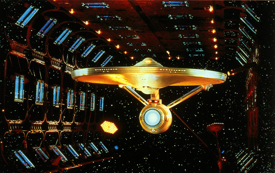
What I will point out is how insistently the “under construction” trope has recurred in Star Trek‘s big picture — its diegesis, metatext, or whatever we’re calling the giant mass of still and moving images, documents and data, that constitute its 42-year-old corpus. Scenes where the ship is in drydock abound in the movies and more recent TV series. 1979’s Star Trek: The Motion Picture, the first viable expansion of the franchise and proof of its ability to endlessly regenerate itself, contains an extended sequence in which Kirk and Scotty circle the under-construction Enterprise-A.

drydock.jpg

This rhapsodic interlude, derided by many critics and even some fans as evidence of ST:TMP‘s visual-effects metastasis — the elephantine marriage of budgetary excess and narcissistic self-indulgence — seems, over the years, to have undergone a kind of greening, emerging as the film’s kernel of authentic Trek, the powerfully beating heart (throbbing dilithium crystal?) of what is otherwise a rather gray and inert film.

pike-complete-2.jpg

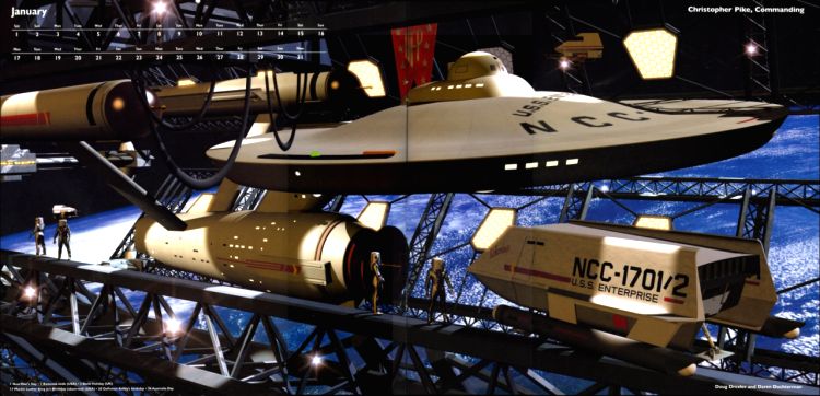
And this image, from the 2005 Ships of the Line calendar, even more succinctly pinpoints the lovely lure of a starship under construction. “Christopher Pike, Commanding” and the class of favored images it exemplifies are like Star Trek‘s primal scenes. Often generated by nonprofessionals using 3D rendering programs, they are what inspired me to write a dissertation chapter about Star Trek‘s “hardware fandom” — those who spend their time buying blueprints of Constitution-class starships, doodling D7 Klingon cruisers and Romulan Birds of Prey, building model kits of the Galileo-7 shuttlecraft, and taping together cardboard-tube and cereal-box mockups of phasers, communicators, and tricorders.

All of those objects were imperfect, and none quite measured up to the onscreen ideal. But it was their very imperfections — their under-constructedness — that marked them as ours, as real and full of possibility. Better the dream of what might come to be then the grim result of its arrival. When it comes right down to it, the Enterprise is always being built, always under construction. I don’t mind waiting another year with the partial version that Abrams has given us.