Crudeness, Complexity, and Venom’s Bite

Back in the 70s, like most kids who grew up middle-class and media-saturated in the U.S., I lived for the blocks of cartoons that aired after school and on Saturday mornings. From Warner Brothers and Popeye shorts to affable junk like Hong Kong Phooey, I devoured just about everything, with the notable exception of Scooby Doo, which I endured with resigned numbness as a bridge between more interesting shows. (Prefiguring my later interest in special effects both cheesy and classy, I was also nutty for the live-action Filmation series the networks would occasionally try out on us: cardboard superhero morality plays like Shazam! and Isis, as well as SF-lite series Ark II, Space Academy, and Jason of Star Command, which was the Han Solo to Space Academy‘s Luke Skywalker.)

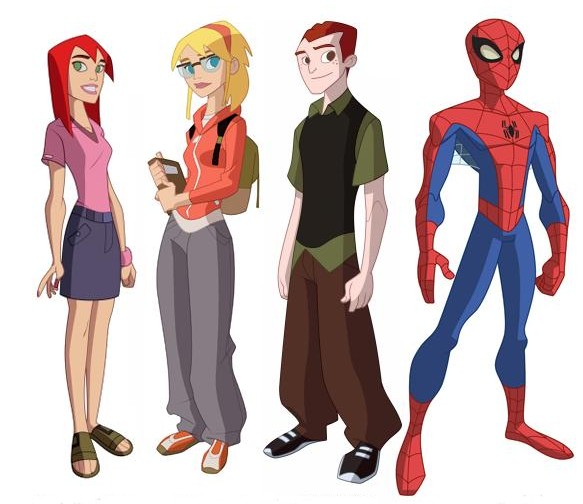
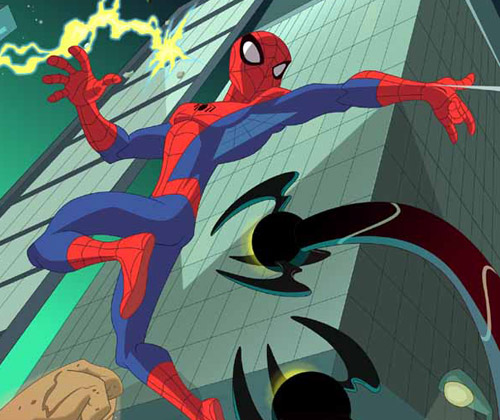
Nowadays, as a fancypants professor of media studies who teaches courses on animation and fandom, I have, I suppose, moved on to a more mature appreciation of the medium’s possibilities, just as animation itself has found a new cultural location in primetime fare like Family Guy, South Park, and CG features from Pixar and DreamWorks that speak simultaneously to adult and child audiences. But the unreformed ten-year-old in me is still drawn to kids’ cartoons – SpongeBob is sublime, and I rarely missed an episode of Bruce Timm’s resurrection of Superman from the 1990s. This week I had a look at the new CW series, The Spectacular Spider-Man (Wiki rundown here; Sony’s official site here), and was startled both by my own negative response to the show’s visual execution and my realization that the transmedia franchise has passed me by while I was busy with others things … like going to graduate school, getting married, and buying a house. Maybe the photographic evidence of a youthful encounter that recently turned up has made me sensitive to the passage of time; whatever the cause, the new series came as a shock.

First, the visual issue. It’s jolting how crude the animation of the new Spider-Man looks to my eye, especially given my belief that criticisms of this type are inescapably tied to generational position: the graphics of one era seem trite beside the graphics of another, a grass-is-always-greener perceptual mismatch we all too readily misrecognize as transhistorical, inherent, beyond debate. In this case, time’s arrow runs both ways: The garbage kids watch today doesn’t hold a candle to the art we had when I was young from one direction, Today’s shows [or movies, or music, or baseball teams, etc.] are light-years beyond that laughable crap my parents watched from the other. Our sense of a media object’s datedness is based not on some teleological evolution (as fervently as we might believe it to be so) but on stylistic shifts and shared understandings of the norm — literally, states of the art. This technological and aesthetic flux means that very little cultural material from one decade to another escapes untouched by some degree of ideological Doppler shift, whether enshrined as classic or denigrated as obsolete, retrograde, stunted.

Nevertheless, I have a hard time debating the evidence of my eyes – eyes here understood as a distillation of multiple, ephemeral layers of taste, training, and cultural comfort zoning. The character designs, backgrounds, framing and motion of The Spectacular Spider-Man seem horribly low-res at first glance: inverting the too-many-notes complaint leveled at W. A. Mozart, this Spider-Man simply doesn’t have enough going on inside it. Of course, bound into this assessment of the cartoon’s graphic surface is an indictment of more systemic deficits: the dialogue, characterization, and storytelling seem thin, undercooked, dashed off. Around my visceral response to the show’s pared-down quality there is a whiff of that general curmudgeonly rot (again, one tied to aging — there are no young curmudgeons): The Spectacular Spider-Man seems slangy and abrupt, rendered in a rude optical and narrative shorthand that irritates me because it baffles me. I see the same pattern in my elderly parents’ reactions to certain contemporary films, whose rhythms seem to them both stroboscopically intense and conceptually vapid.

The irony in all this is that animation historically has been about doing more with less — maximizing affective impact, narrative density, and thematic heft with a relative minimum of brush strokes, keyframes, cel layers, blobs of clay, or pixels. Above all else, animation is a reducing valve between the spheres of industrial activity that generate it and the reception contexts in which the resulting texts are encountered. While the mechanism of the live-action camera captures reality in roughly a one-to-one ratio, leaving only the stages of editing and postproduction to expand the labor-time involved in its production, animation is labor- and time-intensive to its very core: it takes far longer to produce one frame than it takes to run that frame through the projector. (This is nowhere clearer than in contemporary CG filmmaking; in the more crowded shots of Pixar’s movie Cars, for example, some frames took entire weeks to render.)

As a result, animation over the decades has refined a set of representational strategies for the precise allocation of screen activity: metering change and stasis according to an elaborate calculus in which the variables of technology, economics, and artistic expression compete — often to the detriment of one register over another. Most animation textbooks introduce the idea of limited animation in reference to anime, whose characteristic mode of economization is emblematized by frozen or near-frozen images imparted dynamism by a subtle camera movement. But in truth, all animation is limited to one degree or another. And the critical license we grant those limitations speaks volumes about collective cultural assumptions. In Akira, limitation is art: in Super Friends (a fragment of which I caught while channel-surfing the other day and found unwatchably bad), it’s a commercial cutting-of-corners so base and clumsy as to make your eyeballs burst.

It’s probably clear that with all these caveats and second-guessings, I don’t trust my own response to The Spectacular Spider-Man‘s visual sophistication (or lack of it). My confidence in my own take is further undermined by the realization that the cartoon, as the nth iteration of a Spider-Man universe approaching its fiftieth year, pairs its apparent crudeness with vast complexity: for it is part of one of our few genuine transmedia franchises. I’ve written on transmedia before, each time, I hope, getting a little closer to understanding what these mysterious, emergent entities are and aren’t. At times I see them as nothing more than a snazzy rebranding of corporate serialized media, an enterprise almost as old as that other oldest profession, in which texts-as-products reproduce themselves in the marketplace, jiggering just enough variation and repetition into each spinoff that it hits home with an audience eager for fresh installments of familiar pleasures. At other times, though, I’m less cynical. And for all its sketchiness, The Spectacular Spider-Man offers a sobering reminder that transmedia superheroes have walked the earth for decades: huge, organic archives of storytelling, design networks, and continuously mutating continuity.

Geoff Long, who has thought about the miracles and machinations of transmedia more extensively and cogently than just about anyone I know, recently pointed out that we live amid a glut of new transmedia lines, most of which — like those clouds of eggs released by sea creatures, with only a lottery-winning few lucky enough to survive and reproduce — are doomed to failure. Geoff differentiates between these “hard” transmedia launches and more “soft” and “crunchy” transmedia that grow slowly from a single, largely unanticipated success. In Spider-Man, Batman, Superman and the like, we have serial empires of apparent inexhaustibility: always more comic books, movies, videogames, action figures to be minted from the template.

But the very scale of a long-lived transmedia system means that, at some point, it passes you by; which is what happened to me with Spider-Man, around the time that Venom appeared. This symbiotic critter (I could never quite figure out if it’s a sentient villain, an alter-ego of Spidey, or just a very aggressive wardrobe malfunction) made its appearance around 1986, approximately the same time that I was getting back into comic books through Love and Rockets, Cerebus, and the one-two punch of Frank Miller’s The Dark Knight Returns and Moore’s and Gibbons’s Watchmen. Venom represented a whole new direction for Spider-Man, and, busy with other titles, I never bothered to do the homework necessary to bind him into my personal experience of Spider-Man’s diegetic history. Thus, Sam Raimi’s botched Spider-Man 3 left me cold (though it did restage some of the Gwen Stacy storyline that broke my little heart in the 70s), and when Venom happened to show up on the episode of Spectacular Spider-Man that I watched, I realized just how out of touch I’ve become. Venom is everywhere, and any self-respecting eight-year-old could probably lecture me on his lifespan and dietary habits.

Call this lengthy discourse a meditation on my own aging — a bittersweet lament on the fact that you can’t stay young forever, can’t keep up with everything the world of pop entertainment has to offer. Long after I’ve stopped breathing, the networked narratives of my favorite superheroes and science-fiction worlds will continue to proliferate. My mom and dad can enjoy this summer’s Iron Man without bothering over the lengthy history of that hero; perhaps I’ll get to the same point when, as an old man one day, I confront some costumed visual effect whose name I’ve never heard of. In the meantime, Venom oozes virally through the sidechannels and back-alleys of Spider-Man’s mediaverse, popping up in the occasional cartoon to tease me — much as he does the eternally-teenaged, ever-tormented Peter Parker — with a dark glimpse of my own mortality, as doled out in the traumas of transmedia.

Planet of the Apes

As my attention shifts to one of the major goals of the summer — drafting a proposal for my book on special and visual effects — I’ve started to augment my movie-a-day habit with some classic FX titles. These are films I’ve seen before, in some cases many times, but which need revisiting. Seeing them now can be a corrective shock, revealing my memory for the sloppy generalizing mechanism it is. Impressions of movies watched in childhood blend together, in the adult mind, like ingredients of a stew, a delicious melange that is nevertheless a kind of monotaste: a tidy averaging of visual and narrative pleasures that, with a fresh viewing, shatter back into discrete components. The movie again becomes a complex terrain rather than a distant map, a succession of contrasting images rather than a single iconic poster still, a cascade of rediscovered characters, tableaux, action setpieces, and lines of dialogue. It’s like opening a box of forgotten photographs.

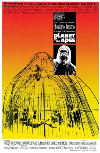
In the case of Planet of the Apes — Franklin J. Schaffner’s 1968 original, not Tim Burton’s lousy 2001 remake — I was stunned to find a film far more stark, confident, somber, chilling, and stylish than the simplistic caricature to which I’d reduced it. My first encounter with Planet of the Apes came sometime in the mid-1970s, when it ran as part of “Ape Week” on our local ABC affiliate’s Four-O’Clock Movie. I’d get home from school in time to watch an hour or so of cartoons before the feature came on; Ape Week was just one of several themed lineups I looked forward to eagerly, including “James Bond Week” and “Monster Week” (a string of Eiji Tsuburaya‘s Godzilla and Mothra movies).

The Apes series was a perfect fit for the Four-O’Clock Movie because there was one for every day of the week: from Monday’s installment of the first film through Beneath the Planet of the Apes (1970) on Tuesday, Escape from the Planet of the Apes (1971) on Wednesday, Conquest of the Planet of the Apes (1972) on Thursday, and Battle for the Planet of the Apes (1973) on Friday. The end of the week didn’t mean an end to Apes, though. Right about that time, a live-action TV series aired, followed by an animated counterpart on Saturday mornings. It would be thirty years before I heard the term transmedia franchise, but — along with daily reruns of the original Star Trek series — Apes was my inaugural passport to the labyrinthine landscape of distributed science-fiction storyworlds.

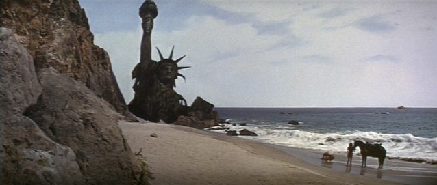
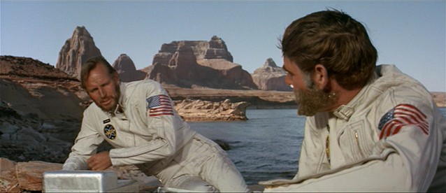
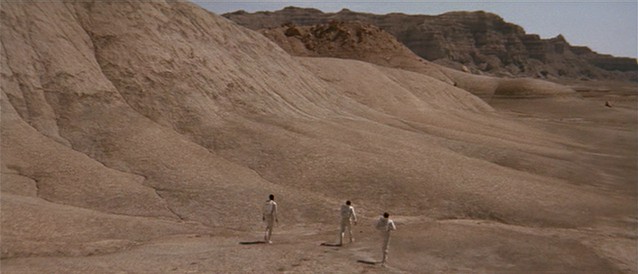
What I loved about Planet of the Apes back then, and what has stayed with me over the years, can be summarized in two images that sent me into an ecstasy of eeriness: the ape makeup created by Ben Nye and implemented by John Chambers; and the famous final shot, in which the hero Taylor (Charlton Heston) stumbles across the ruins of the Statue of Liberty and realizes he’s been on Earth — not an alien world, but his own home — all this time. The frame is below; a grainy YouTube version can be found here.

It’s one of the great twist endings in SF — contributed, fittingly enough, by Rod Serling. But its unfortunate effect was to instantly reduce the movie to a grand cliche, a semiotic Shrinky-Dink, source of endless quotations and parodies in the decades that followed. The sad truth about twist endings is that they follow a logic opposite that of genre (in which the same patterns reappear over and over again without anyone taking offense; we applaud them, in fact, for their iterative familiarity): once given its Big Reveal, a twist shrivels on the vine, spoiled by critics, lampooned for its very memorability. Citizen Kane‘s Rosebud, The Sixth Sense‘s dead psychiatrist, St. Elsewhere‘s world-in-a-snowglobe — each exists, like Taylor’s final, horrible epiphany, as the ultimate self-annihilating closure, shutting down not just a particular narrative instance, but the possibility of its own resurrection in anything but smirkily insincere form. Shots like the one that concludes Planet of the Apes are, to me, a perfect example of Lacanian captation: they arrest and hold us in an escape-proof hermetic prison of the imaginary.

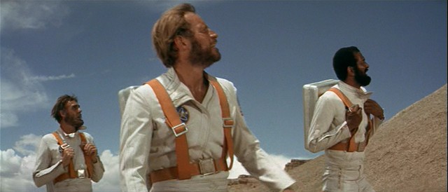
OK, psychoanalytic blather aside, what was so great about watching Planet of the Apes again? I suppose my answer is yet more Lacan, for both the apes and humans are trapped by and within their own misrecognitions. Taylor and his fellow astronauts firmly believe themselves to be on an alien planet, despite evidence to the contrary (the apes speak English); for their part, the apes see the humans as completely Other and cannot countenance any notion that there is an evolutionary link between them. It’s a comedy of evolutionary errors, the Scopes Trial replayed simultaneously as farce and deadpan drama. The truth of the situation is hidden, like the purloined letter, in plain sight; it is not until the end, in a traumatic confrontation with the Real, that Taylor traverses his fantasy. (Maybe that’s why the joke has been replayed so frequently in pop culture, from Spaceballs to The Simpsons; what is repetition but the insistent revisiting of trauma?) Of course, as often occurs in science fiction, the meta-misrecognition that operates here is failing to see in the portrayal of a “future” the actual representation of a “present.” Eric Greene’s Planet of the Apes as American Myth explores this aspect of the film and its sequels, arguing that Apes is a funhouse mirror held up to racial politics in the United States.

Bringing this all back home to the movie and its special effects, I see two kinds of misrecognition at play in the visuals, both of them integral to the suspension of disbelief by astronauts, apes, and audiences alike. First, of course, are the actual human beings (Roddy McDowell, Kim Hunter, Maurice Evans) beneath the prosthetics and hair appliances. The makeup and costumes that turn these actors into sentient, speaking apes do not mask or muffle the performances, but rather estrange and amplify them: we watch and listen for nuances of emotion, an amused glint in the eye, a subtle shift in intonation, precisely because they are cloaked in filmmaking technology. At first glance the masquerade is comical, almost grotesque, but it quickly gives way to some remarkably graceful performances. Our twinned awareness of the trickery and investment in the fantasy reflects the knife-edge calibration of disbelief attending the finest FX work.

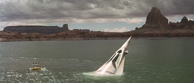
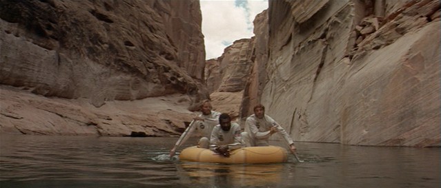
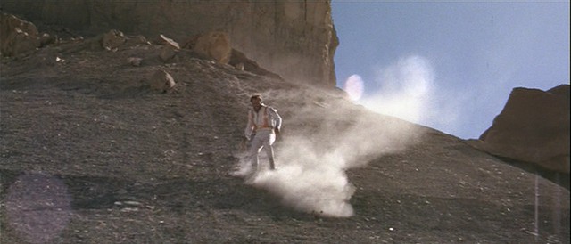
But there’s a second register of misrecognition here, one I would have missed completely if I hadn’t been watching a pristine widescreen transfer of the film. The first act of Planet of the Apes consists of Taylor and his fellow astronauts trekking across the forbidding but beautiful scenery of Arizona and Utah — in particular, the area of the Colorado River known as Lake Powell:

I was dumbstruck by this natural backdrop of mountains, deserts, and water, as gorgeously alien as anything in Nicolas Roeg’s Walkabout (1971). It occurred to me that the genius of this portion of the movie — an opening thirty minutes before the apes even show up — is that it places the spectator in a homologous position to the stranded astronauts. Like them, we stare at a world that is at once ours and another’s; a landscape both earthly and unearthly. Like the ape makeup, the cinematography forces us into sublime attentiveness, consuming every detail of a setting made familiar by our experience with terrestrial features, then unfamiliar through a storyline that presents it as an alien world, then familiar again in the final beachside revelation.

I guess what I’m saying with all this is that Planet of the Apes stands out to me as much for its planet as for its apes; and that in both constructs (and our response to them) we glimpse something of the multitiered, shuttling structure of belief and disavowal that great special effects provoke.

Spider-Fan

I thought I’d share with you a fragment of my history — a frozen formative moment in a fanboy’s evolution. This summer I’ve spent a lot of time in Ann Arbor, Michigan, the town where I grew up and where my parents still live. Given that I now have a house of my own, Mom and Dad have been pleading with me to get my stuff out of their basement. This led to some pleasurable archeology, digging through old sketchbooks (from when I wanted to be a comic-book artist), science-fiction screenplays (from when I wanted to become a Super-8 filmmaker), and broken model kits (I must have glued together the U.S.S. Enterprise a dozen times). And some painful triage, as I decided what had to come back with me to Pennsylvania (the long white coffins holding my plastic-bagged collection of Fantastic Four, Love and Rockets, and Cerebus) and what could be disposed of (just about everything else).

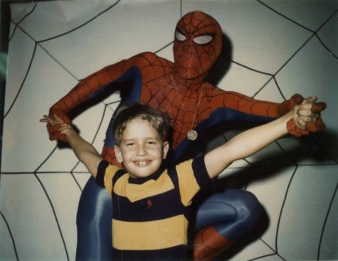
This Polaroid documents a trip my father and I took to a shopping mall called Arborland, where I had the honor of meeting the Spectacular Spider-Man and getting my picture taken with him. I remember little of our encounter, though the webslinger struck me as a nice enough guy, and I certainly appreciated his taking time out of crimefighting (or alternatively his job at the Daily Bugle) to visit his fans. From the visual evidence, I was probably a bit tense — note the contrast between my clenched right fist and the flamboyant fingers of my left hand. It was 1975 or 1976; I would have been nine or ten years old.

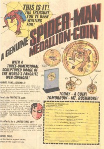
What jumps out at me now is the object hanging from a chain around Spider-Man’s neck. This, of course, was the economic agenda of the superhero’s tour: selling special coins to fans. I don’t have my own medallion any more; at least, it hasn’t yet turned up in the excavation of my parents’ basement. But I do have the photo (I assume this too cost something — Have your picture taken with Spider-Man!) and, thanks to the obsessive-compulsive accumulator of memory that is the internet, I have a scan of the print ad pushing this particular collector’s item. I found it on this website but am reproducing the image below (click to enlarge).

I don’t mean, by pointing out this financial base to the superstructure of my preteen jouissance, to be cynical or to undermine the coolness of having met Spidey more than thirty years ago. On the contrary: I love that so many forces came together that day to produce the experience, including not just Marvel’s sharklike pursuit of side profits but my sincere love for this particular superhero (so saddled with his own adolescent angst) and my dad’s willingness to cart me off for an audience with him. And as I get used — reluctantly — to my own adulthood, which can sometimes seem to be setting up like cold cement around my unchanged 10-year-old heart, images like this offer a brief window of escape: a memory to glimpse, cherish, then put away with a sense of gratitude.

Digital Day for Night

A quick followup to my recent post on the new Indiana Jones movie: I’ve seen it, and find myself agreeing with those who call it an enjoyable if silly film. Actually, it was the best couple of hours I’ve spent in a movie theater on a Saturday afternoon in quite a while, and seemed especially well suited to that particular timeframe: an old-fashioned matinee experience, a slightly cheaper ticket to enjoy something less than classic Hollywood art. Pulp at a bargain price.

But my interest in the disproportionately angry fan response to the movie continues. And to judge by articles popping up online, Indiana Jones and the Kingdom of the Crystal Skull is providing us, alongside its various pleasures (or lack thereof), a platform for thinking about that (ironically) age-old question, “How are movies changing?” — also known as “Where has the magic gone?” Here, for example, are three articles, one from Reuters, one from The Atlantic.com, and one from an MTV blog, each addressing the film’s heavy use of CGI.

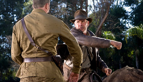
I can see what they’re talking about, and I suppose if I were less casual in my fandom of the first three Indy movies, I’d be similarly livid. (I still can’t abide what’s been done to Star Wars.) At the same time, I suspect our cultural allergy to digital visual effects is a fleeting phenomenon — our collective eyes adjusting themselves to a new form of light. Some of the sequences in Crystal Skull, particularly those in the last half of the film, simply wouldn’t be possible without digital visual FX. CG’s ability to create large populations of swarming entities onscreen (as in the ant attack) or to stitch together complex virtual environments with real performers (as in the Peru jungle chase) were clearly factors in the very conception of the movie, with the many iterations of the troubled screenplay passing spectacular “beats” back and forth like hot potatoes on the assumption that, should all else fail, at least the movie would feature some killer action.

Call it digital day for night, the latest version of the practice by which scenes shot in daylight “pass” for nighttime cinematography. It’s a workaround, a cheat, like all visual effects, in some sense nothing more than an upgraded cousin of the rear-projected backgrounds showing characters at seaside when they’re really sitting on a blanket on a soundstage. It’s the hallmark of an emerging mode of production, one that’s swiftly becoming the new standard. And our resistance to it is precisely the moment of enshrining a passing mode of production, one that used to seem “natural” (for all its own undeniable artificiality). By such means are movies made, but it’s also the way that the past itself is manufactured, memory and nostagia forged through an ongoing dialectic of transparency and opacity that haunts our recreational technologies.

We’ll get used to the new way of doing things. And someday, movies that really do eschew CG in favor of older FX methodologies, as Spielberg and co. initially promised to do, will seem as odd in their way as performances of classical music that insist on using authentic instruments from the time. For the moment, we’re suspended between one mode of production and another, truly at home in neither, able only to look unhappily from one bank to another as the waterfall of progress carries us ever onward.

Indiana Jones and the Unattainable FX Past

This isn’t a review, as I haven’t yet made it to the theater to see Indiana Jones and the Kingdom of the Crystal Skull (portal to the transmedia world of Dr. Jones here; typically focused and informative Wiki entry here). What I have been doing — breaking my normal rule about keeping spoiler-free — is poring over fan commentaries on the new movie, swimming within the cometary aura of its street-level paratexts, working my way into the core theatrical experience from the outside in. This wasn’t anything intentional, more the crumbling of an internet wall that sprang one informational leak after another, until finally the wave of words washed over me like, well, one of the death traps in an Indiana Jones movie.

Usually I’m loath to take this approach, finding the twists and turns of, say, Battlestar Galactica and Lost far more compelling when they clobber me unexpectedly (and let me add, both shows have been rocking out hard with their last couple of episodes). But it seemed like the right approach here. Over the years, the whole concept of Indiana Jones has become a diffuse map, gas rather than solid, ocean rather than island. Indy 4 is a media object whose very essence — its cultural significance as well as its literal signification, the decoding of its concatenated signage — depends on impacted, recursive, almost inbred layers of cinematic history.

On one level, the codes and conventions of pulp adventure genres, 1930s serials and their ilk, have been structured into the series film by film, much like the rampant borrowings of the Star Wars texts (also masterminded by George Lucas, whose magpie appropriations of predecessor art are cannily and shamelessly redressed, in his techno-auteur house style, as timelessly mythic resonance). But by now, 27 years after the release of Raiders of the Lost Ark, the Indy series must contend with a second level of history: its own. The logic of pop-culture migration has given way to the logic of the sequel chain, the franchise network, the transmedia system; we assess each new installment by comparing it not to “outside” films and novels but to other extensions of the Indiana Jones trademark. Indy 4, in other words, cannot be read intertextually; it must be read intratextually, within the established terms of its brand. And here the franchise’s history becomes indistinguishable from our own, since it is only through the activity of audiences — our collective memory, our layered conversations, the ongoing do-si-do of celebration, critique, and comparison — that the Indy texts sustain any sense of meaning above and beyond their cold commodity form.

All of this is to say that there’s no way Indiana Jones and the Kingdom of the Crystal Skull could really succeed, facing as it does the impossible task of simultaneously returning to and building upon a shared and cherished moment in film history. While professional critics have received the new film with varying degrees of delight and disappointment, the talkbacks at Aint-It-Cool News (still my go-to site for rude and raucous fan discourse) are far more scornful, even outraged, in their assessment. Their chorused rejection of Indy 4 hits the predictable points: weak plotting, flimsy attempts at comic relief, and in the movie’s blunt infusion of science-fiction iconography, a generic splicing so misjudged / misplayed that the film seems to be at war with its own identity, a body rejecting a transplanted organ.

But running throughout the talkback is another, more symptomatic complaint, centering on the new film’s overuse of CG visual effects. The first three movies — Raiders, Temple of Doom, and Last Crusade — covered a span from 1981 to 1989, an era which can now be retroactively characterized as the last hurrah of pre-digital effects work. All three feature lots of practical effects — stuntwork, pyrotechnics, and the on-set “wrangling” of everything from cobras to cockroaches. But more subtly, all make use of postproduction optical effects based on non-digital methods: matte paintings, bluescreen compositing, a touch of cel animation here, a cloud tank there. Both practical and optical effects have since been augmented if not colonized outright by CG, a shift apparently unmissable in Indy 4. And that has longtime fans in an uproar, their antidigital invective targeted variously on Lucas’s influence, the loss of verisimilitude, and the growing family resemblance of one medium (film) to another (videogames):

The Alien shit didnt bother me at all, it was just soulless and empty as someone earlier said.. And the CGI made it not feel like an Indy flick in some parts.. I walked out of the theater thinking the old PC game Fate of Atlantis gave me more Indiana joy than this piece of big budget shit.

My biggest gripe? Too much FUCKING CGI. The action lacked tension in crucial places. And there were too many parts (more than from the past films) where Looney Tunes physics kept coming into play. By the end, when the characters endure 3 certain deaths, you begin to think “Okay, the filmmakers are just fucking around, lean back in your seat and take in the silliness.” No thanks. That’s not what makes Indiana Jones movies fun.

This film was AVP, The Mummy Returns and Pirates of the Fucking Carribean put together, a CGI shitfest. A long time ago in a galaxy far far away, Lucas said “A special effect is a tool, a means to telling astory, a special effect without a story is a pretty boring thing.” Take your own advice Lucas, you suck!!!

The entire movie is shot on a stage. What happened to the locations of the past? The entire movie is CG. What a disappointment. I really, REALLY wanted to enjoy it.

Interestingly, this tension seems to have been anticipated by the filmmakers, who loudly claimed that the new film would feature traditional stuntwork, with CGI used only for subtleties such as wire removal. But the slope toward new technologies of image production proves to be slippery: according to Wikipedia, CG matte paintings dominate the film, and while Steven Spielberg allegedly wanted the digital paintings to include visible brushstrokes — as a kind of retro shout-out to the FX artists of the past — the result was neither nostalgically justifiable or convincingly indexical.

Of course, I’m basing all this on a flimsy foundation: Wiki entries, the grousing of a vocal subcommunity of fans, and a movie I haven’t even watched yet. I’m sure I will get out to see Indy 4 soon, but this expedition into the jungle of paratexts has definitely diluted my enthusiasm somewhat. I’ll encounter the new movie all too conscious of how “new” and “old” — those basic, seemingly obvious temporal coordinates — exceed our ability to construct and control them, no matter how hard the filmmakers may try, no matter how hard we audiences may hope.

Man in the Suit

creature.jpg

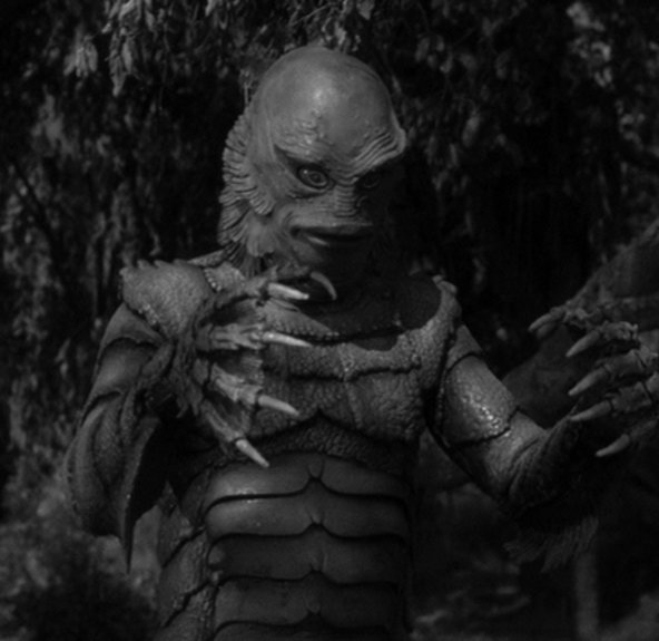
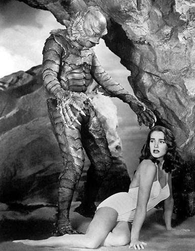
Sad news: Ben Chapman, who played the Creature from the Black Lagoon in the 1954 film of the same name, is dead.

Chapman’s death, while no less tragic, hits me a little differently than the passing of William Tuttle, whom I wrote about last August. While Tuttle contributed to hundreds of films, Chapman played just one role in one movie — and that uncredited at the time. While Tuttle worked behind the scenes, Chapman performed in front of the camera. And while Tuttle designed and applied makeup and prosthetics that others wore, Chapman was literally the man in the suit: a full-body sheath made of foam rubber, a headpiece fringed with pulsating gills, and two webbed gloves tipped with fearsome claws.

In this sense, we might think of Chapman as occupying a nodal point in the circuit of special effects manufacture precisely opposite that of the costume’s “creator.” Somebody else designed the thing; all Chapman did was inhabit it. Indeed, Chapman’s contribution subdivides and apparently dissipates the more closely we examine it, scattering into a shadowy network of elided labor and thwarted fame. He was not, for example, the only person to play the Creature. Ricou Browning wore the suit for underwater sequences, while Chapman did the bits on land. (Browning returned for the water scenes in sequels Revenge of the Creature [1955] and The Creature Walks Among Us [1956]; in these films the Creature-on-land was played by Tom Hennesy and Don Megowan respectively.) Even the suit’s original designer is in question, credited for many years to veteran makeup artist Bud Westmore, but recently recuperated as the work of Milicent Patrick.

Yet amid the thicket of Hollywood’s ramified pasts, Chapman and the suit he wore are fused in my memory as well as the collective memory of horror and science fiction fans. To some extent this is due to the first Creature‘s place at the overlap of several important genre histories. It was a cornerstone of the grand 1950s wave of cinematic SF that includes The Thing from Another World (1951), The Day the Earth Stood Still (1951), War of the Worlds (1953), Them (1954), Invasion of the Body Snatchers (1956), Earth Versus the Flying Saucers (1956), The Blob (1958), and — a personal favorite and source of this blog’s signature image — Forbidden Planet (1956). Moreover, Creature was directed by Jack Arnold, who also helmed the classics It Came From Outer Space (1953), This Island Earth (1955), and The Incredible Shrinking Man (1957).

Not all of these films are of equal caliber, certainly. They run the gamut from cerebral “message” films to drive-in shockers, a continuum on which Creature probably registers toward the window-mounted-speakers end. Befitting its status as an early Jaws, Creature was released in 3D. As a kid, I was lucky enough to see one of these ghosty red-and-green prints at a screening on the University of Michigan campus; the headache induced by those plastic glasses is inseparable from the excitement of seeing claws jutting out of a petrified wall in one of the film’s opening images.

claw.jpg

But the fascination of Creature (the movie) and Creature (the monster) outlasted their tricked-up 3D and their genre boomlet, surviving as only an icon can throughout many replayings on TV, VCR, and DVD. Ben Chapman built a career out of his few minutes on screen, appearing at conventions, giving interviews, and running a website whose very title — www.the-reelgillman.com — insists on the singular authenticity of his performance. Like the suit he wore, a neglected piece of film flotsam rediscovered by a janitor and ultimately purchased by Forrest J. Ackerman of Famous Monsters, Chapman physically anchored a diffuse cloud of memories and fantasies, concretizing a point in time and space where Creature from the Black Lagoon “really happened.”

Not just an icon, then, but an index: evidentiary proof of a world existing simultaneously before the camera and within our imaginations, and hence a junction point between virtual and real, dream and daylight, forgotten and retrieved, submarine and dry land.

julieadams4.jpg

Retrographics and Multiplayer avant la lettre

super-mario-galaxy-21.jpg

Let me start with a disclosure: although I own both a Nintendo Wii and an XBox 360, I almost exclusively play the latter — and rarely play the former. I’ve agonized over this. Why does my peak Wii moment remain the mercenary achievement of tracking one down last summer? Why haven’t the Wii-mote and its associated embodied play style inspired me to spend a fraction as many hours in front of the television as I’ve spent working through Katamari Beautiful, Valve’s Orange Box, Halo 3, and Need for Speed Carbon on the Xbox? The answer, it seems to me, comes down to graphics: Microsoft’s console simply pushes more pixels and throws more colors on my new HD TV, and I vanish into those neon geometries without looking back. I feel guilty about this, vaguely philistine, the same way I felt when I switched from Macintosh to PC. But there it is. Like Roy Neary (Richard Dreyfuss) in Close Encounters of the Third Kind, I go where the pretty lights lead me.

But that doesn’t make the phenomenon of the Wii any less fascinating, and the recent New York Times article on the top-selling console games of 2007 is compelling in its assertion that gamers are turning away from the kind of high-end techno-sublime represented by the Xbox 360 and the Playstation 3 and toward the simpler graphics and more accessible play style of the Wii. It makes sense that a dialectic would emerge in videogames between the superadvanced aesthetic and its primitive-by-comparison cousin; the binary of shiny-new and gnarly-old has structured everything from Quake‘s blend of futuristic cyborgs and medieval demons to Robert Zemeckis’s digital adaptation of the ancient Beowulf.  Anyone who’s discovered the joy of bringing old 8-bit games to life with emulators like MAME knows that the pleasure of play involves an oscillation between where we’ve been and where we’re going; between what passes for new now and what used to do so; between the sensory thrill of the state-of-the-art and the nostalgia of our first innocent encounters with the videogame medium in all its subjectivity-transforming power.

A less elaborate way of saying which is: the Wii represents through its pared-down graphics the return of a historical repressed, the enshrining of a certain simplicity that remains active at the medium’s heart, but until now has not been packaged and sold back to us with quite such panache.

The other interesting claim in the article is that the top games (World of Warcraft, Guitar Hero) are not solitary, solipsistic shooters like Bioshock and Halo, but rich social experiences — you play them with other people around, whether online or ranged around you in the dorm room. Seth Schiesel writes,

Ever since video games decamped from arcades and set up shop in the nation’s living rooms in the 1980s, they have been thought of as a pastime enjoyed mostly alone. The image of the antisocial, sunlight-deprived game geek is enshrined in the popular consciousness as deeply as any stereotype of recent decades.

The thing is, I can’t think of a time when the games I played as a child and teenager in the 1970s and 1980s weren’t social. I always consumed them with a sense of community, whether because my best friend Dan was with me, watching me play (or I watching him) and offering commentary, or because I talked about games endlessly with kids at school. Call it multiplayer avant la lettre; long before LANs and the internet made it possible to blast each other in mazes or admire each other’s avatarial stand-ins, we played our games together, making sense of them as a community — granted, a maligned subculture by the mainstream measure of high school, but a community nonetheless. As graphics get better and technologies more advanced, I hope that gamers don’t rewrite their pasts, forgetting the friendships forged in an around algorithmic culture.

Beep … Beep … Beep …

sputnik-image-1.gif

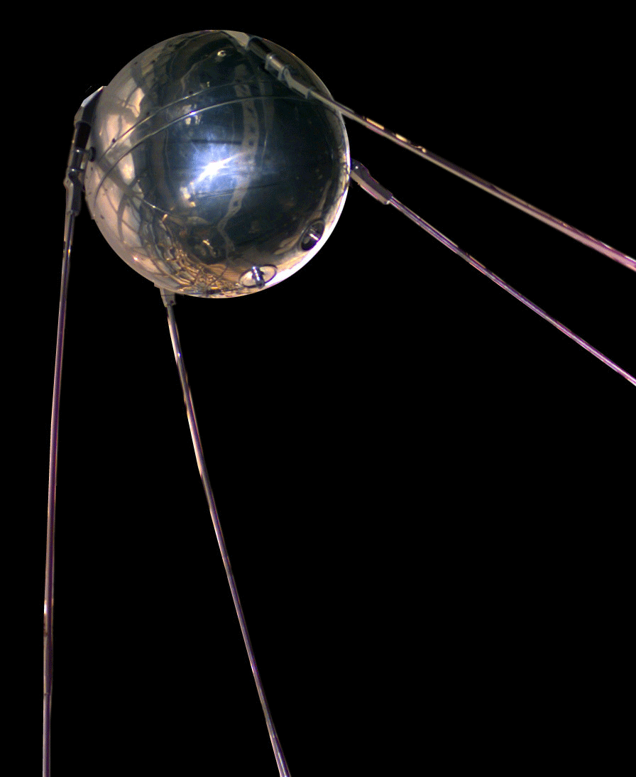
The Soviet satellite Sputnik, launched fifty years ago today, is stitched into my family history in an odd way. A faded Polaroid photograph from that year, 1957, shows my older siblings gathered in the living room in my family’s old house. The brothers and sisters I would come to know as noisily lumbering teenage creatures who alternately vied for my attention and pounded me into the ground are, in the image, blond toddlers messing around with toys. There also happens to be a newspaper in the frame. On its front page is the announcement of Sputnik’s launch.

Whatever the oblique and contingent quality of this captured moment — one time-stopping medium (newsprint) preserved within another (the photograph) — I’ve always been struck by how it layers together so many kinds of lost realities, realities whose nature and content I dwell upon even though, or because, I never knew them personally. Sputnik’s rhythmically beeping trajectory through orbital space echoes another, more idiomatic “outer space,” the house where my family lived in Ann Arbor before I was born (in the early 1960s, my parents moved across town to a new location, the one that I would eventually come to know as home). These spaces are not simply lost to me, but denied to me, because they existed before I was born.

Which is OK. Several billion years fall into that category, and I don’t resent them for predating me, any more than I pity the billions to come that will never have the pleasure of hosting my existence. (I will admit that the only time I’ve really felt the oceanic impact of my own inevitable death was when I realized how many movies [namely all of them] I won’t get to see after I die.) If I’m envious of anything about that family in the picture from fall 1957, it’s that they got to be part of all the conversations and headlines and newspaper commentaries and jokes and TV references and whatnot — the ceaseless susurration of humanity’s collective processing — that accompanied the little beeping Russian ball as it sliced across the sky.

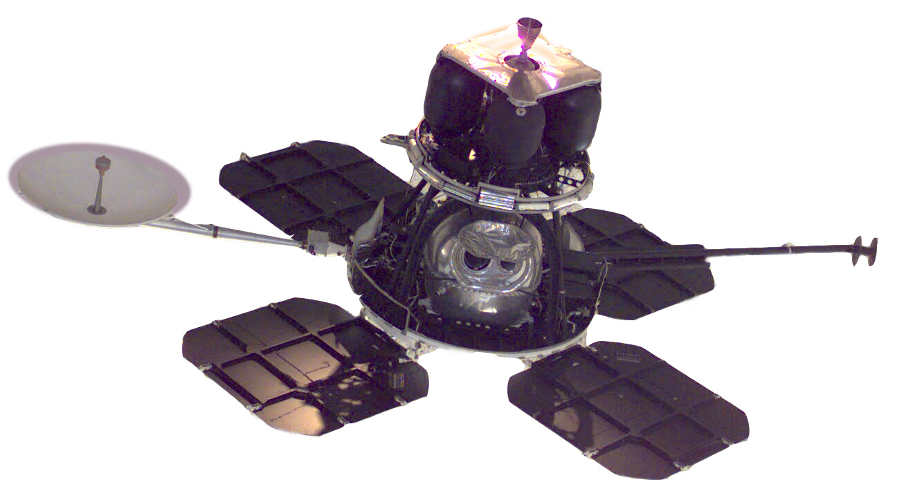
As a fan of the U.S. space program, I didn’t think I really cared that much about Sputnik until I caught a story from NPR on today’s Morning Edition, which profiled the satellite’s designer, Sergei Korolev. One of Korolev’s contemporaries, Boris Chertok, relates how Sputnik’s shape “was meant to capture people’s imagination by symbolizing a celestial body.” It was the first time, to be honest, I’d thought about satellites being designed as opposed to engineered — shaped by forces of fashion and signification rather than the exigences of physics, chemistry, and ballistics. One of the reasons I’ve always liked probes and satellites such as the Surveyor moon probe, the Viking martian explorer, the classic Voyager, and my personal favorite, the Lunar Orbiter 1 (pictured here), is that their look seemed entirely dictated by function.

lunar_orbiter.jpg

Free of extras like tailfins and raccoon tails, flashing lights and corporate logos, our loyal emissaries to remoteness like the Mariner or Galileo satellites possessed their own oblivious style, made up of solar panels and jutting antennae, battery packs and circuit boxes, the mouths of reaction-control thrusters and the rotating faces of telemetry dishes. Even the vehicles built for human occupancy — Mercury, Gemini, and Apollo capsules — I found beautiful, or in the case of Skylab or the Apollo missions’ Lunar Module, beautifully ugly, with their crinkled reflective gold foil, insectoid angles, and crustacean asymmetries. My reverence for these spacefaring robots wasn’t limited to NASA’s work, either: when the Apollo-Soyuz docking took place in 1975 ( I was nine years old then, equidistant from the Sputnik launch that bracketed my 1966 birthday), it was like two creatures from the deep sea getting it on — literally bumping uglies.

apollo-soyuz.jpg

So the notion that Sputnik’s shape was supposed to suggest something, “symbolizing a celestial body,” took me at first by surprise. But I quickly came to embrace the idea. After all, the many fictional space- and starships that have obsessed me from childhood — the Valley Forge in Silent Running, the rebel X-Wings and Millennium Falcon from Star Wars, the mothership from Close Encounters of the Third Kind, the Eagles from Space 1999, and of course the U.S.S. Enterprise from Star Trek — are, to a one, the product of artistic over technical sensibilities, no matter how the modelmakers might have kit-bashed them into verisimilitude. And if Sputnik’s silver globe and backswept antennae carried something of the 50s zeitgeist about it, it’s but a miniscule reflection of the satellite’s much larger, indeed global, signification: the galvanizing first move in a game of orbital chess, the pistol shot that started the space race, the announcement — through the unbearably lovely, essentially passive gesture of free fall, a metal ball dropping endlessly toward an earth that swept itself smoothly out of the way — that the skies were now open for warfare, or business, or play, as humankind chooses.

Happy birthday, Sputnik!

The One True Enterprise

Thanks to an incredibly generous gift certificate from some friends, my wife and I spent last weekend at a ritzy hotel in Washington, DC – where the 100-degree temperatures made us quite happy to stay inside, work out in the fitness center, order room service, and watch TV.

But the one time we had to venture outside was to visit the National Air and Space Museum, my favorite spot in Washington and, perhaps, the greatest place in the known universe. Ever since I first visited DC, at nine or ten years old, I have loved the NASM: the satellites suspended from the ceiling, the Imax theater, the giant Robert McCall mural, the silver packets of freeze-dried ice cream, and of course the full-size Skylab sitting on its end like a small cylindrical skyscraper, a constant line of people threading through its begadgeted, submarinelike innards.

I’ve been to the museum several times, so it was a shock to come face-to-face with one of its most famous artifacts, and realize that – somehow – I’d forgotten it was there. It used to hang gloriously over the entrance to some special exhibit (Spaceflight in Science Fiction, maybe?), which has now been replaced by a room devoted to the role of computers in aeronautical design and engineering. As for the marvelous object, it has moved to the lower floor of the gift shop, where it sits toward the back in its own plexiglass box, big enough to hold a Hummer…

Enterprise at NASM - side view

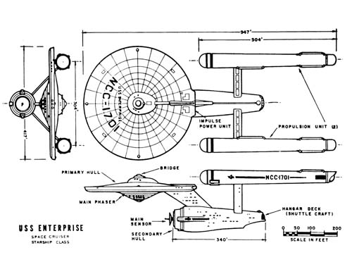
This is the original miniature of the U.S.S. Enterprise, used for optical effects shots in the first series of Star Trek (1966-1969). It’s been part of the Smithsonian collection since 1974, and has undergone several modifications in that time, including a new “mosaic” paint job to simulate square hull plating. (This concept, introduced with the starship’s redesign for Star Trek: The Motion Picture [Robert Wise, 1979], has since become standard for Trek’s vessels, reflected in the numerous sequels and series that constitute the franchise.)

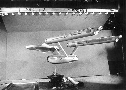
After gazing reverently at the Enterprise for a while, I dragged my wife over to see it. I explained to her – feeling somewhat like a goofball – that this was not just a replica or facsimile, but the actual shooting model that went before the cameras of the Howard Anderson effects company, to which Desilu Studios farmed out its optical work. (Actually, the miniature made the rounds of several FX houses, including Film Effects of Hollywood, the Westheimer Company, and Van Der Veer Photo Effects – Trek demanding a particularly high number of expensive and time-consuming optical effects.) Eleven feet long and weighing 200 pounds, the miniature is made of poplar wood, vacuformed plastic, and sheet metal. It was one of three Enterprises used in shooting (the others included a small balsa-wood version that appeared in the “swish” flybys of the title sequence, and a three-foot version used to show the ship in the far distance). It was designed by Walter “Matt” Jefferies in consultation with series creator Gene Roddenberry, and build by Richard C. Datin, Jr.

Enterprise lofted

Enterprise in studio

The miniature undeniably has a sad aspect to it now. Consigned to what is essentially the museum basement, it sits by a shelf of books about Star Trek and Star Wars like an aging carny hawking its wares. Once lit from within by a complex electrical system of lights and relays, it is now shadowed and gloomy, its sepulchral air made more poignant by the racks of day-glow flags, posters, and coffee mugs that surround it. (In this, the back corner of the gift shop, the air-and-space motif gives way to a randomly-themed grab bag of DC memorabilia: Washington Monument t-shirts, Abraham Lincoln yo-yos.)

Yet despite or perhaps because of the diorama of motley neglect in which I encountered it, the Enterprise miniature possesses an historical solidity, a gravity classifying it as the best kind of museum exhibit: one that belongs simultaneously to past and present, functioning as a material bridge between one moment in time and another. For as I circled the plexiglass case, snapping pictures with my digital camera, I realized that the real magic was not in seeing the Enterprise with my own eyes. It was, instead, in the act of capturing its image — of being physically present at one node of a visual apparatus, framing the model in my viewfinder and recording the light rays reflecting off its surface. In doing so, I fleetingly occupied the position of the original camera operators at Howard Anderson and Van Der Veer in Hollywood in the late 1960s, whose daily job it was to line up and shoot this structure of wood and plastic.

Enterprise at NASM

Enterprise TV capture


Enterprise at NASM


Enterprise TV capture

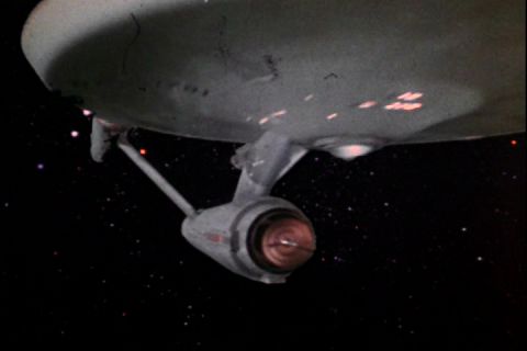
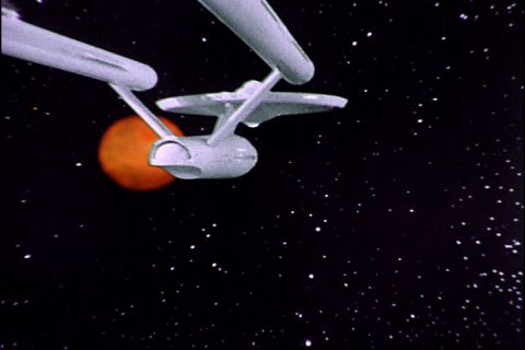
This, I suggest, is the real experience of the Enterprise. As a viewer growing up, watching the show on TV, I saw the starship only in its final composited form – as an “actual” vessel in space – experiencing a play-along immediacy that is the basic perceptual displacement necessary to the operation of television, movies, and videogames (we can only believe what we are seeing if we disbelieve in the fact of its having-been-made). Photographing the model at the National Air and Space Museum on Saturday, I experienced a flash of disbelief’s opposite, what I can only call mediacy, bringing layers of technology and labor – of historical material practice – back into the picture. It was like going to work and going to church at the same time, like punching a timeclock that is also a reliquary holding the bones of a saint. It was great; I’ll never forget it.

Bob at the NASM