Making Mine Marvel


marvuntold

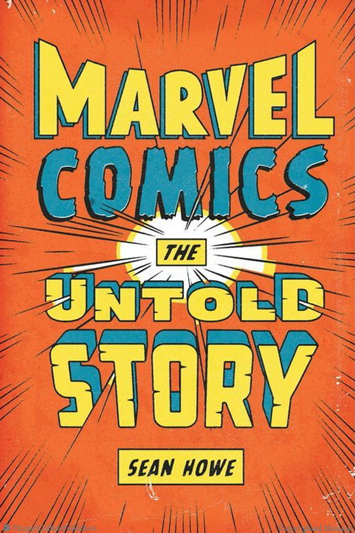
Reading Sean Howe’s Marvel Comics: The Untold Story (New York: Harper Perennial, 2013) I am learning all sorts of things. Or rather, some things I am learning and some things I am relearning, as Marvel’s publications are woven into my life as intimately as are Star Trek and Star Wars: other franchises of the fantastic whose fecundity — the sheer volume of media they’ve spawned over the years — mean that at any given stage of my development they have been present in some form. Our biographies overlap; even when I wasn’t actively reading or watching them, they served at least as a backdrop. I would rather forget that The Phantom Menace or Enterprise happened, but I know precisely where I was in my life when they did.

Star Wars, of course, dates back to 1977, which means my first eleven years were unmarked by George Lucas’s galvanic territorialization of the pop-culture imaginary. Trek, on the other hand, went on the air in 1966, the same year I was born. Save for a three-month gap between my birthday in June and the series premiere in September, Kirk, Spock and the universe(s) they inhabit have been as fundamental and eternal as my own parents. Marvel predates both of them, coming into existence in 1961 as the descendent of Timely and Atlas. This makes it about as old as James Bond (at least in his movie incarnation) and slightly older than Doctor Who, arriving via TARDIS, er, TV in 1963.

My chronological preamble is in part an attempt to explain why so much of Howe’s book feels familiar even as it keeps surprising me by crystallizing things about Marvel I kind of already knew, because Marvel itself — avatarizalized in editor/writer Stan Lee — was such an omnipresent engine of discourse, a flow of interested language not just through dialogue bubbles and panel captions but the nondiegetic artists’ credits and editorial inserts (“See Tales of Suspense #53! — Ed.”) as well as paratextual spaces like the Bullpen Bulletins and Stan’s Soapbox. Marvel in the 1960s, its first decade of stardom, was very, very good not just at putting out comic books but at inventing itself as a place and even a kind of person — a corporate character — spending time with whom was always the unspoken emotional framework supporting my issue-by-issue excursions into the subworlds of Spider-Man, the Fantastic Four, and Dr. Strange.

Credit Howe, then, with taking all of Marvel’s familiar faces, fictional and otherwise, and casting each in its own subtly new light: Stan Lee as a liberal, workaholic jack-in-the-box in his 40s rather than the wrinkled avuncular cameo-fixture of recent Marvel movies; Jack Kirby as a father of four, turning out pages at breakneck speed at home in his basement studio with a black-and-white TV for company; Steve Ditko as — and this genuinely took me by surprise — a follower of Ayn Rand who increasingly infused his signature title, The Amazing Spider-Man, with Objectivist philosophy.

It’s also interesting to see Marvel’s transmedial tendencies already present in embryo as Lee, Kirby, and Ditko shared their superhero assets across books: Howe writes, “Everything was absorbed into the snowballing Marvel Universe, which expanded to become the most intricate fictional narrative in the history of the world: thousands upon thousands of interlocking characters and episodes. For generations of readers, Marvel was the great mythology of the modern world.” (Loc 125 — reading it on my Kindle app). Of course, as with any mythology of sufficient popular mass, it becomes impossible to read history as anything but a teleologically overdetermined origin story, so perhaps Howe overstates the case. Still, it’s hard to resist the lure of reading marketing decisions as prescient acts of worldbuilding: “It was canny cross-promotion, sure, but more important, it had narrative effects that would become a Marvel Comics touchstone: the idea that these characters shared a world, that the actions of each had repercussions on the others, and that each comic was merely a thread of one Marvel-wide mega-story.” (Loc 769)

I like too the way Untold Story paints comic-book fandom in the 1960s as a movement of adults, or at least teenagers and college students, rather than the children so often caricatured as typical comic readers; Howe notes July 27, 1964 as the date of “the first comic convention” at which “a group of fans rented out a meeting hall near Union Square and invited writers, artists, and collectors (and one dealer) of old comic books to meet.” (Loc 876) The company’s self-created fan club, the Merry Marvel Marching Society or M.M.M.S., was in Howe’s words

an immediate smash; chapters opened at Princeton, Oxford, and Cambridge. … The mania wasn’t confined to the mail, either — teenage fans started calling the office, wanting to have long telephone conversations with Fabulous Flo Steinberg, the pretty young lady who’d answered their mail so kindly and whose lovely picture they’d seen in the comics. Before long, they were showing up in the dimly lit hallways of 625 Madison, wanting to meet Stan and Jack and Steve and Flo and the others. (Loc 920)

A forcefully engaged and exploratory fandom, then, already making its media pilgrimages to the hallowed sites of production, which Lee had so skillfully established in the fannish imaginary as coextensive with, or at least intersecting, the fictional overlay of Manhattan through which Spider-Man swung and the Fantastic Four piloted their Fantasticar. In this way the book’s first several chapters offhandedly map the genesis of contemporary, serialized, franchised worldbuilding and the emergent modern fandoms that were both those worlds’ matrix and their ideal sustaining receivers.

Howe is attentive to these resonances without overstating them: Lee, Kirby and others are allowed to be superheroes (flawed and bickering in true Marvel fashion) while still retaining their earthbound reality. And through his book, so far, I am reexperiencing my own past in heightened, colorful terms, remembering how the media to which I was exposed when young mutated me, gamma-radiation-like, into the man I am now.

The Walking Dead

How does the old joke go? “What a terrible restaurant — the food sucks, and such small portions!” That seems to be the way a lot of people feel about AMC’s The Walking Dead: it’s an endless source of disappointment as well as the best damn zombie show on television.

Not that there’s much competition. Contemporary TV horror is a small playing field, nothing like the heyday of the 1970s, when Night GalleryKolchak, Ghost Story, and telefilms like Don’t Be Afraid of the Dark fed home audiences a plentiful stream of dark and disturbing content, “channeling” a boom in horror cinema that began with demonic-possession blockbuster The Exorcist and morphed late in the decade, via Halloween and Friday the 13th, into the slasher genre. The only real competition for TWD is American Horror Story, a series whose unpleasantness is so expertly-wrought that I couldn’t make it past the third episode. Apart from this and an endless supply of genre-debasing quasi-reality shows on SyFy a la Paranormal Witness, there’s simply not a lot to choose from, and for this reason alone, The Walking Dead is far, far better than it needs to be.

But it’s still a frustrating show: like its zombies, slow-moving and unsure of its goals. (The guys at Penny Arcade, it should be pointed out, hold the opposite interpretation.) Following a phenomenal pilot episode that ended on one of the best cliffhangers I’ve seen since the closing shot of Best of Both Worlds, Part 1, the first season burned through four tense episodes, only to close with an implausible, shoehorned finale set in CDC control center. Season two, at twice the length, has moved at half the speed, and while I enjoyed the thoughtful pace of life at Herschel’s farm, I grew impatient — like many — with plots that seemed to circle compulsively around the same issues week after week, played out in arguments that reduced a formidable cast of characters (and likeable actors) into tiresomely broken records. (The death of Dale [Jeffrey DeMunn] in the antepenultimate episode came as a relief, signaling that the series was fed up with its own moral center.)

Too, there is simply a feeling that more should be happening on a show about the zombie apocalypse; events should play out on a larger scale, balancing the conflicts among characters with action sequences on the level of the firebombing of Atlanta that opens “Chupacabra.” Part of the problem, I suspect, is that the ZA has been visualized so thoroughly in the decades since George A. Romero’s Night of the Living Dead; books like Max Brooks’s Zombie Survival Guide and World War Z, not to mention the many sequels, remakes, and ripoffs of Romero’s 1968 breakthrough, have fleshed out the undead plague on a planetary scale. The blessing of this most fecund of horror genres (second only, perhaps, to vampires) is also its curse: too much has been said, too many bottoms of barrels scraped, too many expectations raised. When the Centers for Disease Control put out preparedness warnings, it’s a safe bet the ante has been upped.

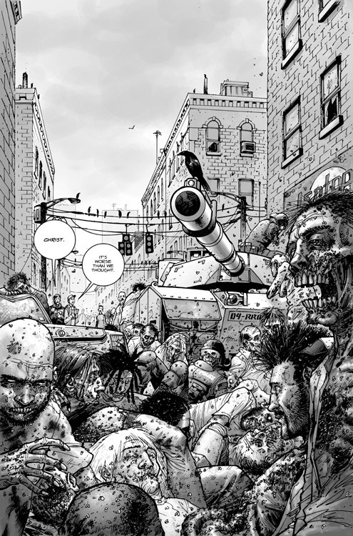
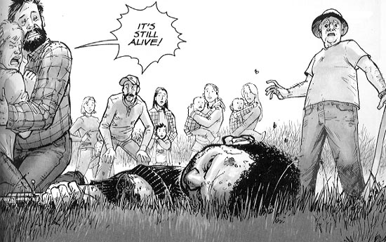
Of course, the most proximate source of raised expectations is the comic book and graphic novel series that originated The Walking Dead; Robert Kirkman, Tony Moore, and Charlie Adlard captured lightning in a bottle with their brisk yet methodical storytelling, whose black-and-white panels powerfully recall Romero’s foundational film, and whose pacing — in monthly bites of thirty pages — lends itself to a measured unfolding that has so far eluded the TV version. I’m less interested in discrepancies between the comic and the show than in the formal (indeed, ontological) problems of adaptation they illustrate: like Zack Snyder’s Watchmen movie, some fundamental, insurmountable obstruction seems to exist between the two forms of visual storytelling that otherwise seem so suited to mutual transcoding.

On a surface level, what works in the comic — the mise-en-scene of an emptied world, a uniquely American literalization of existential crisis through the metaphor of reanimated, cannibalistic corpses — works beautifully on screen. And person by person, the show brings the characters of the page to life (an artful act of reanimation itself, I suppose). But what it hasn’t done, and maybe never can do, is recreate the comic’s particular style of punctuation, doling out panels that closely attend to nuances of expression and shifts in lighting, then interleaving those orderly moments of psychological observation with big, raw shocks of splash pages that bring home the sickening spectacle of existence as eventual prey.

I’ll tune in tonight for the finale, and without question I will be there to devour season three. Furthermore, I’ll defend The Walking Dead — in both its incarnations — as some of the best horror that’s currently out there. But I’ll be watching the show out of a certain duty to the genre, whereas the comic, which I’m saving up to read in blocks of 10 and 12 issues at a go, I’ll savor as such stories are meant to be savored: late at night, alone in the quiet house, by a lamp whose glow might as well be the last light left in a world gone dark.

The Reimagination of Disaster

Adapting Watchmen After 9/11

For a work that gives off such a potent impression of originality and singularity, Watchmen has always been haunted by the concept of the near-parallel, the skewed copy, the version. Start with its setting, an alternate-reality 1985. Cocked at a knowing and sardonic angle to our own, the world of Watchmen is one in which superheroes and costumed crimefighters are real, American won the Vietnam War, and Richard Nixon has just been elected to his fifth term as U.S. President. Consider too the book’s industrial origins in the early 1980s, when DC purchased a set of characters from the defunct Charlton Comics and handed them to a rising star, the British writer Alan Moore, to spin into a new series. When it became clear that the “close-ended scenario” Moore envisioned would preempt the Charlton lineup’s commercial possibilities, Moore and his collaborator, illustrator Dave Gibbons, simply reinvented them: Blue Beetle became Nite Owl, Captain Atom became Dr. Manhattan, The Question became Rorschach, and so on — an act of “reimagining” avant la lettre (1). The result, a 12-issue limited series published in 1986-1987 and collected in a single volume many times thereafter, is one of the undisputed keyworks in any canon of comic-book literature (or, if you prefer, graphic novels), winning a 1988 Hugo Award and named by Time Magazine one of the 100 best English-language novels from 1923 to 2005 (2).

But if Watchmen‘s transit across the hierarchies of culture constitutes yet another level of indeterminacy — a kind of quantum tunneling among the domains of geek, popular, and elite taste — this trajectory seemed to hit its limit at the ontological divide between the printed page and moving-image media. The drive to turn Watchmen into a movie arose early and failed often over the next two decades. Producer Joel Silver and directors Terry Gilliam and Darren Aronofsky were among those who ultimately fell before the challenge of what Moore described as an “unfilmable” text for its dependence on the formal aesthetics of comic-book storytelling (3). By the time Zack Snyder’s adaptation finally made it to the screen in 2009, the mission had grown beyond a mere cinematic “take” on the material into the production of something like a simulacrum, marshalling a host of artistic and technological resources to recreate in exact detail the panels, dialogue, and world-design of the original.

Only one thing was changed: the ending.

Watchmen‘s climax involves a conspiracy by the polymathic industrialist Adrian Veidt — alter-ego of the superhero Ozymandias — to correct the course of a world on the brink of nuclear armageddon. As written by Moore and drawn by Gibbons, Veidt teleports a giant, genetically-engineered squid into the heart of New York City, killing millions, and tricking global superpowers into uniting against a perceived alien invasion. Snyder’s version omits the squid in favor of a different hoax: in the movie, Dr. Manhattan, a superbeing created by atomic accident, is set up as the fall guy for a series of explosions in major world cities. As explained by Snyder and screenwriter Alex Tse in commentaries and interviews, the substitution elegantly solves a number of storytelling tangles, cutting a Gordian knot much like the one faced by Veidt. It simplifies the narrative by eliminating a running subplot; it employs a major character, Dr. Manhattan, whose godlike powers and alienation from humanity provide a logical basis for the blame he receives; perhaps most importantly, it trades an outrageous and even laughable version of apocalypse for something more familiar and believable.

Measured against the relentless fidelity of the rest of the project, the reimagined ending of Watchmen has much to say about the process of adaptation in an era of blockbuster filmmaking and ubiquitous visual effects, as well as the discursive means by which differences between one version and another are negotiated in an insistently expansive culture of seriality and transmedia. But it is also a striking and symptomatic response to an intervening real-world event, the terrorist attacks of 9/11, and our modes of visualizing apocalypse and its aftermath.

From the start, Watchmen‘s reputation for unadaptability stemmed not just from its origin as a graphic novel but from the self-reflexive way it drew on the unique phenomenology and affordances of comic-book storytelling. Its 384 pages interpolate metafictional excerpts from personal memoirs and tabloid interviews, business memos, and product brochures. The wealth of invented and implied information in these prepackaged paratexts extends the effects of Gibbons’s artwork, laid out in precise, nine-panel grids brimming with background details, from the logo of the Gunga Diner restaurant chain to the smokeless cigarettes, electric cars, and dirigible airships that signal an alternative technological infrastructure. Shaped by symmetries large and small, the comic’s plot — a mystery about the murder of costumed heroes — emerges as a jigsaw of such quotidian pieces, assembled by readers free to pause and scan back through the pages, rereading and recontextualizing, in a singularly forensic and nonlinear experience of the text.

Nowadays, the difficulty of appreciating the unprecedented nature of Watchmen is, ironically, proof of its genre-altering influence: grim dystopias and grittily “realistic” reinventions of superheroes quickly became a trend in comics as well as film, making Watchmen a distant parent of everything from Kick-Ass (Mark Millar and John Romita, Jr., 2008-2010) to Heroes (2006-2010) and The Dark Knight (Christopher Nolan, 2008). It may also be hard, in retrospect, to grasp why a detailed fictional world should pose a challenge to filmmakers. For his 1998 “special editions,” George Lucas added layers of CG errata to the backgrounds of his original Star Wars trilogy, and contemporary techniques of match-moving and digital compositing make it possible to jam every frame with fine detail. (Given that this layered ornamentation is best appreciated through freeze-frames and replays — cinematic equivalents of flipping back and forth through the pages — one might trace this aesthetic back to Watchmen as well.) Simply put, the digital transformation of filmmaking, a shift most visible in the realm of special effects but operative at every level and stage of production, has made the mounting of projects like Watchmen relatively straightforward, at least in technical terms.

But the state of the art did not emerge overnight, and Watchmen‘s path to adaptation was a slow and awkward one. Two concerns dominated early efforts to convert Moore’s and Gibbons’s scenario into a workable screenplay: compression of the comic’s scope (with a consequent reduction of its intricacy); and how to handle its setting. The economics of the blockbuster, built on the exigencies of Classical Hollywood, dictate that confusion on the audience’s part must be carefully choreographed — they should be intrigued and mystified, but not to the point where they choose to take their entertainment dollars elsewhere. Turning Watchmen into a successful feature film meant committing, or not, to a premise that probably seemed more formidable at a time when alternate realities (again, “versions”) were a limited subset of science fiction.

Sam Hamm, the first screenwriter to tackle the adaptation, rejected the squid subplot as an implausible lever for world peace, saying, “While I thought the tenor of the metaphor was right, I couldn’t go for the vehicle.” (4) His 1989 script climaxes with Veidt opening a portal in time in order to assassinate Jon Osterman before he can become Dr. Manhattan — undoing the superhuman’s deforming effects on the world. Although Veidt fails, Manhattan grasps the logic of his plan, and opts to erase himself from the timeline. The ensuing paradox unravels the alternate reality and plunges surviving heroes Nite Owl, Rorschach, and the Silk Spectre into “our” unaffected world.

It is tempting to view Hamm’s ending as a blend of science-fiction film motifs dominant at the end of the 1980s, fusing the time-traveling assassin of The Terminator (James Cameron, 1984) with the branching realities of Back to the Future 2 (Robert Zemeckis, 1989). Certainly David Hayter’s 2003 script takes the ending in a different direction: here Veidt bombards New York City with concentrated solar radiation, killing one million, in order to establish himself as a kind of benevolent dictator. Again, Veidt dies, but — in a denouement closer to the original’s — the hoax is allowed to stand, since to reveal the truth would return the world to the brink of war.

The version that Snyder finally filmed, based on a script co-authored with Alex Tse, makes just one final adjustment to the ending, one that could be seen as a synthesis of the versions that had come before: instead of solar radiation, it is Dr. Manhattan’s energy signature that destroys cities around the world, and Dr. Manhattan who takes the blame, exiling himself to explore other forms of reality.

It may be overestimating the depth of Hollywood’s imagination to suggest that its pairing of Zack Snyder and Watchmen was an inspired rather than merely functional decision — that Warner Brothers saw Snyder not just as a director with the right specializations to make their film, but as a kind of auteur of adaptation. Certainly Snyder had proved himself comfortable with vivid, subculturally cherished texts, as well as effects-intensive film production, with his first two movies, Dawn of the Dead (2004) and 300(2006). The latter film in particular, shot on a digital backlot of greenscreens with minimal sets, must have seemed an ideal resume for Watchmen, demonstrating Snyder’s ability to bring static artwork — in this case, Frank Miller’s and Lynn Varley’s — to strange, half-animated life on screen while maintaining his own distinct layer of stylization. (Snyder’s predilection for speed ramping, in which action shifts temporal gears midshot, may be his most obvious and mockable tic, but it is a clever way to substitute a cinematic signifier for comic art’s speed-line symbolalia.)

Rejecting prior half-measures at sanding off the story’s rough edges, Snyder embraced Moore’s and Gibbons’s work almost literally as a bible, letting the collected Watchmen guide production design “like an illuminated text, like it was written 2000 years ago.” (5) The prominence of this sentiment and others like it in the host of materials accompanying Watchmen‘s marketing can be seen as a discursive strategy as much as anything else, a move to reassure prospective audiences — a group clearly identified early on as a small but important base worthy of wooing, in much the manner that New Line Cinemas cultivated and calibrated its relationships with fans during the making of The Lord of the Rings. (6) Enacted at the layer of the manufactured paratextual penumbra that, as Jonathan Gray reminds us, is now de rigeur for blockbuster film events, public performances of allegiance to a single, accepted reference constitute a crucial discursive technology of adaptation, working in concert with the production technologies involved in translating fan-cherished works (7)

One such production technology doubling as discursive tool was the participation of Dave Gibbons. In DVD and Blu-Ray extras, Gibbons tours the set, posing with Snyder, all smiles, confirming the authenticity and integrity of the production. “I’m overwhelmed by the depth and detail of what I’m seeing,” he wrote of his visit. “I’m overwhelmed by the commitment, the passion, the palpable desire to do this right.” (8) Working with Moore in the 80s, Gibbons’s part in the origination of Watchmen was profound, extending far beyond the simple illustration of a script; the two brainstormed together extensively, and the story’s more reflexive and medium-aware qualities demanded near-microscopic coordination of story and image. Further, Moore’s choice to remove himself from the chain of mandatory citation that constitutes authorship as legal status, relinquishing any claim on the filmic realization of Watchmen, leaves only Gibbons to take credit for the work.

But it is hard to escape a suspicion that promotional discourses around the film lay a surreptitious finger on the scale, biasing the source’s creative center of gravity toward Gibbons, whose contributions are, after all, those most “available” to film production: the design of sets, costumes, props; character physiques and hair styles; background environments and architecture; even the framing of key shots and events. Graphic illustration and cinematic manufacture meet at the layer of the look, understood here not through film theory’s account of the gaze but the more pragmatic (drawable, buildable) framework of mise-en-scene.

Within this odd binary — the highlighting of Gibbons, the structuring absence of Moore — Snyder appears as something of a third term, positioned not as creator but as faithful cinematic translator. His mode of “authorship” is defined chiefly, and perhaps paradoxically, as a fierce and unremitting loyalty to the work of others.

All of these forces come together in the paratextual backstory of the film’s single biggest change. The tie-in publication Watchmen: The Art of the Film reprints storyboards created by Gibbons for the new ending. According to Peter Aperlo, “these new ‘pages’ were drawn at Zack Snyder’s request during pre-production, to ensure that the film’s re-imagined ending nevertheless drew from an authentic source.” (9) Completing the cycle, Gibbons also provided promotional artwork illustrating key images from the film for use in marketing. These interstitial storyboards perform a kind of suture at the industrial level of film-as-artifact and the communicational level of film-as-public-presence, knitting together the visualizations of Gibbons and Snyder in a fusion that guarantees the film’s pedigree while plastering over the hole left by Moore’s departure.

The versionness that has always haunted Watchmen is also present in our hesitation before the question of whether it is a closed, finite text or a sprawling serial object. Is there one Watchmen or many? This indeterminacy too seems embedded in the text’s fortunes from the start: whether you label it a “comic book” or “graphic novel” depends on whether you think of the original as a sequence of twelve discrete issues released one month apart, or as a single work collected between the covers of a book. Kin to Roland Barthes’s distinction between writerly and readerly texts, the latter perspective underpins perceptions of the story as something inviolate, to be protected from tampering; the former leans toward modification, experimentation, openness.

Similarly, Watchmen‘s storyworld — the intricately conceived and exhaustively detailed settings whose minutia, repeated from panel to panel, form a stressed palimpsest — displays characteristics of both a one-off extrapolation, complete unto itself, and the endlessly expandable backdrops of serial fictions like Star Trek, larger than any one instance of the text can contain.

Matt Hills uses the term hyperdiegesis to identify these “vast and detailed narrative spaces” and the rules of continuity and coherence that organize them into explorable terrain (10). A defining attribute of cult texts, hyperdiegesis invites expansion by official authors and fan creators alike, thus functioning as a space of contest and negotiation as well. The approach taken by Snyder, with the participation of Gibbons, is to treat the weakly serial Watchmen as a strongly serial text with a hyperdiegesis whose facts as established — not just the storyworld’s surface designs, but its history, society, and politics — are to be modified only at the adapter’s peril, risking the loss of audiences’ faith.

Watchmen (the film), in adopting its fanatically faithful approach to the visualization layer of the original, risks also replicating its sealed, hermetic qualities. “The cumulative effect of the astonishing level of attention,” writes Peter Y. Paik, “is a palpable sense of suffocation, so that the world of Watchmen ultimately takes shape in the form of a totality that has become wholly closed in upon itself.” (11) For Paik, the “constricting nature of this mortified reality” is Moore’s and Gibbons’s way of conveying the unique existential prison of Watchmen, “in which is ruled out any form of change other than an abrupt and global transformation of the very conditions of existence, such as would take place with the extinction of Homo sapiens.”

This special case of hyperdiegesis, then — in which a closed fictional universe is forced open, via translatory technologies of visualization, across a terminator dividing still comic art from moving cinema image — is one in which the authorial status of Moore and Gibbons is collapsed with that of Zack Snyder, and in turn with the world-manipulating powers of Doctor Manhattan and (in another register) Adrian Veidt. Just as Veidt alters global existence with his own bold intervention, so does Snyder enact a fundamental ontological violence to deform, remake, and relaunch Watchmen in a new medium.

Snyder’s decision to hew as closely as possible to the visual content and layout of the comic book had a number of strategic effects. By creating an elevated platform for the many contributions of Dave Gibbons, it accounted for Moore’s absence while smoothly installing a third partner, Snyder, as fair-minded referee whose task was less to achieve his own artwork than to render onscreen the comic’s nearest possible analog. His role can thus be understood as mediating an encounter between two media, bridging a gulf born both of form (comics versus movies) and of time (represented by the “new” of CGI).

The decision also made available to the production an archive of already-designed material, the extensive visual “assets” from which Watchmen is woven. More than simply a catalog of surfaces, the comic’s panels embed within themselves the history and operating principles of an alternate reality, a backdrop the production would otherwise have had to invent — placing the film in an inherently derivative status to the original. Going hyperfaithful with the adaptation deflected the production’s need to “top” its source design and instead assign itself the new mission of reverent translation.

At the same time, as I have argued, Snyder’s film risked getting stuck in a bubble of irrelevance, the strange half-life of the cult oddity, whose self-referencing network of meaning results (to outsiders) in the production of nonmeaning: a closed system. Preserving too exactly an inherited set of signs took the politically and mythologically overdetermined text of Watchmen and turned it into a “graphically” overdetermined movie, an affective state described by critics in terms like airless and inert.

From an auteurist point of view, going with a different ending may have been Snyder’s way of increasing the chance that his work would be taken as more than mere facsimile. From an industrial standpoint, dropping the squid may have seemed a way of opening up the story’s interpretations, making it available to a broader audience whose shared base of experience did not include giant teleporting squids, but most certainly did include visions of skyscrapers falling and cities smoldering.

“It seems that every generation has had its own reasons for destroying New York,” writes Max Page, tying our long history of visualizing that city’s destruction in film, television, and other media to a changing set of collective fears and preoccupations (12). From King Kong‘s periodic film rampages (1933, 1976, 2005) to Chesley Bonestell’s mid-century paintings of asteroid strikes and mushroom clouds, to nuclear-armageddon scenarios like Fail-Safe (1964) and 24 (2001-2010), the end of the city has been rendered and rerendered with the feverish compulsion of fetish: a standing investment of artistic resources in the rehearsal — and hence some meager control over the meanings — of apocalypse.

At the time Moore and Gibbons were creating Watchmen, the dominant strain in this mode of visualization had shifted from fears in the 1950s and 60s of atomic attack by outsiders to a sense in the 70s and 80s that New York City was rotting from within, its social landscape becoming an alien and threatening thing. The signifiers of this decline — “crime, drugs, urban decay” (13) — were amplified to extremes in Escape from New York (John Carpenter, 1981), shifted into the register of supernatural comedy in Ghostbusters (Harold Ramis, 1984), and refracted through superhero legend in Batman (Tim Burton, 1989).

The New York of Watchmen is divided into sharply stratified tribes, beset by street drugs, and prone to mob violence; moreover, the city stands in for a state of world affairs in which corrupt superpowers square off over the heads of balkanized countries whose diversity only lead to hostility — multiculturalism as nightmare, not the choral utopia of Coca-Cola’s “I Want to Teach the World to Sing” (1971) but the polyglot imbroglio of Blade Runner (1982).

Viewed this way (as following from a particular thesis about the nature of society’s ills), the original ending with the squid can be seen as the Tower of Babel story in reverse: a world lost in a confusion of differences becomes unified, harmonious, one. That this is achieved through an enormous hoax is the hard irony at the heart of Watchmen — a piece of existential slapstick, or to quote another Alan Moore creation, a “killing joke.”

One consequence of having so insistently committed to visual record simulations of New York’s demise was that the events of September 11 — specifically the burning and collapse of the World Trade Center — arrived as both a horrible surprise and a fulfillment of prophecy. The two towers had fallen before, in Armageddon and Deep Impact (both 1998), and the months after 9/11 were filled with self-analysis and recrimination by media suddenly conscious of their potential complicity, if not in the actual act of terrorism, then in its staging as fantasy dry-run.

Among its other effects, 9/11 brought to devastating life a conception of sheer urban destruction that had formerly existed only in the precincts of entertainment. It also crystallized — or enabled our government to crystallize — the enemies responsible, a shadowy network whose conveniently elastic boundaries could expand to encompass whole cultures or dilate to direct lethal interrogative force on individual suspects. The Bush administration’s response to the attacks, as played out in suppressions of liberty and free press in the U.S., in bellicose pronouncements of righteous vengeance in the world court, and ultimately in the Afghanistan and Iraq wars, was like a cruel proof of Veidt’s concept, conjuring into simultaneous existence a fearsome if largely fictional enemy and a “homeland” united in public avowal, if not in actual practice.

One might make the case that Moore and Gibbons in some way “predicted” 9/11 — not in the particulars of the destruction, but in its affective impact and corresponding geopolitical consequences. Just as the squid released in death a psychic shockwave, killing millions while leaving buildings untouched, so did the cognitive effects of the 9/11 attacks ripple outward: at first in a spectacular trauma borne viruslike on our media screens, later in the form of a post-9/11 mindset notable for its regressive conflation of masculinity and security (14). Ten years on, it is highly debatable whether U.S. actions after 9/11 resulted in a safer or more unified world; we seem in some ways to have ended up back where we started, poised at a tipping point of crisis, just as the concluding panels of Watchmen‘s circular narrative “leave in our hands” the decision to publish Rorschach’s journals and blow the hoax wide open. But in the initial, heady glow of late 2001 and early 2002, with the Abu Ghraib revelations (that blunt and pornographic proof of the enterprise’s rotten core) years away, it seemed briefly possible that the new reality we confronted might turn out to be “a stronger loving world.”

That mass deception underlies Veidt’s plan is, of course, another connection to 9/11, in the eyes of those who believe the attacks were carried out by the U.S. Government. Conspiracy theorizing around 9/11 coalesced so quickly it almost qualifies as its own subdiscipline of paranoid reasoning, rivaling perpetual motion and the assassination of JFK as one of the great foci of fringe scholarship. It would hardly be surprising if the original Watchmen was taken up by this movement as a piece of evidence before the fact, for as Stephen Prince observes, pre-9/11 films such as Gremlins (1984), The Peacemaker (1997), and Traffic (2000) have all been accused of embedding subliminal messages about the impending event. (15)

As a media text manufactured well after 9/11, Snyder’s adaptation faced a dual challenge: not simply whether and how to change the ending to something more narratively and conceptually streamlined, but how to negotiate showing the two towers, which by the logic of period were still standing in 1985, even an “alternative” one. The World Trade Center does not figure among the landmarks consumed by the energy wave, which in any case consumes a small amount of screen time (left unadapted is the famed series of full-sized splash pages that opens Watchmen‘s final chapter, an aftermath of panoramic carnage whose stillness builds creepily upon the static nature of the art). But the towers do appear in at least two shots, during the Comedian’s funeral and in the background of Veidt’s office. Both scenes were seized upon for commentary by fans as well as conspiracists. As one blogger wrote,

My interpretation was that Snyder was giving a nod to the fact that the terrible, horrible, completely implausible conclusion of Watchmen has, in fact, already happened. The 9/11 attacks were a lot like the finale of the book — alien, unexpected, tragic, unifying — only without the giant squid. … Snyder felt he had to at least address that in some way. The allusions to the towers were a way of saying, “Okay, I get it. This has already happened.” (16)

The effect of 9/11 on cinematic representation has been to turn either choice — to show or not to show — into a significant decision. For a time following 9/11, studios scrambled to scrub the twin towers from the frame, in films like ZoolanderSerendipity, and Spider-Man. (17) Later appearances of the World Trade Center took on inevitable thematic weight, in films such as Gangs of New York and Munich — presumably a motivation shared by Snyder’s Watchmen, which uses the towers to underscore rhetorical points.

Adaptation is not a new concern for film and media studies, any more than it is a new phenomenon in the industry; as Dudley Andrew points out, “the making of film out of an earlier text is virtually as old as the machinery of cinema itself.” (18) One of the most “frequent and tiresome” discussions of adaptation, Andrew goes on, is the debate over fidelity versus transformation — the degree to which an adapted work succeeds, or suffers, based on its allegiance to an outside source. As tired as this conversation might be, however, Watchmen demonstrates that it continues to structure adaptation both at the level of production (in which Snyder and his crew boast of their painstakingly reverence for the original) and of reception (in which fans analyze the film according to its treatment of Moore and Gibbons). In this way, controversy over the squid’s disappearance goes hand-in-hand with responses to the hyperfaithful visual setting, as referenda on Snyder’s approach; love it or hate it, we cannot resist reading the film of Watchmen alongside the comic book.

But a time of new media gives rise to new questions about adaptation. Whether we understand the mores of contemporary blockbuster filmmaking in terms of ubiquitous special effects, the swarm deployment of paratexts and transmedia, or the address of new audience formations through new channels, Watchmen reminds us that, in an era of new media, all texts mark adaptations in the evolutionary sense, forging recognizability across an alien landscape and establishing continuities with beloved texts — and the media they embody — across the digital divide.

Works Cited

1. Dave Gibbons, Chip Kidd, and Mike Essl, Watching the Watchmen(London: Titan Books, 2008), 28-29.

2. Peter Aperlo, Watchmen: The Film Companion (London: Titan Books, 2009), 16.

3. David Hughes, “Who Watches the Watchmen? How the Greatest Graphic Novel of All Time Confounded Hollywood,” in The Greatest Sci-Fi Movies Never Made (Chicago: A Cappella Books, 2001), 144.

4. Hughes, 147.

5. Aperlo, 26.

6. Kristin Thompson, The Frodo Franchise: The Lord of the Rings and Modern Hollywood (Berkeley: University of California Press, 2007).

7. Jonathan Gray, Show Sold Separately: Promos, Spoilers, and other Paratexts (New York: NYU Press, 2010).

8. Aperlo, 38.

9. Aperlo, 62.

10. Matt Hills, Fan Cultures (London: Routledge, 2002), 137-138.

11. Peter Y. Paik, From Utopia to Apocalypse: Science Fiction and the Politics of Catastrophe (Minneapolis: University of Minnesota Press, 2010), 50.

12. Max Page, The City’s End: Two Centuries of Fantasies, Fears, and Premonitions of New York’s Destruction (New Haven: Yale University Press, 2008), 7.

13. Page, 144.

14. Susan Faludi, The Terror Dream: Fear and Fantasy in Post-9/11 America (New York: Metropolitan Books, 2007).

15. Stephen Prince, Firestorm: American Film in the Age of Terrorism (New York: Columbia University Press, 2009), 78-79.

16. Seth Masket, “The Twin Towers in ‘Watchmen’ (http://enikrising.blogspot.com/2009/03/twin-towers-in-watchmen.html), accessed January 27, 2011.

17. Prince, Firestorm, 79.

18. Dudley Andrew, “Adaptation,” in Film Adaptation, Ed. James Naremore (New Brunswick: Rutgers University Press, 2000), 29.

Watchmen: Stuck in the Uncanny Valley

[Warning: this review contains spoilers — and at the end, a blue penis.]

One wonders if Masahiro Mori, the roboticist who introduced the term “uncanny valley” in 1970, now wishes he’d had the foresight to trademark it; after laying largely dormant for a couple of decades, the concept came into its own, bigtime, with the advent of photorealistic CG. Or perhaps I should say CG posing as photorealistic, for what nearly passes muster in one year — the liquid pseudopod in The Abyss (1986), the lipsynched LBJ in Forrest Gump (1994), the entire casts of Final Fantasy: The Spirits Within (2001), The Polar Express (2004), and Beowulf (2007) — lapses into reassuringly spottable artifice the next. The only strategy by which CG convincingly and sustainably replicates organic life, in fact, is Pixar’s, and their method is simultaneously a cheat and a transcendent knight’s-move of FX design. Engaging in what Andrew Darley has called second-order realism, Pixar’s characters wear their manufactured status on their skin, er, surface (toys, bugs, fish, cars) while drawing on expressive traditions derived from cel- and stop-motion animation to deliver believable, inhabited performances and make us forget that what we’re watching are essentially, with their sandwiching of organic and synthetic elements, cyborgs.

Of course, by casting its films in this manner, Pixar retreats from true uncanniness. Humanity has always been an easier sell when it comes to cartoonish abstractions; ask anyone from Pac-man to Punch and Judy. The uncanny valley actually kicks in when a simulation comes close enough to almost fool us, only to fall back into uncomfortable, irreducible alterity. Such is the fate, I think, of Watchmen.

That calm, urbane salon that is the internet is already abuzz with evaluations of the movie adaptation of Alan Moore’s and Dave Gibbons’s graphic novel — actually, it’s been buzzing for months, even years, another instance of what I have elsewhere termed the cometary halo that precedes any hotly-anticipated media property. Fans have been speculating, cogitating, and arguing about the whys and wherefores of overnight techno-auteur Zack Snyder’s approach for so long that the arrival of the film itself marks the conversation’s end rather than its beginning. The Christmas present has been unwrapped; Schoedinger’s Cat is out of the box; we’ve traveled into the Forbidden Zone only to learn we were on Earth the whole time.

My own take on Watchmen is that it’s an impressive feat of engineering: detailed, intricate, and surprisingly unified in tone. Beyond a splendid opening-credit sequence, however, it isn’t particularly invigorating or dramatic — hell, I’ll just say it, the thing’s boring for long stretches. As Alexandra DuPont, my absolute favorite reviewer on Ain’t-It-Cool News, points out, the boring bits are unfortunately more prevalent toward the end, giving the movie as a whole the feeling of a party that peters out once the fun people leave, or a hot date that takes a wrong turn when someone brings up religion. (And while I’m linking recommendations, let me encourage you toward the smartest movie site out there.) Watchmen is still a rather miraculous object, an oddly introverted and idiosyncratic epic whose very existence lends support to the idea that fans have become an audience important enough to warrant their own blockbuster. Tastewise, the periphery has become the center; the niche the norm.

For Watchmen, love it or hate it, is fanservice with a $120 million budget. Let’s remember that to hardcore fandom, love and hate are as difficult to disarticulate as the tattoos on Harry Powell‘s knuckles; the object is never simply accepted or rejected outright (that’s a mark of the fickle mainstream, whose media engagements resemble one-night stands or trips to the drive-through) but instead studied and anatomized with scholarly rigor, its faults and achievements tabulated and ranked with an accountant’s thoroughness. Intimacy is the name of the game — that and passing the object from hand to hand until it is worn smooth as a worry bead. I’ve no doubt that Watchmen will be worried to death in coming weeks, the only thing keeping it from complete erasure the periodic infusion of new material: transmedia expansions like Tales of the Black Freighter, or the four-hour director’s cut rumored to be lurking on Snyder’s hard drive.

The principal focus of all this discussion will undoubtedly be the pros and cons of adaptation, for that is the process which Watchmen foregrounds in all its contradiction and mystery. Viewing the film, I thought irritably of all the adaptations to which we give a free pass, the ones that don’t get scrutinized at a subatomic level: endless versions of Pride and Prejudice, and let’s not forget that little gift that keeps on giving, Romeo and Juliet. Shakespeare, it seems to me, is as viral as it gets, and Masterpiece Theater a breeding ground that could compete with Nadya Suleman‘s womb. Watchmen simply takes faithfulness and fidelity to a cosmic degree, its mise-en-scene a mimetic map of the printed panels that were its source.

Or source code; for what Synder has achieved is not so much adaptation as transcription, operationalization; a phenotypic readout of a genetic program, a “run” in cinematic hardware of an underlying instruction set. Watchmen verges, that is, on emulation, and its spiritual fathers are not Moore and Gibbons but Turing and von Neumann. Snyder probably thought his hands were tied; there’s no transposing Watchmen to a new setting without disrupting its elaborate weavework of political and pop-cultural signifiers. The origin of the story in graphic form means that cinema’s primary ability, visualization, had already been usurped; faced with a publicly-available reference archive and a legion of fans ready to apply it, Synder may have felt his only option was to replicate down to the tiniest prop and wardobe detail what’s shown in the panel. Next level up is the determining rhythm of Moore’s scripting: storytelling and dialogue have been similarly transposed from printed page to filmed frame, and while some critics laughingly excoriate Rorschach’s purple prose, his overheated voice-overs sounded fine to me (Rorschach’s a rather self-important character, after all — as narcissistic and monomaniacal in his way as the ostensible villain Ozymandias). Editing, too, copies over with surprising fluidity: some of the most effective sequences, like the Comedian’s funeral interwoven with flashbacks to his ignoble career, or Jon Osterman’s tragic temporal tapestry of an origin story, are crosscut almost precisely as laid out on the page.

What’s left to Synder and the cinematic signifier, then, is a handful of sensory registers, deployed sometimes with subtlety and sometimes an almost slapstick obviousness. Music plays a crucial role in the film, as does the casting; some choices are dead-on effective, others (Malin Akerman, I’m looking at you — with sympathy) not so much. The most talked-about aspect of Synderian style is probably his use of variable speed or “ramping,” and on this front I’m with DuPont: the effect of all the slow-mo is to suggest something of the fascinated readerly gaze we bring to comic books, lingering over splash pages, reconstituting in our internal perceptions the hieroglyphic symbolia of speed lines and large-fonted “WHOOSHES.”

But back to the uncanny valley. The world of Watchmen is undoubtedly digital in ways we can’t even detect; there are certainly some showstopping visual moments, but I’d argue that more important to the movie’s cumulative immersive impact are the framing, composition, and patterns of hue, saturation, and texture that only a digital intermediate makes possible. It’s less garish than Sin City, and nowhere near the green-screened limbo of Sky Captain and the World of Tomorrow, but all the exterior shots and real-world sets shouldn’t blind us to the essential constructedness of what we’re seeing.

And here’s where the real uncanniness resides. We’re often hoodwinked into thinking that the visual (indeed, existential) crisis of our times is the rapidly closing gap between profilmic truth and what’s been simulated with computer graphics. But CG is merely the latest offspring of a vast heritage of manipulation, a tradition of trickery indistiguishable from cinema itself. Watchmen is uncanny not because of its visual effects, but because it comes precariously close to convincing us that we are seeing Moore’s and Gibbons’s graphic novel preserved intact, when, after all, it is only a copy — and a lossy one at that. In flashes, the film fools us into forgetting that another version exists; but then the knowledge of an original, an other, comes crashing back in to sour the experience. It is not reality and its digital double whose narrowing difference freaks us out, but the aesthetic convergence between two media, threatening to collapse into each other through the use of ever more elaborate production tools and knowing appeals to fannish competencies. At stake: the very grounds of authenticity — the epistemic rules by which we recognize our originals.

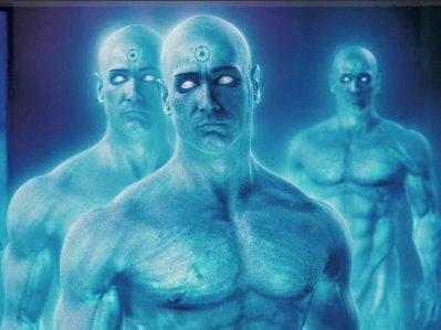
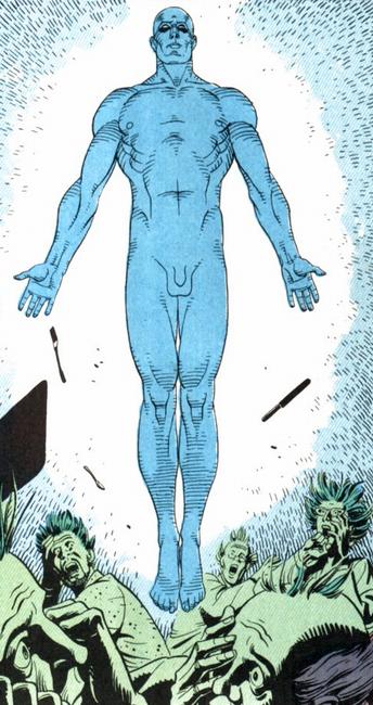
I’ll conclude by noting that the character who most fascinated me in the graphic novel is also the one I couldn’t tear my eyes from onscreen: Dr. Manhattan. He’s “played” by Billy Crudup, and as I noted in my post on Space Buddies, the actor’s voice is our central means of accepting Manhattan as a living character. Equally magnificent, though, is the physical performance supplied by Manhattan’s digital surface, an iridescent azure body hanging from Crudup’s motion-captured face. Whether intentionally or through limits in the technology, Dr. Manhattan never quite fits into his surroundings, and that’s exactly as it should be; as conceived by Moore, he’s a buzzing collection of hyperparticles, a quantum ghost, and Snyder uses digital effects to nail Manhattan’s transhuman ontology. (He is, both diegetically and non-, a walking visual effect.) Presciently, the print version of Watchmen — published between 1986 and 1987, when CG characters were just starting to creep into movies (see Young Sherlock Holmes) — gave us in Dr. Manhattan our first viable personification of digital technology. The metaphysical underpinning and metaphorical implications of the print Manhattan, of course, are radioactivity and the atomic age, not digitality and the information revolution. But in the notion of an otherwordly force, decanted into a man-shaped vessel but capable of manipulating the very fabric of reality, they add up to much the same: Dr. Manhattan — synthespian avant la lettre.

Getting Granular with Setpieces

Dan North has published an excellent analysis of the Sandman birth sequence in Spider-Man 3, using this three-minute shot as springboard for a characteristically deft dissection of visual-effects aesthetics and the relationship between CG and live-action filmmaking. His concluding point, that CGI builds on rather than supplants indexical sensibilities — logically extending the cinematographic vocabulary rather than coining utterly alien neologisms — is one that is too often lost in discussions that stress digital technology’s alleged alterity to traditional filmic practices. I’d noticed the Sandman sequence too; in fact, it was paratextually telegraphed to me long before I saw the movie itself, in reviews like this from the New York Times:

… And when [The Sandman] rises from a bed of sand after a “particle atomizer” scrambles his molecules, his newly granulated form shifts and spills apart, then lurches into human form with a heaviness that recalls Boris Karloff staggering into the world as Frankenstein’s monster. There’s poetry in this metamorphosis, not just technological bravura, a glimpse into the glory and agony of transformation.

I don’t have anything to add to Dan’s exegesis (though if I were being picky, I might take issue with his suggestion that the Sandman sequence simply could not have been realized without computer-generated effects; while it’s true that this particular rendering, with its chaotic yet structured swarms of sand-grains, would have taxed the abilities of “stop-motion or another kind of pro-filmic object animation,” the fact is that there are infinitely many ways of designing and staging dramatic events onscreen, and in the hands of a different creative imagination than Sam Raimi and his previz team, the Sandman’s birth might have been realized in much more allusive, poetic, and suggestive ways, substituting panache for pixels; indeed, for all the sequence’s correctly lauded technical artistry and narrative concision, there is something ploddingly literal at its heart, a blunt sense of investigation that smacks of pornography, surveillance-camera footage, and NASA animations — all forms, incidentally, that share the Spider-Man scene’s unflinching long take).

But my attention was caught by this line of Dan’s:

This demarcation of the set-piece is a common trope in this kind of foregrounded spectacle — it has clear entry and exit points and stands alone as an autonomous performance, even as it offers some narrative information; It possesses a limited colour scheme of browns and greys (er … it’s sand-coloured), and the lack of dialogue or peripheral characters further enforces the self-containment.

I’ve long been interested in the concept of the setpiece, that strange cinematic subunit that hovers somewhere between shot, scene, and sequence, hesitating among the registers of cinematography, editing, and narrative, partaking of all while being confinable to none. Setpieces can be an unbroken single shot from the relatively brief (the Sandman’s birth or the opening to Welles’s Touch of Evil) to the extravagantly extended (the thirteen-minute tracking shot with which Steadicam fetishist Brian DePalma kicks off Snake Eyes). But we’re perhaps most familiar with the setpiece as constituted through the beats of action movies: hailstorms of tightly edited velocity and collision like the car chases in Bullitt or, more humorously, Foul Play; the fight scenes and song-and-dance numbers that act as structuring agents and generic determinants of martial-arts movies and musicals respectively; certain “procedural” stretches of heist, caper, and espionage films, like the silent CIA break-in of Mission Impossible (smartly profiled in a recent Aspect Ratio post). Setpieces often occur at the start of movies or near the end as a climactic sequence, but just as frequently erupt throughout the film’s running time like beads on a string; Raiders of the Lost Ark is a gaudy yet elegant necklace of such baubles, including one of my favorites, the “basket chase” set in Cairo. Usually wordless, setpieces tend to feature their own distinctive editing rhythms, musical tracks, and can-you-top-this series of gags and physical (now digital) stunts.

Setpieces are, in this sense, like mini-movies embedded within bigger movies, and biological metaphor might be the best way to describe their temporal and reproductive scalability. Like atavistic structures within the human body, setpieces seem to preserve long-ago aesthetics of early cinema: their logic of action and escalation recalls Edison kinetoscopes and Keystone Cops chases, while more hushed and contemplative setpieces (like the Sandman birth) have about them something of the arresting stillness and visual splendor of the actualite. Or to get all DNAish on you, setpieces are not unlike the selfish genes of which Richard Dawkins writes: traveling within the hosts of larger filmic bodies, vying for advantage in the cultural marketplace, it is actually the self-interested proliferation of setpieces that drives the replication — and evolution — of certain genres. The aforementioned martial-arts movies and musicals, certainly; but also the spy movie, the war and horror film, racing movies, and the many vivid flavors of gross-out comedy. The latest innovation in setpiece genetics may be the blockbuster transmedia franchise, which effectively “brands” certain sequences and delivers them in reliable (and proprietary) form to audiences: think of the lightsaber duels in any given phenotypic expression of Star Wars, from film to comic to videogame.

On an industrial level, of course, setpieces also signal constellations of labor that we can recognize as distinct from (while inescapably articulated to) the films’ ostensible authors. One historical instance of this is the work of Slavko Vorkapich, renowned for the montages he contributed to other peoples’ movies — so distinctive in his talents that to “Vorkapich” something became a term of art in Hollywood. Walt Disney was a master when it came to channeling and rebranding the work of individual artists under his own overweening “vision”; more recently we have the magpie-like appropriations of George Lucas, who was only in a managerial sense the creator of the Death Star battle that ends the 1977 Star Wars: A New Hope. This complexly composited and edited sequence (itself largely responsible for bringing setpieces into being as an element of fannish discourse) was far more genuinely the accomplishment of John Dykstra and his crew at Industrial Light and Magic, not to mention editors Richard Chew and Marcia Lucas. Further down the line — to really ramify the author function out of existence — the battle’s parentage can be traced to the cinematographers and editors who assembled the World War II movies — Tora! Tora! Tora!, The Bridges at Toko-Ri, The Dam Busters, etc. — from which Lucas culled his reference footage, a 16mm reel that Dykstra and ILM used as a template for the transcription of Mustangs and Messerschmitts into X-Wings and TIE Fighters.

Thirty years after the first Star Wars, sequences in blockbuster films are routinely farmed out to visual effects houses, increasing the likelihood that subunits of the movie will manifest their own individuating marks of style, dependent on the particular aesthetic tendencies and technological proficiencies of the company in question. (Storyboards and animatics, as well as on-the-fly oversight of FX shots in pipeline, help to minimize the levels of difference here, smoothing over mismatches in order to fit the outsourced chunks of content together into a singularly authored text — hinting at new ways in which the hoary concepts of “compositing” and “continuity” might be redeployed as a form of meta-industrial critique.) In the case of Spider-Man 3, no fewer than eight FX houses were involved (BUF, Evil Eye Pictures, Furious FX, Gentle Giant Studios, Giant Killer Robots, Halon Entertainment, Tweak Films, and X1fx) in addition to Sony Pictures Imageworks, which produced the Sandman shot.

When we look at a particular setpiece, then, we also pinpoint a curious node in the network of production: a juncture at which the multiplicity of labor required to generate blockbuster-scale entertainment must negotiate with our sense of a unified, unique product / author / vision. Perhaps this is simply an accidental echo of the collective-yet-singular aura that has always attended the serial existence of superheroes; what is Spider-Man but a single artwork scripted, drawn, acted, and realized onscreen by decades of named and nameless creators? But before all of this, we confront a basic heterogeneity that textures film experience: our understanding, at once obvious and profound, that some parts of movies stand out as better or worse or more in need of exploration than others. Spider-Man 3, as Dan acknowledges, is not a great film; but that does not mean it cannot contain great moments. In sifting for and scrutinizing such gems, I wonder if academics like us aren’t performing a strategic if unconscious role — one shared by the increasingly contiguous subcultures of journalists, critics, and fans — our dissective blogging facilitating a trees-over-forest approach to film analysis, a “setpiece-ification” that reflects the odd granularity of contemporary blockbuster media.

Crudeness, Complexity, and Venom’s Bite

Back in the 70s, like most kids who grew up middle-class and media-saturated in the U.S., I lived for the blocks of cartoons that aired after school and on Saturday mornings. From Warner Brothers and Popeye shorts to affable junk like Hong Kong Phooey, I devoured just about everything, with the notable exception of Scooby Doo, which I endured with resigned numbness as a bridge between more interesting shows. (Prefiguring my later interest in special effects both cheesy and classy, I was also nutty for the live-action Filmation series the networks would occasionally try out on us: cardboard superhero morality plays like Shazam! and Isis, as well as SF-lite series Ark II, Space Academy, and Jason of Star Command, which was the Han Solo to Space Academy‘s Luke Skywalker.)

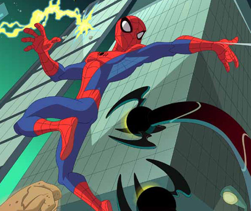
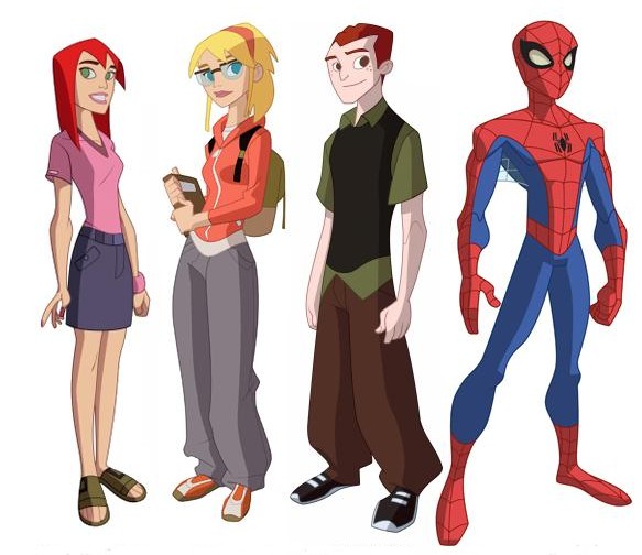
Nowadays, as a fancypants professor of media studies who teaches courses on animation and fandom, I have, I suppose, moved on to a more mature appreciation of the medium’s possibilities, just as animation itself has found a new cultural location in primetime fare like Family Guy, South Park, and CG features from Pixar and DreamWorks that speak simultaneously to adult and child audiences. But the unreformed ten-year-old in me is still drawn to kids’ cartoons – SpongeBob is sublime, and I rarely missed an episode of Bruce Timm’s resurrection of Superman from the 1990s. This week I had a look at the new CW series, The Spectacular Spider-Man (Wiki rundown here; Sony’s official site here), and was startled both by my own negative response to the show’s visual execution and my realization that the transmedia franchise has passed me by while I was busy with others things … like going to graduate school, getting married, and buying a house. Maybe the photographic evidence of a youthful encounter that recently turned up has made me sensitive to the passage of time; whatever the cause, the new series came as a shock.

First, the visual issue. It’s jolting how crude the animation of the new Spider-Man looks to my eye, especially given my belief that criticisms of this type are inescapably tied to generational position: the graphics of one era seem trite beside the graphics of another, a grass-is-always-greener perceptual mismatch we all too readily misrecognize as transhistorical, inherent, beyond debate. In this case, time’s arrow runs both ways: The garbage kids watch today doesn’t hold a candle to the art we had when I was young from one direction, Today’s shows [or movies, or music, or baseball teams, etc.] are light-years beyond that laughable crap my parents watched from the other. Our sense of a media object’s datedness is based not on some teleological evolution (as fervently as we might believe it to be so) but on stylistic shifts and shared understandings of the norm — literally, states of the art. This technological and aesthetic flux means that very little cultural material from one decade to another escapes untouched by some degree of ideological Doppler shift, whether enshrined as classic or denigrated as obsolete, retrograde, stunted.

Nevertheless, I have a hard time debating the evidence of my eyes – eyes here understood as a distillation of multiple, ephemeral layers of taste, training, and cultural comfort zoning. The character designs, backgrounds, framing and motion of The Spectacular Spider-Man seem horribly low-res at first glance: inverting the too-many-notes complaint leveled at W. A. Mozart, this Spider-Man simply doesn’t have enough going on inside it. Of course, bound into this assessment of the cartoon’s graphic surface is an indictment of more systemic deficits: the dialogue, characterization, and storytelling seem thin, undercooked, dashed off. Around my visceral response to the show’s pared-down quality there is a whiff of that general curmudgeonly rot (again, one tied to aging — there are no young curmudgeons): The Spectacular Spider-Man seems slangy and abrupt, rendered in a rude optical and narrative shorthand that irritates me because it baffles me. I see the same pattern in my elderly parents’ reactions to certain contemporary films, whose rhythms seem to them both stroboscopically intense and conceptually vapid.

The irony in all this is that animation historically has been about doing more with less — maximizing affective impact, narrative density, and thematic heft with a relative minimum of brush strokes, keyframes, cel layers, blobs of clay, or pixels. Above all else, animation is a reducing valve between the spheres of industrial activity that generate it and the reception contexts in which the resulting texts are encountered. While the mechanism of the live-action camera captures reality in roughly a one-to-one ratio, leaving only the stages of editing and postproduction to expand the labor-time involved in its production, animation is labor- and time-intensive to its very core: it takes far longer to produce one frame than it takes to run that frame through the projector. (This is nowhere clearer than in contemporary CG filmmaking; in the more crowded shots of Pixar’s movie Cars, for example, some frames took entire weeks to render.)

As a result, animation over the decades has refined a set of representational strategies for the precise allocation of screen activity: metering change and stasis according to an elaborate calculus in which the variables of technology, economics, and artistic expression compete — often to the detriment of one register over another. Most animation textbooks introduce the idea of limited animation in reference to anime, whose characteristic mode of economization is emblematized by frozen or near-frozen images imparted dynamism by a subtle camera movement. But in truth, all animation is limited to one degree or another. And the critical license we grant those limitations speaks volumes about collective cultural assumptions. In Akira, limitation is art: in Super Friends (a fragment of which I caught while channel-surfing the other day and found unwatchably bad), it’s a commercial cutting-of-corners so base and clumsy as to make your eyeballs burst.

It’s probably clear that with all these caveats and second-guessings, I don’t trust my own response to The Spectacular Spider-Man‘s visual sophistication (or lack of it). My confidence in my own take is further undermined by the realization that the cartoon, as the nth iteration of a Spider-Man universe approaching its fiftieth year, pairs its apparent crudeness with vast complexity: for it is part of one of our few genuine transmedia franchises. I’ve written on transmedia before, each time, I hope, getting a little closer to understanding what these mysterious, emergent entities are and aren’t. At times I see them as nothing more than a snazzy rebranding of corporate serialized media, an enterprise almost as old as that other oldest profession, in which texts-as-products reproduce themselves in the marketplace, jiggering just enough variation and repetition into each spinoff that it hits home with an audience eager for fresh installments of familiar pleasures. At other times, though, I’m less cynical. And for all its sketchiness, The Spectacular Spider-Man offers a sobering reminder that transmedia superheroes have walked the earth for decades: huge, organic archives of storytelling, design networks, and continuously mutating continuity.

Geoff Long, who has thought about the miracles and machinations of transmedia more extensively and cogently than just about anyone I know, recently pointed out that we live amid a glut of new transmedia lines, most of which — like those clouds of eggs released by sea creatures, with only a lottery-winning few lucky enough to survive and reproduce — are doomed to failure. Geoff differentiates between these “hard” transmedia launches and more “soft” and “crunchy” transmedia that grow slowly from a single, largely unanticipated success. In Spider-Man, Batman, Superman and the like, we have serial empires of apparent inexhaustibility: always more comic books, movies, videogames, action figures to be minted from the template.

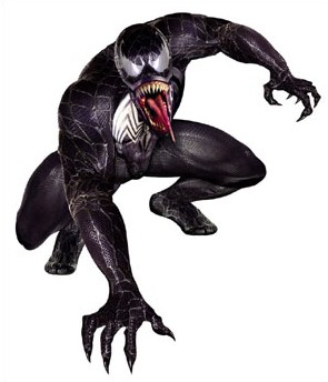
But the very scale of a long-lived transmedia system means that, at some point, it passes you by; which is what happened to me with Spider-Man, around the time that Venom appeared. This symbiotic critter (I could never quite figure out if it’s a sentient villain, an alter-ego of Spidey, or just a very aggressive wardrobe malfunction) made its appearance around 1986, approximately the same time that I was getting back into comic books through Love and Rockets, Cerebus, and the one-two punch of Frank Miller’s The Dark Knight Returns and Moore’s and Gibbons’s Watchmen. Venom represented a whole new direction for Spider-Man, and, busy with other titles, I never bothered to do the homework necessary to bind him into my personal experience of Spider-Man’s diegetic history. Thus, Sam Raimi’s botched Spider-Man 3 left me cold (though it did restage some of the Gwen Stacy storyline that broke my little heart in the 70s), and when Venom happened to show up on the episode of Spectacular Spider-Man that I watched, I realized just how out of touch I’ve become. Venom is everywhere, and any self-respecting eight-year-old could probably lecture me on his lifespan and dietary habits.

Call this lengthy discourse a meditation on my own aging — a bittersweet lament on the fact that you can’t stay young forever, can’t keep up with everything the world of pop entertainment has to offer. Long after I’ve stopped breathing, the networked narratives of my favorite superheroes and science-fiction worlds will continue to proliferate. My mom and dad can enjoy this summer’s Iron Man without bothering over the lengthy history of that hero; perhaps I’ll get to the same point when, as an old man one day, I confront some costumed visual effect whose name I’ve never heard of. In the meantime, Venom oozes virally through the sidechannels and back-alleys of Spider-Man’s mediaverse, popping up in the occasional cartoon to tease me — much as he does the eternally-teenaged, ever-tormented Peter Parker — with a dark glimpse of my own mortality, as doled out in the traumas of transmedia.

Spider-Fan

I thought I’d share with you a fragment of my history — a frozen formative moment in a fanboy’s evolution. This summer I’ve spent a lot of time in Ann Arbor, Michigan, the town where I grew up and where my parents still live. Given that I now have a house of my own, Mom and Dad have been pleading with me to get my stuff out of their basement. This led to some pleasurable archeology, digging through old sketchbooks (from when I wanted to be a comic-book artist), science-fiction screenplays (from when I wanted to become a Super-8 filmmaker), and broken model kits (I must have glued together the U.S.S. Enterprise a dozen times). And some painful triage, as I decided what had to come back with me to Pennsylvania (the long white coffins holding my plastic-bagged collection of Fantastic Four, Love and Rockets, and Cerebus) and what could be disposed of (just about everything else).

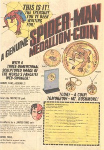
This Polaroid documents a trip my father and I took to a shopping mall called Arborland, where I had the honor of meeting the Spectacular Spider-Man and getting my picture taken with him. I remember little of our encounter, though the webslinger struck me as a nice enough guy, and I certainly appreciated his taking time out of crimefighting (or alternatively his job at the Daily Bugle) to visit his fans. From the visual evidence, I was probably a bit tense — note the contrast between my clenched right fist and the flamboyant fingers of my left hand. It was 1975 or 1976; I would have been nine or ten years old.

What jumps out at me now is the object hanging from a chain around Spider-Man’s neck. This, of course, was the economic agenda of the superhero’s tour: selling special coins to fans. I don’t have my own medallion any more; at least, it hasn’t yet turned up in the excavation of my parents’ basement. But I do have the photo (I assume this too cost something — Have your picture taken with Spider-Man!) and, thanks to the obsessive-compulsive accumulator of memory that is the internet, I have a scan of the print ad pushing this particular collector’s item. I found it on this website but am reproducing the image below (click to enlarge).

I don’t mean, by pointing out this financial base to the superstructure of my preteen jouissance, to be cynical or to undermine the coolness of having met Spidey more than thirty years ago. On the contrary: I love that so many forces came together that day to produce the experience, including not just Marvel’s sharklike pursuit of side profits but my sincere love for this particular superhero (so saddled with his own adolescent angst) and my dad’s willingness to cart me off for an audience with him. And as I get used — reluctantly — to my own adulthood, which can sometimes seem to be setting up like cold cement around my unchanged 10-year-old heart, images like this offer a brief window of escape: a memory to glimpse, cherish, then put away with a sense of gratitude.

A Marvel of Engineering

The opening act of the summer movie season, Iron Man, is much like the machine armor worn by Tony Stark (Robert Downey Jr.): a potent blend of advanced technology, sleek style, and glowing energy. The fetishism of the super-suit has rarely been quite so explicitly rendered, or embraced with such pornographic shamelessness, in comic-book cinema. Sure, movies and television have given us plenty of heroes whose iconic power resides in the costume (whether caped or capeless): Christopher Reeve’s Superman, Tobey Maguire’s Spider-Man, the leather-overcoat-and-sunglasses combo of Wesley Snipes in Blade, the patriotic bustier worn by Lynda Carter as Wonder Woman. Often these sartorial choices become flashpoints of controversy with fans: think of Bryan Singer’s X-Men adaptation, which did away with the classic yellow costumes of the comic series, or the many nippled and sculpted variations of the Batsuit worn by the Batactors playing a series of Batmen in the Batfranchise.

In Iron Man, the situation is different, for Iron Man is his suit, the “secret identity” within a compromised figure both morally and physically. Over the course of the story, Stark’s transformation from a hard-partying weapons magnate to a passionately peace-committed and (mostly) teetotaling cyborg is made concrete — made metal, really — through the metaphor of the successively more sophisticated armor shells in which he encases himself. The first is a kitbashed monstrosity the color of corroded tin cans, crisscrossed with scars of solder. Like a rustbucket car, it survives just long enough to convey Stark to version two, a more compact silver exoskeleton reminiscent of Ginsu knives and Brookstone gadgets. It’s quite satisfying when Stark arrives at the canonical configuration, a red-and-gold chassis of interlocking plates, purring hydraulics, and HUD graphics that answers the question “What would it be like to wear a Lamborghini?”

What’s clever is how these upgrades express Stark’s ethical evolution while recapitulating decades of shifting design in the Marvel comic series from which this movie sprang. (It’s kind of like a He’s Not There version of James Bond in which the lead is played over the course of the film by Sean Connery, then Roger Moore, followed by Timothy Dalton, Pierce Brosnan, and Daniel Craig — with a quick dream interlude, of course, starring George Lazenby.) Iron Man, in other words, manages to honor superhero history rather than pillaging it, and this — along with the film’s smart screenplay and glossy digital mise-en-scene — wins it a sure place in future best-of lists when it comes to the spotty genre of comic-book adaptations.

Another weapon in the film’s arsenal, riding within in its narrative delivery system like he pilots his mechanical costume, is Robert Downey Jr., who seems to have arrived at a point of perfect intertextual harmony with this turn in his career. His performance as Stark is properly lived-in and mischievous (indeed, the actor’s persona is yet another kind of suit, this one built of bad publicity) yet alive with disarmingly sincere warmth. In one of the film’s facile yet pitch-perfect tropes, Stark must wear a pulsing blue-and-white generator on his chest, a kind of electromagnetic pacemaker that doubles as an energy source for his armor and trebles as a signifier of the character’s humanity. Downey Jr. is himself a kind of power source that propels the vehicle of Iron Man forward while lending it, in stray moments, genuine moral weight. His portrayal reminds us that, while a superhero’s technological or organic essence is important, the larger ingredient is something harder to quantify and calibrate — in Stark’s case, a kludge of intellect, imagination, and compassion that easily trades one outfit for another.

That’s not all that’s going on under the hood: the fight scenes, not to mention flight scenes, are awesome, and Jeff Bridges is remarkably menacing with all his hair relocated from his head to his chin. There’s some nimble ideological shadowboxing around the the military-industrial complex and the terrible allure of “shock and awe” (there’s your real pornography). And while Stan Lee makes his trademarked cameo, branding this as yet another item in Marvel’s transmedia catalog, a quirky counterpoint is sounded when a villain taunts Stark by asking “Did you really think that just because you had an idea, it belongs to you?” For comic fans, it’s hard not to hear this and think of Marvel’s infamous screwing of Jack Kirby. At the same time, we should count our blessings that concepts like Iron Man travel so fluidly through our mediascape, rephrasing themselves in the transformational grammar of convergence cinema. Too often, the result is an ugly and lifeless thing — a strangled fragment like Daredevil, a run-on sentence like Van Helsing. But once in a lucky while, you get a perfect little poem like Iron Man.