Face Off’s practical magic[ians]

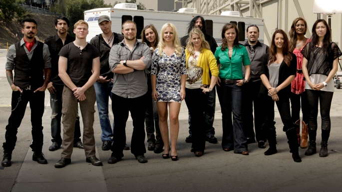
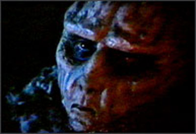
With the finale of Face Off airing tonight, I wanted to quickly share my fondness for the Syfy series, which pits fledgling special-effects artists against each other in timed challenges to create fantastical make-ups. Now in its second season, the show is notable for the way it eschews (to the point of rarely acknowledging the existence of) digital effects, which within the industry increasingly augment and substitute for old-school prosthetics, blood and wound creation, and creature design. For many who grew up watching SF and fantasy film and television in what we now recognize as the analog era of special effects, there is an irreducible beauty to such practical magic, no matter how realistic or unrealistic such effects might currently appear; indeed, our celebration of the artistry involved arguably cannot flower outside the passage of time — and advances in technology — that render older special effects visible precisely as tricks, in turn demonstrating the bankruptcy and uselessness of standards for screen illusion that hinge solely on those illusions’ undetectability.

The deeper import of Face Off, running beneath its highly entertaining races to design, fabricate, apply, and paint prosthetic appliances, is that such processes preserve an individual, artisanal ethos that is vanishing from the contemporary effects industry; CGI takes more people, and more time, than the rigors of reality-show competitions allow, which is one reason why the digital era of visual effects has yet to produce an auteur on the level of Stan Winston, Dick Smith, or Ray Harryhausen. (Instead, that auteur function has reverted to the director, himself [so far always a “him”] a crossover between artist and technician a la James Cameron.)

The other thing I dig about Face Off is that it is one of the few reality competitions that don’t focus on beautiful people — what Brenda Weber calls the “afterbodies” of makeover TV — or on unbeautiful people as a problem in need of solving, as in The Biggest Loser. Instead, the contestants of Face Off, like the judges, are a wonderful miscellany of folks bearing the styles and decorations of subcultures who rarely receive air time except as oddities. The gender (and, between the lines, queer and transgender) identities are welcomely mixed, though so far pretty uniformly white. It’s an almost accidental showcase of diversity that makes perfect sense given the communities of fandom that populate Face Off: a group whose self-conscious display of difference is, itself, a celebration of the modified and colorful body, encased in its cleverly bizarre social prosthetics.

Of Katniss E and Jennifer L

I’m about 30% of the way through Catching Fire, the second book in the Hunger Games trilogy, and something that jumped out at me in the first volume is even more apparent in the glare of publicity around the film adaptation, starring Jennifer Lawrence, that comes out March 23: the uncanny precision of the saga’s send-up of media culture and celebrity.

What stands out on first encounter with the story of Katniss Everdeen are, of course, other things. There’s the breathless, adrenalized competition for survival represented by the eponymous games themselves — a mashup of pop-culture nightmares familiar from other sources, primarily Battle Royale and Stephen King’s early novels (written as Richard Bachman) The Long Walk and The Running Man. Even earlier pre-texts include William Golding’s Lord of the Flies and Nigel Kneale’s BBC one-off Year of the Sex Olympics (1968); but it took The Hunger Games to reconfigure the basic scenario of people-preying-on-other-people-for-a-mass-audience around the subjectivity of a young female protagonist: final girl as must-see TV.

My own attention is captured more by the trilogy’s portrait of its totalitarian state, the nation of Panem, which arises after the U.S. has been hobbled by a vaguely-defined catastrophe. As dystopian futures go, Panem’s mechanisms of tyranny merge the historical forms of domination mapped by Michel Foucault in Discipline and Punish: there are thugs with guns enforcing martial law, but there are also elaborate, interlocked systems of surveillance and broadcast media in which Panem’s subjects live under a constant scrutiny whose public facets are the garish electronic proscenia of show biz.

Hardly surprising, given author Suzanne Collins’s explanation of the story’s origins; like Raymond Williams in the early 1970s, Collins had her brainstorm while randomly channel-surfing. She noticed a disturbing resonance between reality TV and coverage of the invasion of Iraq, influences which lent her resulting work the dual immediacies of contemporary political conflict and an entertainment culture of last-person-standing competitions.

It is the latter portions of the trilogy that fascinate me the most, as Katniss is primped, costumed, and styled into a media star and emblem of Panem’s coercive patriotism. The funniest and most biting scenes involve the team of make-up artists and hairstylists who have been assigned the task of making her over; themselves a tattooed and ornamented bunch with rainbow-hued hair, the entourage gives Collins — via Katniss — a chance to comment mordantly on the fixations of fame, often figured through torturous transformations of Katniss’s face and body, making literal John Updike’s characterization of celebrity as “a mask that eats into the face.”

It’s hard not to think of Katniss’s split between public persona and private space — a space that, in the Hunger Games, is implicitly subversive, even treasonous — when looking at this week’s coverage of the movie’s rollout. “Jennifer Lawrence steals the show at ‘The Hunger Games’ premiere,” writes Access Hollywood, in gushing tones that could have come straight from the clown-crayoned mouth of Effie Trinket. “Jennifer Lawrence stuns the crowd in a golden Prabal Gurung gown at ‘The Hunger Games’ premiere where she chats with Access’ Shaun Robinson about how her life has changed for better and worse since taking on the role of Katniss.”

Jason Mittell wrote recently about “inferred interiority,” that intersubjective artifact of serial storytelling in which the limitations of visual media to present a character’s inner life are compensated for by the viewer’s store of knowledge accumulated through exposure to and study of previous episodes. Reading this effect transmedially and paratextually — not, that is, along the solitary throughline of a single serialized fiction, but along the perpendicular axes of an actor’s larger intertextual existence, along with that of the characters they play — it’s hard not to infer beneath Lawrence’s smiling face the subtle signs of Katniss’s resistance to her own commodification through beautification.

The critical comparisons that unfold from this odd collision of realities range from the similarities between Panem and current political culture (not exactly a huge leap, given the frightening religiosity and hard-line social conservatism of the Republican presidential candidates) to the relentless spectacularization of young women’s bodies in both fictional and actual frameworks — the disciplinary operations of patriarchy marked in the one and unmarked in the other. The artistic merits of the Hunger Games franchise aside (and for the record, I’m enjoying the books and looking forward to the film), it has succeeded, like all good dystopian SF, in collapsing a certain distance between the reassuring rituals of our daily life and the troubling trends that lurk beneath its painted-on smiles.

Talk: The Biology of Virtual Creatures

The Biology of Virtual Creatures: Unconventional Applications of a Science Education in Hollywood Special Effects

Thursday, March 15, 2012 at 8:00 p.m.

Science Center 199, Swarthmore Campus

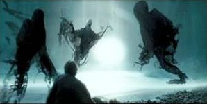
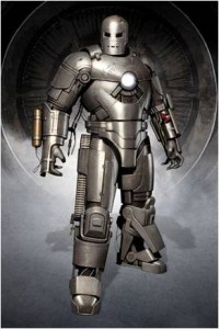
From Chester the Cheetah to swarming Dementors to the Iron Man Mark-I suit, Bradley Gabe’s (’94) computer graphics skills have been honed by experiences working on high-end digital effects in commercial and feature film productions at Quiet Man, Industrial Light & Magic, Stan Winston Studio, and Janimation.

As an active member of the CG community, Bradley has advanced technical approaches to CG production through consulting, teaching courses, leading seminars, and conducting Master Classes at Siggraph and other venues. In 2009 he was honored by his industry peers with an Autodesk Masters award.

Franz Joseph and Star Trek’s Blueprint Culture

As part of a larger project I’m preparing on “blueprint culture” — fan subcultures devoted to drawing, drafting, charting, mapping, and playing the worlds of science-fiction media — here is a brief history, excerpted from my book manuscript on special effects and transmedia, of Franz Joseph and the Starfleet Technical Manual he created in 1975.

One man in particular would dominate Star Trek’s design-oriented fandom in the 1970s. Though not a fan himself, Franz Joseph Schnaubelt was the first to awaken a broad base of fans to the pleasures of charting and extending Star Trek’s diegetic backdrop. By the same token, Schnaubelt brought to the attention of the show’s license holders the enormous profit potential of Trek manufacturing: first through supplementary materials expanding on the Trek universe, then through relaunching Trek as a storytelling franchise.

Schnaubelt, who in his professional life went by the name Franz Joseph, was born in Chicago in 1914. A designer and draftsman, Joseph began working at the aeronautical and military research firm General Dynamics in 1941, drawing up plans of seaplanes and fighter planes. “For being a man who was vehemently opposed to war,” Joseph’s daughter Karen Dick writes, he “certainly worked on some of the most formidable war machinery of the ‘40s, ‘50s, and ‘60s.”[i] Laid off in 1969, Joseph entered an early retirement that ended when his attention turned to Trek – not as entertainment, but as intellectual exercise. During the original series’ run, Joseph and Karen had watched the show together, but her passion outstripped his (he considered Star Trek only slightly superior to Lost in Space). In April 1973, Karen took her father to the inaugural meeting of the San Diego branch of the Star Trek Association for Revival (S.T.A.R.).[ii] The fans gathered there brought with them homemade models of Trek equipment such as communicators and phasers. According to Joseph, the ersatz props “were made out of cardboard, balsa wood, tape, wiring, glue, and paint and, for college kids … the workmanship was pretty bad any way you looked at it.”[iii] A former Cub Scout director, Joseph told the amateur craftsmen he thought “they could do better.”[iv] When they asked for assistance, Joseph agreed to bring his own professional training to bear.

Working from more than 800 film clips Karen had amassed, Joseph began to draft blueprints of the props, basing his work on a principle of architectural draftsmanship in which schematic drawings are projected into 3D views. Joseph reversed this, moving “from picture to plan” rather than from plan to picture.[v] In this sense, he inverted the process by which Matt Jefferies, a decade earlier, designed Trek’s sets and spacecraft: Jefferies would prepare both top-down plans and elevations – 3D views, some in color – showing how the finished object would look from camera viewpoint. According to Joseph,

I could take a picture of an enemy airplane and, as long as there was something on the airplane, or in the picture, that permitted me to determine the scale or make a fairly good judgment of the scale, then I would simply reverse the procedure and draw the plans of the airplane in that picture. This is what I was doing with the Star Trek slides. I drew the plans of the communicator, and then plans of the hand phaser and the pistol phaser.[vi]

When Karen’s friends saw the drawings, Joseph said, they “went wild over them. They wanted a lot more. They wanted everything. They made a whole list of stuff they wanted to see and I decided, well, I would do it if there was an interest in it.”[vii] When Joseph examined the lists, he realized that the fans were asking for “a ‘technical’ manual,” and set to work drawing up a comprehensive mechanical anatomy of Trek’s diegetic contents (Figure 3).[viii] From Lincoln Enterprises, the memorabilia vendor run by Roddenberry and Majel Barrett, Karen obtained a set of Matt Jefferies’s drawings of the Enterprise, the Galileo shuttlecraft, and the shuttledeck. “From those sketches and those in Whitfield’s book [The Making of Star Trek],” Joseph “laid the drawing out, scaled and sized it, and made a drawing of the Enterprise.”[ix] He then departed for the first time from canon, extrapolating a new type of Starfleet vessel – a massive warship called the Dreadnaught, which rearranged elements of the Enterprise configuration. Joseph topped off this initial set of drawings with a pattern for the standard Starfleet uniform, again demonstrating the seamless slippage among visual effects and more concrete elements such as sets, costumes, and props.
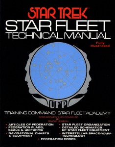
In the course of preparing the technical manual, Joseph decided it would be necessary to map the Enterprise’s internal layout. This was because the fan community

wanted bridge stations and other things concerned with the interior of the Enterprise, which did not exist except in a book or in somebody’s mind as a throwaway line. So it became rather obvious that I would have to lay out the Enterprise far enough to get to those areas – to see whether I could make drawings. This is how the Enterprise blueprints came about – in the middle of making the technical manual – they were primarily an afterthought.[x]

In “lofting” the ship, however, he discovered several errors in scale and perspective, most stemming from the change from 203 to 430 personnel (and a corresponding change in length from 180 to 947 feet) made by Roddenberry and Jefferies during preproduction on the original series. He also noticed that the bridge was 36 degrees out of alignment with the rest of the saucer – throughout the series, Captain Kirk had been facing slightly to the left of the ship’s angle of travel, a mistake that had to do with the producers’ need to create dramatic visual compositions by placing the “turbolift” elevator so it was not directly behind the captain’s chair. Drafting the technical manual and ship blueprints was, then, largely a matter of reconciling the “imaginary” object of the Enterprise miniature with the “real” object of sets such as the bridge, sickbay, and engineering, explaining in graphic form how exterior and interior aspects of the Enterprise fit together into a coherent whole. In this sense, Joseph’s work might be described as operationalizing the Kuleshov effect, tying down and standardizing relationships created through editing. The technical materials upon which design-oriented fandom thrives – blueprints, models, hand-crafted props – thus serve an essentially conservative function, knitting together loose seams of an imperfectly-manufactured diegetic reality, as opposed to the exploding/perverting of officially preferred meanings that occurs in fan fiction (particularly slash).

Nevertheless, his technical productions did ultimately bring him into conflict with Trek’s legal authors. Interviews with Joseph demonstrate the care he took not to step on the toes of Trek’s copyright holders; from the start, he corresponded with Roddenberry and Paramount executives, sending them samples of his work. At the same time, Joseph’s encounters with the fan community convinced him there was substantial interest in his technical drawings, a site of imaginative investment as well as potential profit. By May 14, 1973 – only a month after the S.T.A.R. meeting that inspired the project – Joseph, having completed a dozen drawings, contacted Roddenberry and received a go-ahead. Roddenberry hinted that Lincoln Enterprises would market the drawings once Joseph completed them. For a brief time, Roddenberry even employed Joseph as technical consultant and designer on a new science-fiction series he was then developing, Planet Earth.
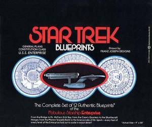
But months later, with a major Trek convention approaching, Joseph had still not received official permission to sell his work. Bypassing Roddenberry, he made a one-time deal with Paramount to sell the “General Plans” (the Enterprise blueprints) at the upcoming convention. Equicon 1974 took place in Los Angeles from April 12-14. Of the 500 copies of the General Plans Joseph had prepared, 410 sold immediately; 450 requests for additional copies were taken on postcards. Paramount, which received Joseph’s royalty check shortly thereafter, sensed it was on to something, and began negotiating for a mass-market release of both the General Plans and the still-growing Technical Manual. The results exceeded all expectations. The blueprints went on sale across the nation on May 24, 1975, selling out within two hours. By May 28, 50,000 additional copies had sold, prompting Ballantine to print 100,000 more. In July the New York Times marveled,

It lives! There’s one publication that’s been selling so furiously in book stores during recent weeks that it would be included on the list [of bestsellers] above except for one fact. It’s not a book. “Star Trek Blueprints” is a set of 12 reproductions by Franz Joseph Schnaubelt showing “every foot of every level of the fabulous starship Enterprise.” Since mid-May Ballantine Books has sold 150,000 sets, enclosed in a plastic and leatherette portfolio, at $5. This week it goes back to press for 100,000 more.[xi]

The blueprints continued to sell strongly throughout the summer, reaching 10th on the paperback bestseller list and receiving a fourth printing in October. Meanwhile, interest in Franz Joseph’s other creation, the Technical Manual, was growing: at a time when a typical first printing of a Trek-related publications might run 20,000, Ballantine Books planned an initial run of 450,000. Both the General Plans and the Technical Manual ended up as bestsellers.

Although he found the widest audience, Joseph was by no means the first or only producer of design-oriented Trek material. In addition to the substantial body of such work that went on unremarked in bedrooms and basement workshops, many fans printed blueprints and manuals and sold them at conventions and through mail order. Geoffrey Mandel’s Starfleet Handbook, for example, came out in September 1974 and featured “schematics of the phaser, communicator, tricorder, and shuttlecraft.”[xii] Nevertheless, Franz Joseph’s creations inspired numerous others throughout the mid- and late 1970s to map the fantasy world of Trek in exacting detail through blueprints of the bridge, K-7 Space Station, and Klingon and Romulan cruisers. The success of the General Plans and Technical Manual led to a string of similar publications at the mass-market level, and constituted an access point for fans wishing to join the ranks of professionals: The Star Fleet Medical Reference Manual, published in 1977, featured the work of Geoffrey Mandel and Doug Drexler (who would later go on to create Christopher Pike, Commanding and other imagery for the “Ships of the Line” calendars). The popularity of Joseph’s technical materials arguably influenced the development of the “Star Trek Poster Magazine,” whose first issue came out in September 1976, and the Trek “Fotonovel” series, both of which showcased Trek’s spectacular visuals through color reproductions of film frames.[xiii] This trend would eventually lead to a series of official Trek publications such as Mr. Scott’s Guide to the Enterprise, as well as technical manuals for spinoff series The Next Generation and Deep Space Nine.[xiv] With the growth of the personal-computer industry, software products such as the Interactive Guide to the Enterprise and Starship Creator joined the lineup.

Franz Joseph himself, however, did not go on to do more Trek projects. In part this was due to a series of illnesses affecting both him and his wife; but the larger obstacle seems to have been caused by Gene Roddenberry and Paramount themselves, who, during Trek’s pop-culture renaissance, were hard at work on relaunching the Star Trek franchise. In the early 1970s, Roddenberry assured Joseph that development of the General Plans and Technical Manual could continue unimpeded because Trek was, to all intents and purposes, a dead property. “Before I started seriously on the Manual,” Joseph said, “I had talked to Gene, Paramount, NBC, and Ballantine Books, and they all assured me that the Star Trek TV series was dead, it would not go back into production.”[xv] But the show had left a uniquely profitable corpse in the form of “the seventy-nine jewels,” as industry insiders called the original series, which continued to earn revenue through constant rebroadcast. The syndicated series was profitable in a secondary, subcultural sense, as Joseph himself acknowledged: “the reruns were maintaining continued fan interest, and gaining new fans every year. So I felt it was all right if I made the manual. It was something the original series never had, Gene wanted me to go ahead and finish it, and Ballantine was interested in publishing it.”[xvi]


[i] Greg Tyler, “Karen Dick” (June-July 1999 interview), <http:www.trekplace.com/fj-kdint01.html>, accessed 18 June 2005.

[ii] Paul Newitt, “An Interview with Franz Joseph” (June 1984), <http:www.trekplace.com/fj-fjnewitt01.html>, accessed 18 June 2005.

[iii] Ibid.

[iv] Ibid.

[v] Ibid.

[vi] Ibid.

[vii] Gerry Williams and Penny Durrans, “These Will Be A Reality Sooner than You Think” (October 1976 interview with Franz Joseph Schnaubelt), <http:www.trekplace.com/fj-fjwilliamsint01.html>, accessed 17 June 2005.

[viii] Newitt, “An Interview with Franz Joseph.”

[ix] Ibid.

[x] Gerry Williams and Penny Durrans, “These Will Be A Reality Sooner than You Think.”

[xi] “Paper Back Talk,” New York Times (13 July 1975), 210.

[xii] Joan Marie Verba, Boldly Writing: A Trekker Fan and Zine History, 1967-1987, 2nd Ed. (Minnesota: FTL Publications, 2003), 17.

[xiii] Lynn Simross, “Fotonovel: The Movie-Picture Book,” Los Angeles Times (18 September 1978), OC_B1.

[xiv] Shane Johnson, Mr. Scott’s Guide to the Enterprise (New York: Simon and Schuster, 1989); Rick Sternbach and Michael Okuda, Star Trek: The Next Generation Technical Manual (New York: Simon and Schuster, 1991); Herman Zimmerman, Rick Sternbach, and Michael Okuda, The Deep Space Nine Technical Manual (New York: Simon and Schuster, 1998).

[xv] Newitt, “An Interview with Franz Joseph.”

[xvi] Ibid.

FMST 84: TV and New Media

Course Description and Goals

This course explores the commercial, technological, and aesthetic dimensions of television, using this fundamentally “transient and unstable” medium (as William Uricchio has called it) as a springboard for larger discussions about cultural responses to media succession. At its birth, television disrupted and reworked the media around it (film, radio, and telephone); has itself been reshaped by VCRs, DVDs, and game consoles; and now faces further redefinition by smart phones, iPads, DVRs, streaming video on demand, social networking, and piracy. Amid all the excitement, our challenge as critical media scholars is to separate the revolutionary from the evolutionary, arriving at a comprehensive picture of how the contemporary mediascape – with its promises of total information access, on-demand entertainment, and democratic participation in content creation – both extends and breaks with tradition.

Our goals, by the end of the term, will be to (A) map the historical paths by which television has grown from a radically “new” medium to an everyday part of our social and ideological fabric; (B) explore the ways in which TV, as industry and entertainment form, incorporates and responds to emerging technologies, new media genres, and globalization; (C) analyze recurrent tropes in the cultural imagining of new media, such as interactivity, “liveness,” and tensions between mass and individual, fiction and reality; and finally (D) reflect critically on our own media practices – how we use media for pleasure and knowledge, and how media in turn shape us as consumers and citizens, as gendered and raced individuals.

Texts

  • Bennett, James and Niki Strange (eds). Television as Digital Media.
    Durham: Duke University Press, 2011. [TVDM]
  • Kackman, Michael et al (eds). Flow TV: Television in the Age of Media
    Convergence
    . New York: Routledge, 2011. [FTV]
  • Newman, Michael Z. and Elana Levine. Legitimating Television: Media
    Convergence and Cultural Status
    . New York: Routledge, 2012. [LT]
  • Links to and PDFs of additional readings on Moodle (https://moodle.swarthmore.edu/my/). Please print and bring all texts to class.

Graded Course Components

  • 10%            Participation
  • 10%            Podcast
  • 15%            Midterm
  • 20%            Journal
  • 20%            Blogging
  • 25%            Final Project

Participation

Includes regular attendance (if you must miss class, please email me with an explanation), preparation (read all materials in advance), and active, helpful contributions to discussion.

Podcast

You will sign up to record and post to Moodle a 5-minute podcast (audio or video) that responds critically to one of our readings. Podcasts must be posted by Monday night so everyone can review before class. Podcasts will begin in Week 3.

Midterm

Working in teams of two, you will find two media artifacts (clips of TV series, YouTube videos, etc.), one representing “old” and the other “new,” and bring them together in a post to the class wiki that explores their relationship and connects it to a question, theory, or author(s) we have covered. We will view and discuss these in class in Week 8.

Journal

Throughout the semester, you will keep a journal on Moodle in which you respond to prompts, track and discuss your own media habits, and analyze media content. Plan to journal once every two weeks, for a total of 6-8 substantive entries. As part of this assignment, watch several episodes of one of the TV series listed at the end of the syllabus, all of which are on reserve at McCabe.

Blogging

I will divide you into four teams of 4-6 people. Each team will take responsibility for posting to the class blog for one three-week term, while the rest of the class comments. Teams should plan to post at least every other day, for a total of 9-12 entries, with all members participating. Posts may be drawn from current news and events in media, historical materials, or responses to course topics and discussion, but should always be relevant and interesting. Note: assessment of this component will be based both on how your team performs, and how active each individual is in commenting when other teams are posting.

Final Project

Your final project, on a research question of your choice, will combine a wiki page with a 10-minute presentation and participation in a Q&A at our colloquium in Week 14.

Calendar

Readings, topics, and screenings are subject to change.

Week 1 (Jan 18) – Course Introduction

  • Screening: Network (Sidney Lumet, 1976)
  • Intros to LT, FTV, TVDM

Week 2 (Jan 25) – Broadcast TV: History, Forms, and Genres

  • Screening: Marty (Delbert Mann, 1953)
  • LT 2, “Another Golden Age?”
  • Anderson, “Television Networks and the Uses of Genre”
  • Williams, “Programming as Sequence or Flow”
  • Dayan and Katz, from Media Events: The Live Broadcasting of History
  • Ellis, from Visible Fictions: Cinema, Television, Video
  • § Team 1 blogs

Week 3 (Feb 1) – TV in the Age of the Web

  • TVDM Dawson, “Television’s Aesthetic of Efficiency”
  • TVDM Burgess, “User-Generated Content and Everyday Cultural Practice”
  • FTV Gurney, “It’s Just Like a Mini-Mall”
  • § Team 1 blogs
  • Podcasts begin

Week 4 (Feb 8 ) – Converging and Spreading

  • You are expected to attend Henry Jenkins events: lecture 2/9 at 7 p.m. in SCI 101; conversation with students 2/10 at 10 a.m., Scheuer Room
  • Excerpts from Convergence Culture, Spreadable Media
  • § Team 1 blogs

Week 5 (Feb 15) – Audiences, Agency, Authorship, Interpretation

  • Screening: Twin Peaks (David Lynch, 1991)
  • LT 3, “The Showrunner as Auteur”
  • FTV Gray, “The Reviews Are In”
  • FTV Stein, “Word of Mouth on Steroids”
  • § Team 2 blogs

Week 6 (Feb 22) – Spaces and Screens

  • LT 6, “The Television Image and Image of Television”
  • TVDM Boddy, “Is It TV Yet?”
  • FTV Chamberlin, “Media Interfaces”
  • § Team 2 blogs

Week 7 ( Feb 29) – Race, Ethnicity, Identity

  • Screening: Color Adjustment (Marlon Riggs, 1992)
  • FTV Kim, “NASCAR Nation and Television: Race-ing Whiteness”
  • FTV Amaya, “Television/Televisión”
  • § Team 2 blogs

Spring Break

Week 8 (Mar 14): Old and New

  • Present midterms in class
  • § Team 3 blogs

Week 9 (Mar 21) – Drama

  • Screening: TBA
  • LT 5, “Not A Soap Opera”
  • Seiter and Wilson, “Soap Opera Survival Tactics”
  • § Team 3 blogs

Week 10 (Mar 28) – Comedy

  • Screening: TBA
  • LT 4, “Upgrading the Situation Comedy”
  • Butsch, “Five Decades and Three Hundred Sitcoms About Class and Gender”
  • § Team 3 blogs

Week 11 (Apr 4) – Reality

  • Screening: TBA
  • Simon, “The Changing Face of Reality Television”
  • FTV Bratich, “Affective Convergence in Reality Television”
  • FTV Kavka, “Industry Convergence Shows”
  • § Team 4 blogs

Week 12 (Apr 11) – News and Politics

  • Screening: Good Night, and Good Luck (George Clooney, 2005)
  • FTV Freedman, “The Limits of the Cellular Imaginary”
  • FTV Tryon, “Representing the Presidency”
  • § Team 4 blogs

Week 13 (Apr 18) – Cult

  • Screening: Dr. Horrible’s Sing-Along Blog (Joss Whedon, Web, 2009); “Love and Monsters” (Doctor Who, BBC1, w. Russell T. Davies, d. Dan Zeff, 2006)
  • TVDM Pearson, “Cult Television as Digital Television’s Cutting Edge”
  • FTV Kompare, “Online Cult Television Authorship”
  • § Team 4 blogs

Week 14 (Apr 25) – Colloquium and Course Conclusion

  • Meet in SCI 101 during screening time to present final projects

There is no final exam in this course.

Fan studies network

Passing along this exciting announcement …

We are pleased to announce the formation of The Fan Studies Network.

Open to scholars at all levels, the FSN is concerned with bringing together those interested in all aspects of fandom, in order to engage in discussions and make connections.

We welcome scholars to join the network by signing up to our Jiscmail mailing list: FanStudies@jiscmail.ac.uk.

You can also visit our website, which features CFPs and events of interest at http://fanstudies.wordpress.com, and our Twitter account @FanStudies.

We look forward to making connections with new members: please circulate this message to anyone you think might be interested.

All the best,

Lucy Bennett and Tom Phillips

The Fan Studies Network

http://fanstudies.wordpress.com

@FanStudies

FSN Team:
Lucy Bennett
Tom Phillips
Bethan Jones
Richard McCulloch
Rebecca Williams

Don’t Be Afraid of the Dark

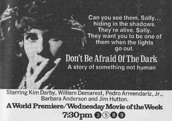
It’s hard to pinpoint the primal potency of the original Don’t Be Afraid of the Dark, the 1973 telefilm about a woman stalked by hideous little troll monsters in the shadowy old house where she lives with her husband. The story itself, a wisp of a thing, has the unexplained purity of a nightmare piped directly from a fevered mind: both circuitously mazelike and stiflingly linear, it’s like watching someone drown in a room slowly filling with water. As with contemporaries Rosemary’s Baby and The Stepford Wives, it’s a parable of domestic disempowerment built around a woman whose isolation and vulnerability grow in nastily direct proportion to her suspicion that she is being hunted by dark forces. All three movies conclude in acts of spiritual (if not quite physical) devouring and rebirth: housewives eaten by houses. To the boy I was then, Don’t Be Afraid of the Dark provoked a delicious, vertiginous sliding of identification, repulsion, and desire: the doomed protagonist, played by Kim Darby, merged the cute girl from the Star Trek episode “Miri” with the figure of my own mother, whose return to full-time work as a public-school librarian, I see now, had triggered tectonic shifts in my parents’ relationship and the continents of authority and affection on which I lived out my childhood. These half-repressed terrors came together in the beautiful, grotesque design of the telefim’s creatures: prunelike, whispery-voiced gnomes creeping behind walls and reaching from cupboards to slice with razors and switch off the lights that are their only weakness.

The 2011 remake, which has nothing of the original’s power, is nevertheless valuable as a lesson in the danger of upgrading, expanding, complicating, and detailing a text whose low-budget crudeness in fact constitutes televisual poetry. Produced by Guillermo del Toro, the movie reminds me of the dreadful watering-down that Steven Spielberg experienced when he shifted from directing to producing in the 1980s, draining the life from his own brand (and is there not a symmetry between this industrial outsourcing of artistry and the narrative’s concern with soul-sucking?). The story has been tampered with disastrously, introducing a little girl to whom the monsters (now framed as vaguely simian “tooth fairies”) are drawn; the wife, played by a bloodless Katie Holmes, still succumbs in the end to the house’s demonic sprites, but the addition of a maternal function forces us to read her demise as noble sacrifice rather than nihilistic defeat, and when husband (Guy Pearce) walks off with daughter in the closing beat, it comes unforgivably close to a happy ending. As for the monsters, now more infestation than insidiousness, they skitter and leap in weightless CGI balletics, demonstrating that, as with zombies, faster does not equal more frightening. But for all its evacuation of purpose and punch, the remake is useful in locating a certain undigestible blockage in Hollywood’s autocannibalistic churn, enshrining and immortalizing — through its very failure to reproduce it — the accidental artwork of the grainy, blunt, wholly sublime original.

The new iPad

I’m neither an automatic Apple acolyte nor a naysayer, but the company and its technologies do go deep with me: my first computer, purchased back in 1980, was an Apple II+ with 48K of RAM, and between me and my wife, the household currently holds six or seven Apple devices, including multiple MacBooks and iPods. That I integrate these machines with a powerful PC that is my primary workstation and gaming platform does not dilute the importance of the role Apple has played in my life.

All that said, today’s announcement of the latest iPad strikes me as a letdown, and I’ve been trying to figure out why. A Retina display with four times the resolution of the current device is nothing to sneeze at, and I’m glad to see a better rear-facing camera. But the quantum leap in capability and, more importantly, a certain escalation of the brand are missing. I am the happy owner of an iPad 2, brought a year ago during a difficult time for Katie and me; March 2011 was a profoundly unhappy month, and I am not embarrassed to say that my iPad was one of the small comforts that got me through long nights at the hospital. Perhaps if I was going through something equivalently tragic now, I might again turn to a technological balm, but I doubt that the new iPad would do the trick. It’s a cautious, almost timid refinement of existing hardware, and I daresay that were Steve Jobs still around, Apple might have taken a bolder leap forward.

I was struck by one statement in the promotional video I watched: the assertion that in an ideal Apple-based technological experience, the mediating device disappears from consciousness, allowing you to concentrate on what you’re doing, rather than the thing you’re doing it with. True enough, I suppose — I’m not thinking about the keyboard on which I’m typing this blog entry, or the screen on which I’m reading my own words. But such analyses leave out the powerful effect of the brand that surrounds those moments of “flow.” The iPad, like so many Apple innovations, is a potent and almost magical object in terms of the self-identifications it provides, and in off-screen moments I am always highly conscious of being an iPad user. It’s a happy interpellation, one I accept enthusiastically, turning with eagerness toward the policeman’s call. It’s anything but a transparent experience, and the money I give Apple goes at least as much to support my own subjectification as to underwrite a particular set of technological and creative affordances. The new iPad lacks this aura, so for now, I’ll stick with what I have.

Remembering Ralph McQuarrie

The death of Ralph McQuarrie on March 3 marked the loss of one of the key founders of the Star Wars franchise. McQuarrie’s authorial status within that vast transmedia network had for decades been subsumed under the cannibalizing sign of George Lucas’s “vision,” and just as the aging and death of the movies’ original actors has cleared the stage for such synthetic, endlessly replenishable replacements as the animated Clone Wars series and the Lego-ification of the saga, so McQuarrie’s demise signals the continued waning of a certain authentic (and temporally specific) artistry tied to, but distinct from, Lucas’s techno-auteurism. Below is an excerpt of my book manuscript on special effects and transmedia franchises, focusing on McQuarrie’s role in the previsualization of Star Wars.

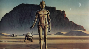
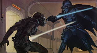
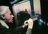
By summer 1974, the rough draft of what was then called The Star Wars ran 132 baffling pages. According to fellow director Michael Ritchie, to whom George Lucas showed the draft, “It was very difficult to tell what the man was talking about.”[i] Another friend, Hal Barwood, said the script “started off in horrible shape. … It was hard to discern there was a movie there. It was both kind of futuristic and funny and endearing and exciting all at once, but that combination of possibilities just didn’t dawn on us reading these words on the page.”[ii] Perhaps thinking back to his use of comic-book frames to sell the story treatment to Twentieth-Century Fox, Lucas acknowledged that “the concepts and characters he was devising were so bizarre that it was very difficult for anyone else to visualize them.” So he turned to a professional artist, Ralph McQuarrie, to portray The Star Wars in concrete visuals.[iii] McQuarrie was an industrial artist for Boeing Aircraft who came to prominence in Hollywood circles when he created illustrations of space flight for CBS’s coverage of the moon landings. Lucas hired him to paint “concept artwork” based on a handful of key images, including the ones below.[iv]

It is fair to say that without McQuarrie’s paintings, Star Wars would not have been made – or would at least have been a very different film. “George spent his money wisely on Star Wars by developing the art,” according to Lucasfilm production assistant Miki Herman. “Ralph McQuarrie’s paintings sold the movie to Fox.”[v] The paintings’ primary value was in leapfrogging past the limitations of time and budget to bring back images from Star Wars’ own future – its spectacular “money shots.” Done in opaque gouache and acrylic in widescreen aspect ratio, the art envisioned in arresting ways the central settings, character looks, and action beats of Lucas’s screenplay. Studio backers were all too pleased to find order amid the chaos; they were particularly reassured by the guarantee that the planned effects would be both technically achievable and splendidly unlike anything that had come before. Lucas “wanted the pictures to be idealist,” according to McQuarrie. “In other words, don’t worry about how things are going to get done or how difficult it might be to produce them – just do them how you’d like them to be.”[vi] Compared to the likely expense of producing the special effects they called for, the paintings cost nothing; yet that very lack of expense suggested that the images could be delivered on time and on budget. With the paintings, Lucas “wanted people to look and say, ‘Gee, that looks great, just like something on the screen.’”[vii]

McQuarrie’s artwork also helped to organize the production side of Star Wars. They defined the look of different characters as well as designs for costumes, settings, props, spaceships, planetary environments, and alien beings. McQuarrie is credited with originating key aspects of the film’s iconography, including Darth Vader’s breathing mask, the Jedi light sabers, the desert planet Tatooine with its two suns, R2-D2’s “three legs, a round swivel top on his cylindrical metal body, and a squat demeanor,”[viii] and certain spaceships. His designs helped lend the film its air of being a “used universe,” Lucas’s term for the scuffed and careworn quality of his retrograde future. More important, McQuarrie’s paintings provided a concrete reference point for the growing staff of casting directors, costume and set designers, storyboard artists, and special-effects craftspeople coming on board as ILM grew. At high levels, the artwork functioned as collaborative archive, enabling design teams to view, assess, and modify plans. At lower levels, the paintings coordinated the labor of draftsmen and model makers, providing a template for maintaining consistency in their output. Joe Johnston, credited with Effects Illustration and Design, was responsible for creating the extensive storyboards for Star Wars. “A lot of people ask me if I was the creator of the Star Wars spaceships, and I really wasn’t,” he has said. “Everyone else’s imagination was kind of funneled through mine and Ralph McQuarrie’s.”[ix] Similarly, John Stears, Special Production Mechnical Effects Supervisor, stated, “We had superb production illustrations by Ralph McQuarrie, and … the film adhered closely to them. A lot of the credit is due McQuarrie, as the look of the picture was due to him.”[x]

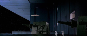
Artwork-to-shot comparisons

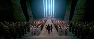
McQuarrie’s paintings acted as ersatz finished frames, which the production crew then reverse-engineered, building them from the ground up. The shots above, for example, duplicate almost exactly their corresponding preproduction art. Although McQuarrie went on to provide artwork for sequels The Empire Strikes Back and Return of the Jedi, he has expressed disappointment that his work for Lucas did not receive more credit in its own right. “I wonder if I haven’t been ripped off,” McQuarrie is quoted as saying. “But then, why should George pay me any more than he had to? He’s a pretty cool businessman.”[xi] Despite what these comments suggest, McQuarrie has never claimed that he alone originated the film’s visual elements, but rather developed them in consultation with Lucas. The fact remains, however, that many of the commonly cited examples of Star Wars’ incorporation of existing designs and motifs have their roots in McQuarrie’s artwork. He based the look of C-3PO, for example, on the robot Maria in Metropolis (Fritz Lang, 1927).

An even more significant contribution is the signature shot from near the end of the film: the rebel ceremony in which Luke Skywalker and his companions receive medals from Princess Leia. Frequently described as recycling the starkly symmetrical “mass ornament” of Nazi ranks from Leni Riefenstahl’s Triumph of the Will (1935), the shot in Star Wars can be traced to McQuarrie through his preproduction painting, reproduced onscreen almost identically, albeit in reverse angle.

McQuarrie also contributed several matte paintings to the Star Wars films, literally inscribing his artwork into the movie. These paintings stand somewhere between design concept and finished frame, a transitional stage between different media:

Previz abounds in such intermediate objects – sketches, blueprints, crude models and maquettes, film tests, outtakes, work prints – weird hybrids seldom discussed in studies of film production, which devote attention and analysis to more stable, neatly classifiable forms. Yet the materials of previz deserve theorization precisely because they fill in the hidden interstices of production, marking incremental transformations from paper to screen and encompassing the totality of filmic manufacture. It is as though the production of motion pictures takes place on a darkened stage with spotlights picking out a few celebrated nodes of creation: in this corner, a director; in another, a writer and screenplay; and at the center, the final print distributed to theaters and serving thereafter as the nucleus of popular, journalistic, and academic discourse about the film. Bringing up the lights reveals that the stage is in fact crowded with materials and personnel whose work, while essential to the production, is effaced in order to maintain an orderly cosmology. This industrial mythology is anchored by the unifying figure of the film director.

I do not mean to suggest that previsualization (or the preproduction phase that is its larger backdrop) receives no public attention. Indeed, these technical activities and their associated narratives and imagery fuel a highly visible side industry of publication pitched to audiences fascinated with the process of making movies. Making-of books and behind-the-scenes documentaries are nothing new in Hollywood, and have to some extent been the focus of academic scrutiny for their role in what Steve Neale terms cinema’s “inter-textual relay”:

The institutionalized public discourse of the press, television and radio often plays an important part in the construction of [movies’ public] images. So, too, do the “unofficial,” “word of mouth” discourses of everyday life. But a key role is also played by the discourse of the industry itself, especially in the earliest phases of a film’s public circulation, and in particular by those sectors of the industry concerned with publicity and marketing: distribution, exhibition, studio marketing departments, and so on.[xii]

The “making-of” mania was particularly intense around Star Wars, echoing in discursive form the many tie-in objects – toys, model kits, pajamas, posters – used to promote the film. In 1977, Ballantine Books released an oversized portfolio of McQuarrie’s paintings, along with “The Art of Star Wars,” a book reprinting the screenplay alongside preproduction art, storyboards, and stills from the movie.[xiii] Such publications provided snapshots of an evolving production, freezing them like prehistoric insects in amber: a glimpse of Luke Skywalker as a woman; a McQuarrie painting of Han Solo as a Chewbacca-like monster; a scene or snippet of dialogue that failed to make the final cut. The material record of previz, riddled with gaps on their way to being closed, offers not just a glimpse of possibilities that might have been, but a relatively unvarnished perspective on the logics of appropriation and suppression by which Hollywood attempts to close a circle of authorial singularity and originality around its products. Because of its very in-betweenness, previz seems to mark a moment at which forces of ideological regulation are at their most contested and unstable. The promotional use of previsualization materials might therefore be seen as a clever strategy of containment, drawing attention to an impressive apparatus of visual-effects design in order ultimately to subsume it within the techno-auteur’s all-encompassing “vision.”


[i] Marcus Hearn, The Cinema of George Lucas (New York: Harry N. Abrams, 2005), 147.

[ii] Ibid, 83.

[iii] Ibid 83-84.

[iv] Ibid.

[v] Quoted in Pollock, Skywalking, 149.

[vi] Hearn, The Cinema of George Lucas, 83-84.

[vii] Quoted in Dale Pollock, Skywalking: The Life and Films of George Lucas (Hollywood, CA: Samuel French, 1990), 149.

[viii] Ibid 150.

[ix] Mandell, Paul. “Joe Johnston.” Interview. Cinefantastique 6.4/7.1 (1978), 78.

[x] Mandell, Paul. “John Stears.” Interview. Cinefantastique 6.4/7.1 (1978), 64.

[xi] Quoted in Pollock, Skywalking, 197.

[xii] Steve Neale, Genre and Hollywood (London: Routledge, 2000), 39.

[xiii] The first of these was Carol Titelman, ed., The Art of Star Wars (New York: Ballantine Books, 1979).

CFP: Materiality and Object-Oriented Fandom (March 2014)

I’m excited to be guest-editing a special issue of Transformative Works and Cultures on objects and artifacts in media fandom! The CfP follows.

Alongside its consumption and transformation of texts, media fandom has always been marked by its consumption and transformation of objects. From superhero figures, model kits, and wargaming miniatures for sale at hobby shops, to costumes and props worn at Comic-Con, material objects and body decoration have functioned as displays of textual affiliation, crafting skills, or collecting prowess, reflecting a long history of fan-created and -circulated artifacts around popular media fictions. While “mimetic” and “affirmational” practices seek to replicate the objects of fantastic media as faithfully as possible, other fan creations result in material mash-ups, expressing transformative impulses in artifact form. Regardless of orientation, object-oriented fandom represents a distinct strand within old and new activities and cultures, one whose intimate and often friendly relationship with corporate branding and ancillary market exploitation make it of central interest to an emerging body of scholarship on transmedia, convergence, and the franchise.

This special issue seeks historically and theoretically informed essays that explore the role of objects and their associated practices in fandom, as instances of creativity and consumerism, transformation and affirmation, private archive and public display. We are particularly interested in work that complicates or transcends the binaries of social vs. solitary, artwork vs. commodity, and gift vs. monetary economies to engage with object-oriented fandom as self-aware and playful in its own right.

We welcome submissions dealing with, but not limited to, the following topics:

  • creating and collecting, buying and selling fan artifacts (production artifacts, memorabilia, reference materials, models, material fan art, and fan crafts…)
  • cosplay (creating costumes and other artifacts, performing cosplay, competitions…)
  • fan enactments, events, and embodiment (Renaissance Fairs, Quidditch competitions, re-enactments, fannish tattoos…)
  • fan objects as paratext and transmedia extension
  • dissemination of skills and abilities (workshops, online blogs, fan meetings…)
  • object marketplaces (con, comic-book store, ebay, etsy…)
  • evaluation and valuation of artifacts across the various economies of fandom
  • impact of digital technologies (including social networking and 3D printing) on object creation, collecting, and cataloging
  • new debates over authorship, ownership, and control

Submission guidelines

TWC accommodates academic articles of varying scope as well as other forms that embrace the technical possibilities of the Web and test the limits of the genre of academic writing. Contributors are encouraged to include embedded links, images, and videos in their articles, or to propose submissions in alternative formats that might comprise interviews, collaborations, or video/multimedia works. We are also seeking reviews of relevant books, events, courses, platforms, or projects.

Theory: Often interdisciplinary essays with a conceptual focus and a theoretical frame that offer expansive interventions in the field. Blind peer review. Length: 5,000–8,000 words plus a 100–250-word abstract.

Praxis: Analyses of particular cases that may apply a specific theory or framework to an artifact; explicate fan practice or formations; or perform a detailed reading of a text. Blind peer review. Length: 4,000–7,000 words plus a 100–250-word abstract.

Symposium: Short pieces that provide insight into current developments and debates. Non-blind editorial review. Length: 1,500–2,500 words.

Submissions are accepted online only. Please visit TWC’s Web site (http://journal.transformativeworks.org/) for complete submission guidelines, or e-mail the TWC Editor (editor AT transformativeworks.org).

Contact

We encourage potential contributors to contact the guest editors with inquiries or proposals: Bob Rehak (rehak.twc AT gmail.com)

Due dates

Contributions for blind peer review (Theory and Praxis essays) are due by March 1, 2013.

Contributions that undergo editorial review (Symposium, Interview, Review) are due by April 1, 2013.